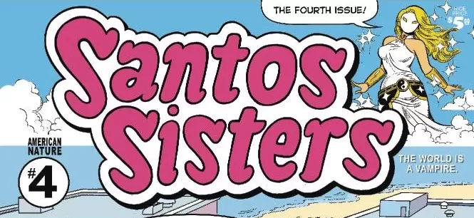
REVIEW: Santos Sisters #4
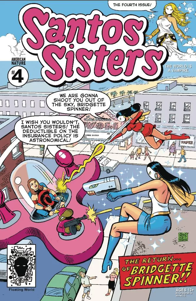 Before today, I had never heard of the Santos Sisters. After today, I would love to hear more about the Santos Sisters. This ragtag team of superhero sisters battles the low-key, funny, and cute villains of Las Brisas. From organized crime pros specializing in stealing cars to scammed and honey-covered horny men, and even quirky supervillains, the Santos Sisters are a hoot and a holler.
This is a really fun read. I think there’s a lot of great stuff that sets this comic apart from our usual reads on the shelf. The art is very good, and while it’s rather simple in terms of backgrounds, mostly keeping to flat colors with a couple of gradients here and there, and maybe one or two establishing shots to set the mood, the character art more than makes up for it. It is very reminiscent of old-school Archie comics, and I have no doubt that it is a deliberate choice. The writing is quirky, funny, and the girls can let out a swear or two every so often. It’s very much meant for adults to read, but I am also sure that if I had found a comic like this when I was in my teens, I would have loved to have it for my collection.
The team that put this together is called Floating World and is composed of five writers and two artists who handle the bulk of the work. It has so many writers because it is split up into different short-form comics that make up the final full book. In my opinion, this would work wonderfully as a webcomic with a Patreon, as well as independent mini-comics. Not saying that it doesn’t work as a full comic, but it has so many advertisements that it would just work better on its own dedicated site, going up for free online, garnering a core fanbase that supports through Patreon, and then supplementing that income through sponsored ads on the site. I just don’t like ads in comics. I know it’s a necessary evil, and while I do like that they are promoting other members of the comics community, such as podcasts, independent artists, and other comics, having ads in the middle of stories breaks up the flow of the story and messes up the immersion of the reader. If they are going to have ads, I would suggest they have them at the end of each short story instead of in the middle, and then have like 2-4 pages at the end with the rest of the ads that couldn’t be fitted in the end of the short stories.
Speaking of the end of short stories… A book like this suffers greatly when you have long-form storytelling in between short-form stories. The first story this book presents leaves you with a cliffhanger and a “coming soon,” but then you launch into a completely different story, and I don’t think that’s a good idea. By the end of the book and after reading two other completely different stories that have their own beginning, middle, and end, you simply forget what the whole cliffhanger thing was about. I think if you’re going to make a book like this, then you have to stick to either all short stories or sacrifice one short story for the next issue in order to tell the full longer story without having the cliffhanger, which is not a bad choice because that means for issue 5 you’ll already have a nice story in there.
I do have to say it, even though I don’t like the ads, I have to admit that they do go out of their way to pick ads that fit their aesthetic and match the style of the comic very well, as well as the audience. I didn’t enjoy stopping midway through the story to read the ads, but I did enjoy the individual ads. Had they all been at
the end or in between the full short stories, I might have enjoyed them more because they are both fun and pleasing to look at.
The lettering is fun and straight to the point, and while I do wish they had a couple more sound effects to really make this world pop, it wasn’t the worst thing in the world. I particularly enjoy that it’s all done mostly by two people. These last couple of reviews have been done either by really small teams like this one or by one-man teams, and I love that in comics. It’s that sort of go-getter attitude in comics that I love. It makes me feel like there’s no limit to the creativity we can put out into the world when we sit down and dedicate ourselves to telling the stories we love to read.
This is a fun book, and I enjoyed it thoroughly. All the issues it has come from its layout rather than its actual content. The way the ads are handled and the fact that it doesn’t have a credit page are really my only major issues with this book, but other than that, this is a fun book and worth a read. Again though, look into making it into a webcomic and monetizing with Patreon and ads. Of course, keep selling the book, but I think you’d make much more money that way and be able to release the books ad-free or a little less ad-heavy with that move. I look forward to reading more. Keep up the good work over at Floating World Comics. Oh, and I really do love the mid-page title opening panels. So old-school, Tales from the Crypt vibes!
Writing: 5 Stars
Art: 5 Stars
Colors: 5 Stars
Overall: 5 Stars
Writing by: Greg & Fake, Graham Smith, Dave Landsberger, and Marc Koprinarov
Art & Colors by: Greg & Fake
Lettering by: Greg & Fake
Cover art by: Greg & Fake
Published by Floating World Comics
Author Profile
Latest entries

 Comic BooksMarch 30, 2024REVIEW: Monstress #50
 Comic BooksMarch 28, 2024REVIEW: Cemetery Kids Don’t Die #2
 Comic BooksMarch 27, 2024REVIEW: Forgotten Runes #3 (of 10)
 Comic BooksMarch 6, 2024REVIEW: Sam and Twich- Case Files #1


