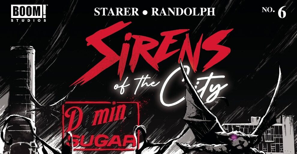
REVIEW: Sirens of the City #6 (of 6)
 Out in New York a band of uncanny young adults must use their powers to safe their friend and hope not to level the whole city while they are doing it. Beautifully drawn and colored Sirens of the City issue #6 brings closure to several plot points that have been troubling our young heroes. Layla, fueled by the waters of the river brings out her strongest form but is she strong enough to not only defeat her enemies but survive “Mother dearest’s” impromptu feticide? A very fun read filled with action, beautiful splashes of colors in an otherwise black and white story, and some very strong dramatic moments.
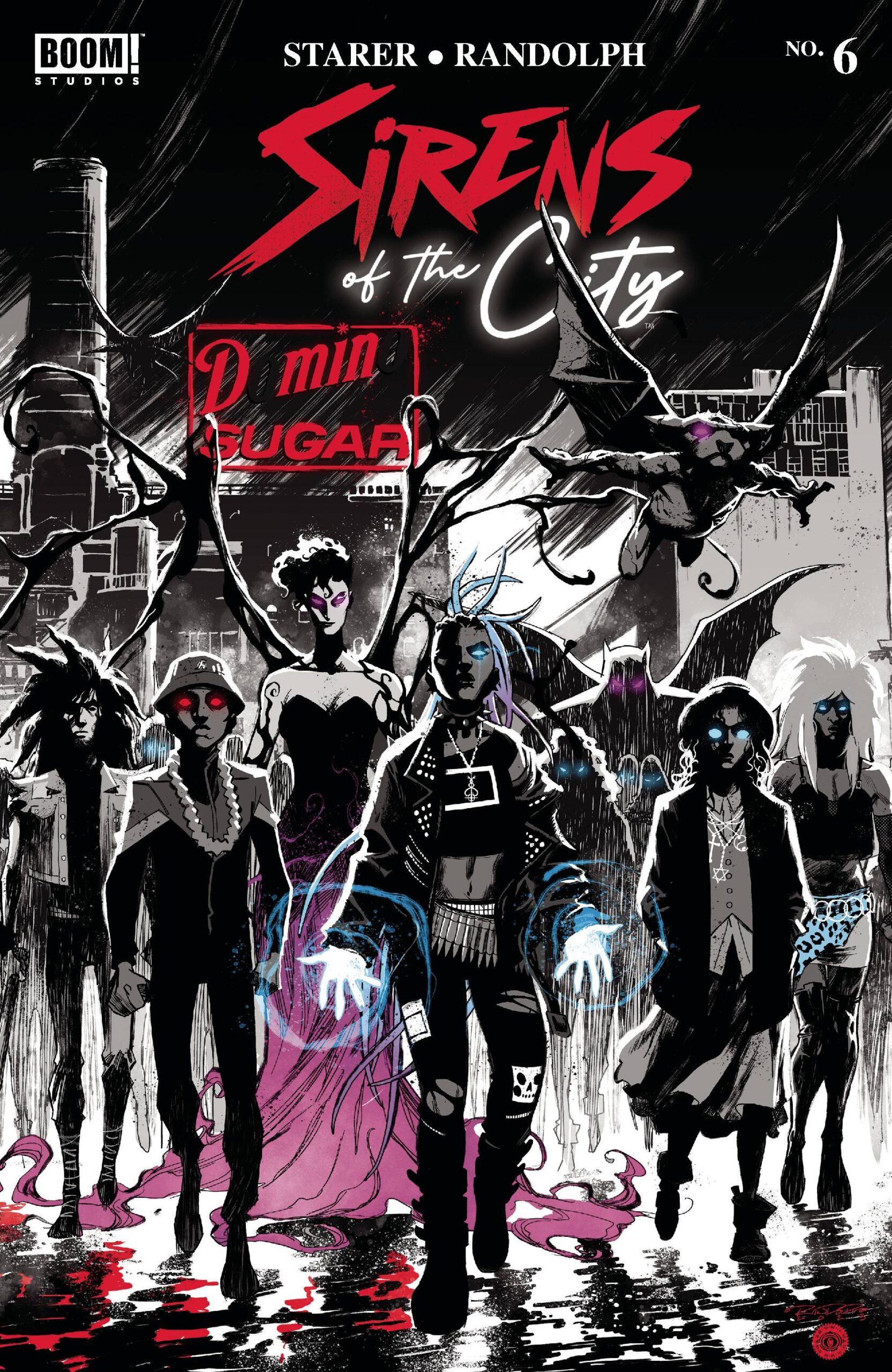
In this issue, we see the uncanny band of characters face off against Bam and his goons at the sugar factory. Whilst the story is well paced in terms of the overall narrative of the series, it is a little hard to get into as a first time reader. Everything happens a little too quickly for us first-timers to really process what is going on and dive fully into the story. There is a lot of characters to deal with and whilst they are all very well designed and incredibly interesting, the large amount of characters to get to know at a first glance makes for a bit of a confusing read during the first few pages. However, once you get your bearings and start following the story, you clearly see that this is a labor of love and that there is some really great stuff being addressed in this series. From poverty to marginalization and unwanted pregnancies, Sirens of the City is the type of comic that holds a mirror to society whilst still managing to keep things interesting and otherworldly. At times it reminds me of stories like The New Mutants and perhaps even Kick-ass, in terms of giving powers and responsibilities to otherwise under qualified individuals that must make amends with themselves and each others in order to uphold their duties as superhuman beings.
Whilst there is a tiny bit of comedy in the story, especially with the interactions between the human character and the mind control character. In most instances I would abhor the idea of adding a character page at the beginning but perhaps for a story like this and especially an issue with so much action happening, a characters section with everyone’s names and their powers would have been a great asset for me as a first-time reader of this series. That being said, other than the initial difficulties, this is a great comic and I enjoyed the action greatly. It contains a beautiful double page spread of what Layla the “water elemental” type character does to the opposing band and all the havoc is shown in little blue and white vignettes that manages to transmit high levels of carnage without truly being too graphic. I also love how the artists used Layla’s hair as the panel borders for this spread because it is something I have not seen done that much in comics, to use aspects of the character like this that not only serve as aesthetical elements but double in function as actual panel borders is marvelous.
If the last sentence isn’t enough to tell you how much I love the art of this comic, then perhaps diving deeper into it will do the trick. For starters the character designs are all fantastic. From Mother Dearest to Layla, to the human guy and literally all the other uncannies, this is one of those rare instances in which I am in love with all the characters equally. I do wish we were able to see a bit more of each one of them but that is no fault of the comic, but rather my own personal desire to get a taste of every character’s power in just one issue. It is obvious however that this issue focuses on Layla’s struggle both as a mother and as a powerful uncanny, so most of the awesome poses will go to her. With that in mind there is still some really great shots of Mother as well as the human character who’s sporting a rocking head of hair on him. I am also a huge fan of what they did with the coloring on this comic. The black and white is done very well, and it uses heavily the technique of black spotting and contrasting these large masses of ink against white backgrounds works wonders to highlight the detailed character designs. The little bits of color here and there break up what would otherwise be a monotone color scheme. These colors however are not simply adding in there for pizazz’s but rather carefully placed in order to elevate the story and make emphasis during key action moments. It also serves to show you when characters are using their uncanny abilities. Love it when color serves a higher purpose to the story. The environment designs are alright, but this is for the most part a character piece so while the environments work well they do not hold a candle to the amazing work being done with the characters and their dynamic poses and style.
The lettering works well in this story. It is nothing too fancy or complicated, and there isn’t a lot to mention in terms of experimental word balloons, fonts or sound fx but it does the job. One thing I will mention about the lettering though is that I did like the bit where they colored Layla’s words when she was approaching her full potential. I liked that she was so filled with water that even her text became blue, that was a nice little touch.
I liked the story. It wasn’t easy to get into but it was a great read nonetheless. It happens that once you get the story going and you get to the later issues, that the story becomes less accessible for newcomers who don’t fully understand who is who, and why something is happening. However, for the case of this story even with that small barrier for entry it was still highly entertaining and I enjoyed the art greatly. For being set in New York it is nice that this story feels a lot darker and grungier than our usual Spider-Man New York themed settings where everything feels clean and perfect and the only thing that’s messed up is the world that Spider-Man has to live in. If you’re into a darker superhumans/mutants story this might be right up your alley. It also reminds me of the newer Static Shock stories, so if you’re a fan of that, you could be a fan of this as well.
Writing: 4 Stars Art: 5 Stars Colors: 5 Stars
Overall: 4.5 Stars
Written by: Joanne Starer
Illustrated by: Khary Randolph
Coloring by: Matt Herms
Lettering by: Andworld Design
Cover art by: Khary Randolph
Variant Covers by: Vanesa R. Del Rey, Mike Del Mundo, Chris Brunner & Rico Renzi Published by: Boom! Studios
Author Profile
Latest entries
 Comic BooksApril 30, 2024REVIEW: Rick and Morty: Kingdom Balls #1
 ReviewsApril 30, 2024PRCC2024 Recap: Fans from all over the world join together in Puerto Rico to celebrate all things comics, anime and videogame
 Comic BooksMarch 30, 2024REVIEW: Monstress #50
 Comic BooksMarch 28, 2024REVIEW: Cemetery Kids Don’t Die #2