

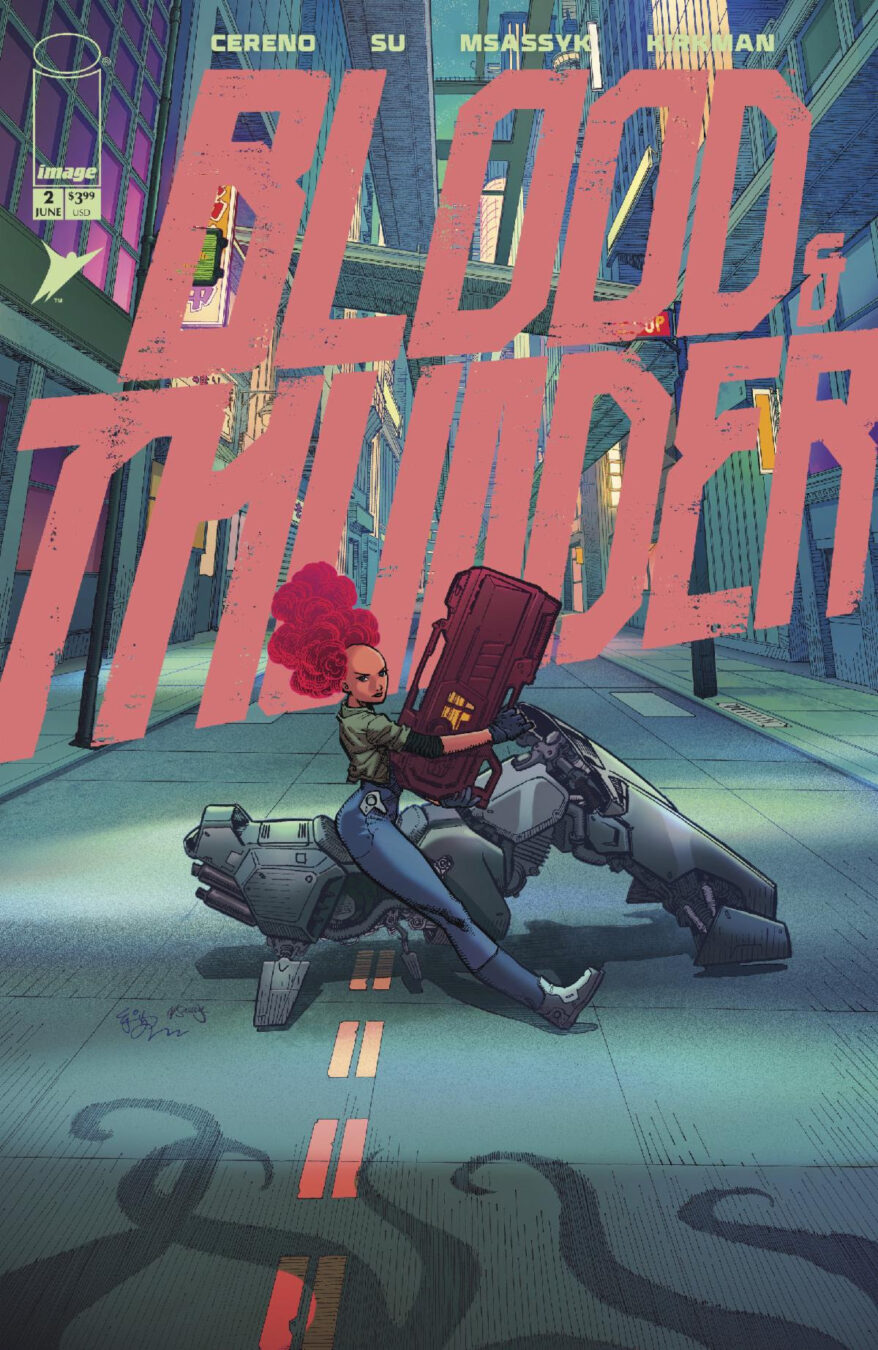
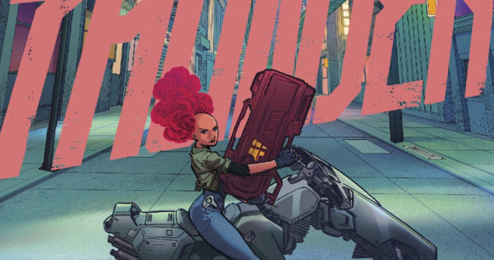
First Look: Blood and Thunder Are Our Last Hope in ‘Blood & Thunder #2’ from Benito Cereno, E.J. Su, MSassyK & Robert Kirkman
Skybound and Image Comics revealed interior pages and the lineup of variant covers for the
Skybound and Image Comics revealed interior pages and the lineup of variant covers for the
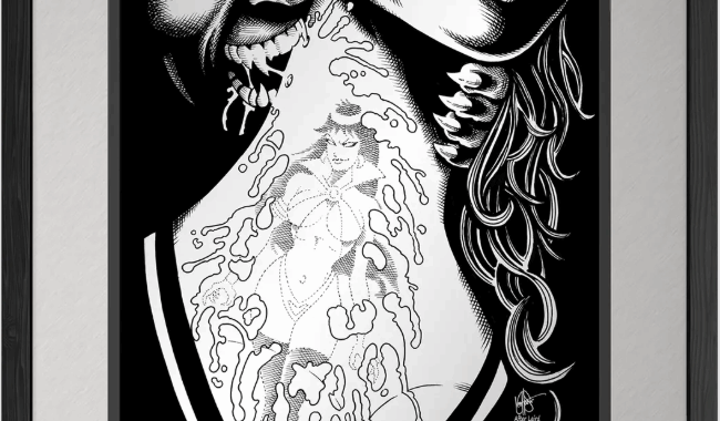
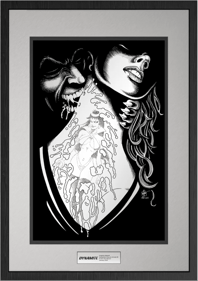
VeVe and Dynamite Entertainment Launch Limited Time Silent Auction for NFT Edition of Original Vampirella
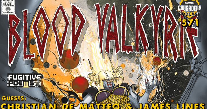
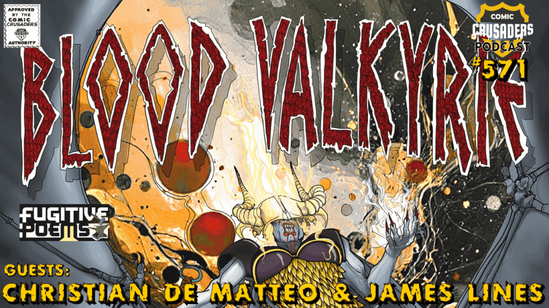
The Fugitive Poems team—Christian De Matteo and James Lines—return to the Comic Crusaders Podcast to
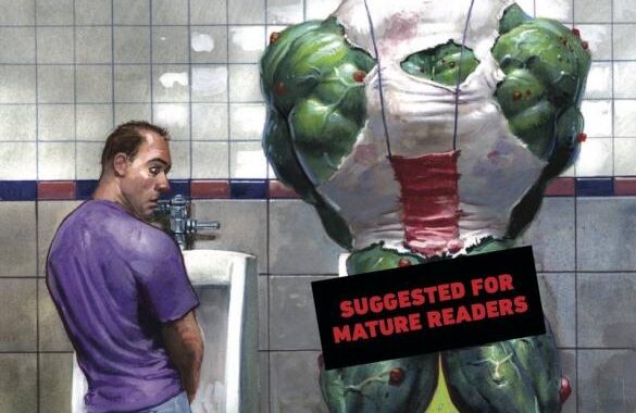
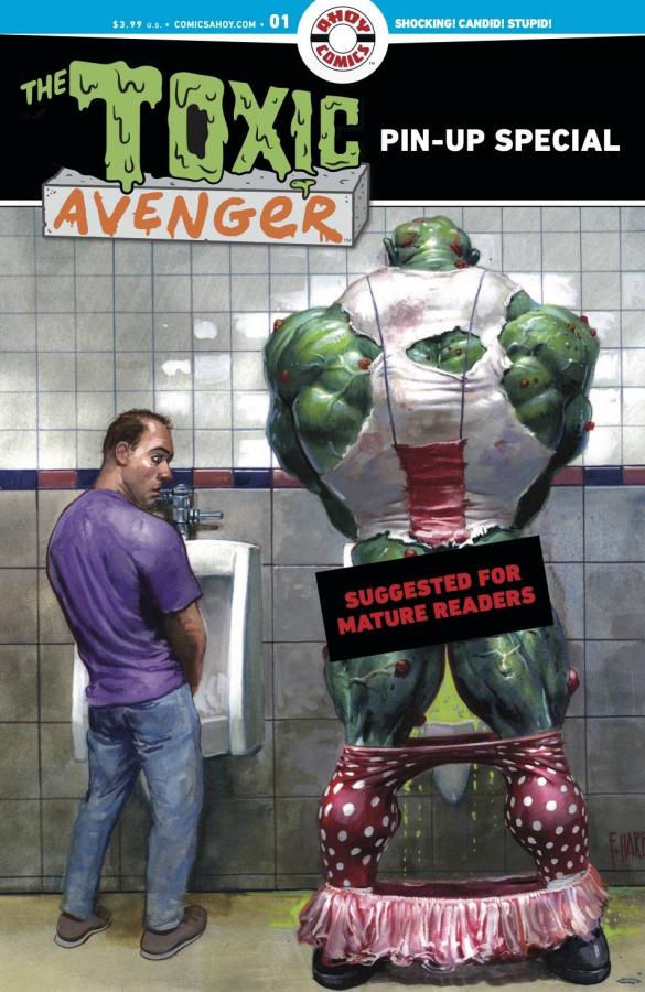
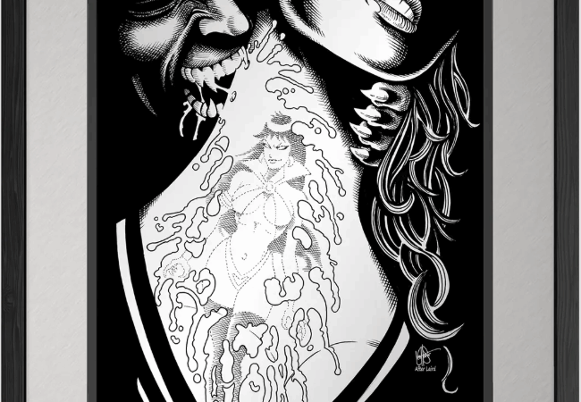
Shocking! Candid! Violent! Dopey! Explosive pinups by a murder of artists—Fred Harper, Matt Bors, Ben

Miami’s racing scene has grown into a vibrant hub for motorsport enthusiasts, attracting both seasoned
This list is based on the shipping dates from the distributors order forms. Not all comicbook shops
This list is based on the shipping dates from the distributors order forms. Not all comicbook shops
This list is based on the shipping dates from the distributors order forms. Not all comicbook shops
This list is based on the shipping dates from the distributors order forms. Not all comicbook shops
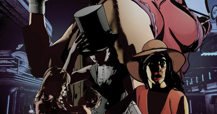
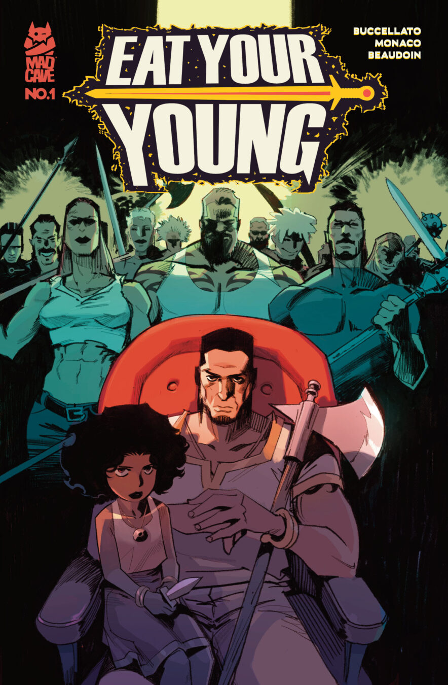
Halley, the sister of Killian’s former partner wants her dead sibling’s old job, and as
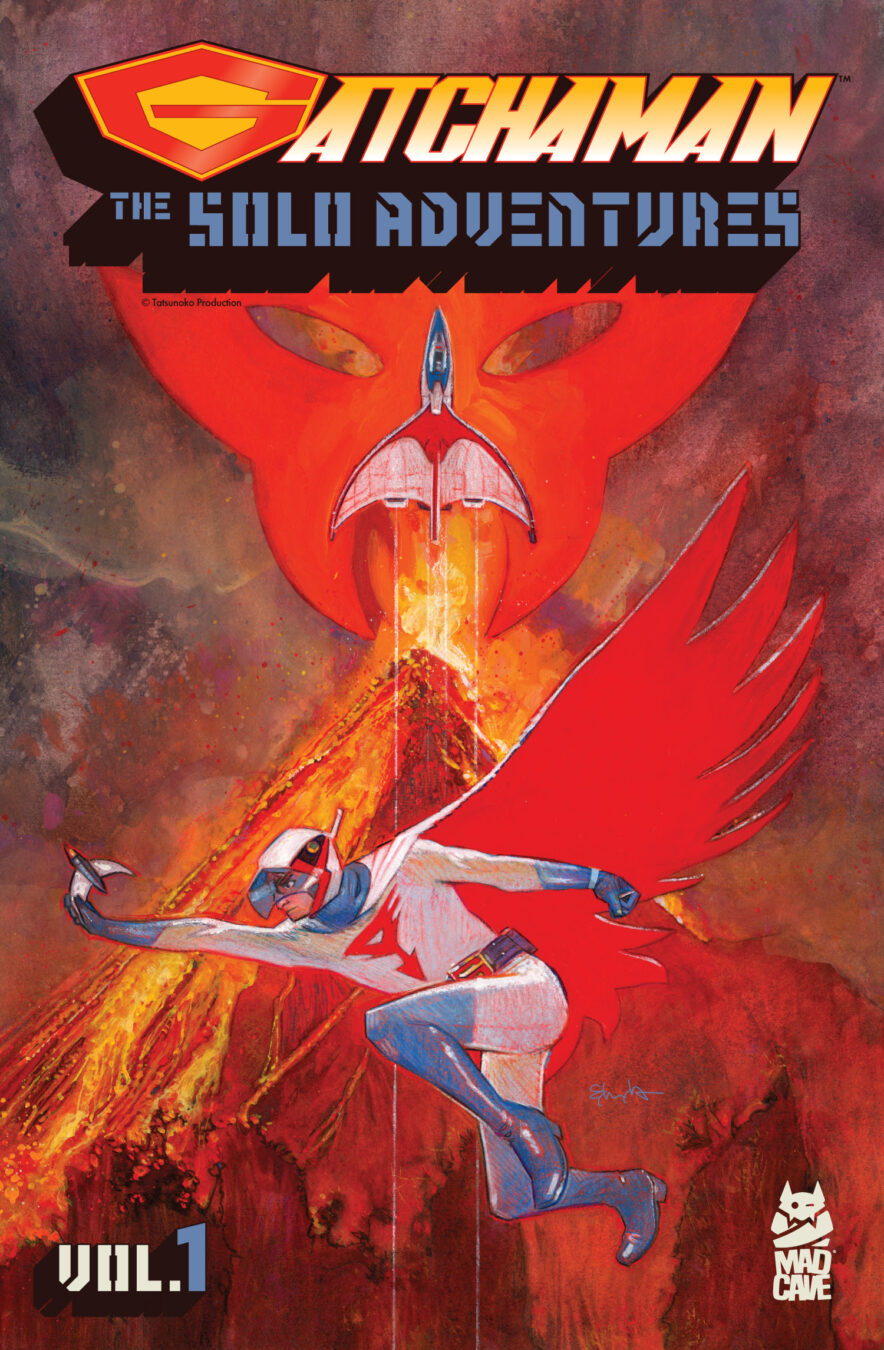
The final battle! Can the ancient teachings of Atrena and the Science Ninja Team’s machinery
Skybound and Image Comics, in collaboration with leading games, IP and toy company Hasbro, revealed
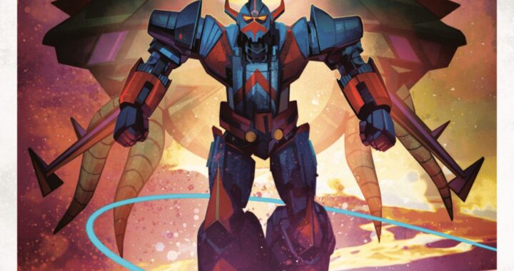
Three Standalone Stories. One Iconic Legacy. Dive Deep into the Individual Missions of G-1, G-3,
Announcing BLOODLETTER, the latest addition to the ever-expanding Spawn Universe and Image Comics! Spawn’s Secret History Unleashes a New
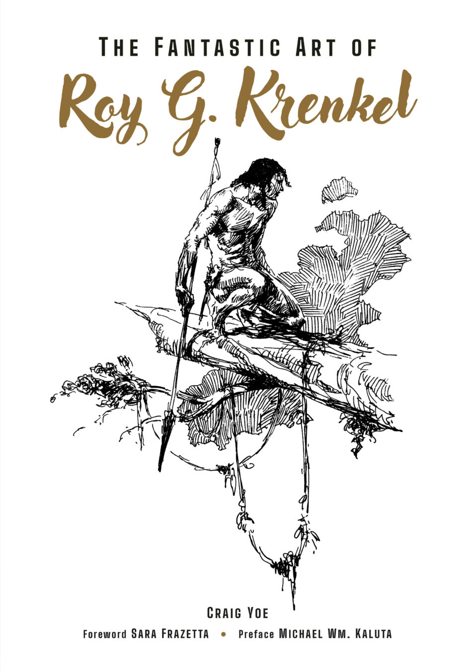
Curated by art and comics legend Craig Yoe (Cartoonists Against Racism: The Secret Jewish War
Now packed with 30 PAGES of story content, including a BRAND-NEW STORY! INTRODUCING: MEDUSA DOOM,
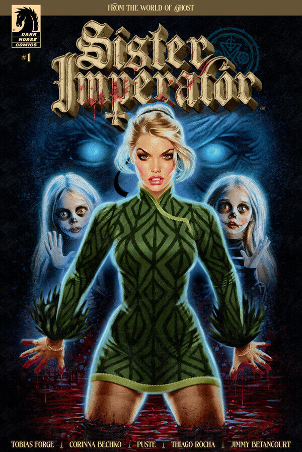
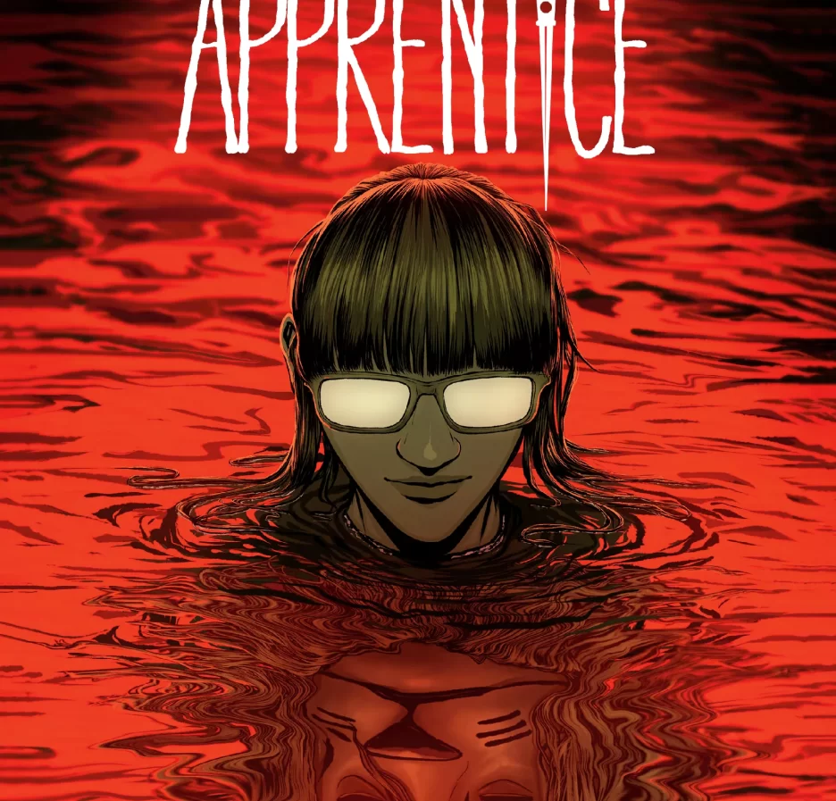
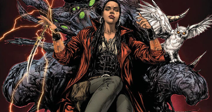
Immortality Is a Curse. Legacy Is a Weapon. And Blood Is the Only Way Out.
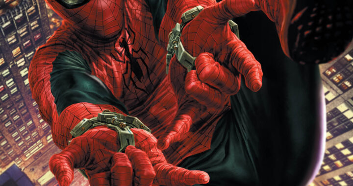
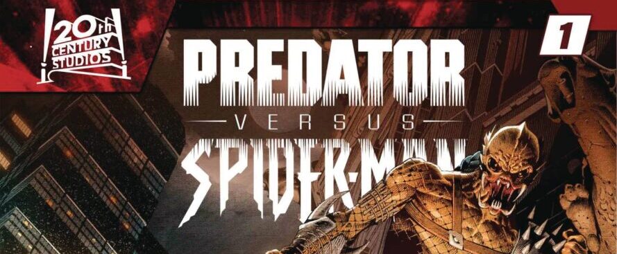
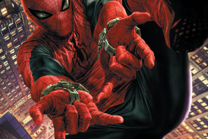
Arriving in comic shops on June 11, GIANT-SIZE AMAZING SPIDER-MAN #1 is the jam-packed, must-have
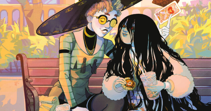
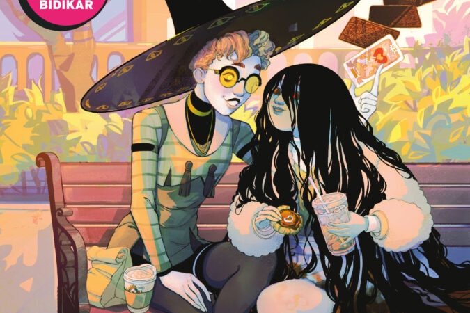
James Tynion IV (Something is Killing the Children, The Nice House by the Sea), Tate Brombal
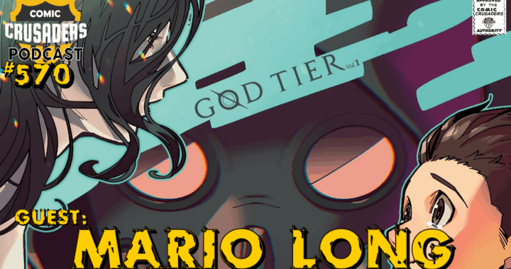
🔥 In this divine-level episode of the Comic Crusaders Podcast, host Al Mega welcomes writer