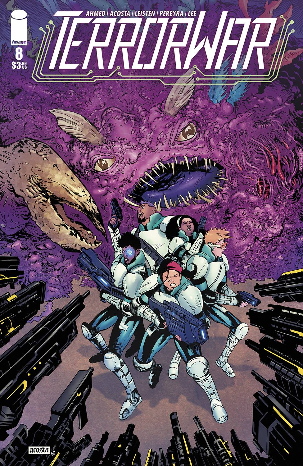
REVIEW: Terror War #8
 In this issue of Terror War, the team must make a swift escape if they are to survive Ronali’s army. Now that they know where the terror’s come from and why they are attacking the city they must make amends with the fears inside themselves and find a common ground with the terror’s to change the tide of the war. Fantastic artwork, with an equally wonderful story pacing, coloring and great action shots this is another home run for Image.
As Cho and his team make a hasty escape from Ronali’s base, they crash land into the floor level of the city with no protection from the terrors. In between fears of poverty, sickness, anger, and betrayal; Cho finds it in his heart to reach out to a little grey boy who personifies the terrors. In a sweet moment of understanding, they hug and the energy of the terrors changes from fear and horror to joy and hope. Hallucinations of cheating become surprise parties, dreams of sickness become breakthroughs for cure discoveries and the team finds themselves in allies with who they once thought were their enemies. The terrors combine with the team and create terror/human hybrids unlike anything else we’ve seen before. These new hybrid suits are exactly what the team needs to fight against Ronali’s army and make a decisive change in the war once and for all.
This issue is quite interesting because it has a little bit of everything. We have some really sad moments, for example, when the terrors attack the team and start giving them horrific hallucinations. We can see that despite carrying the weight of a supernatural war on their shoulders, each one of the team members has something that they fear the most. Whether it’s Dmitry’s fear of dying from the same illness that his uncle and his dad died from; or Mae’s fear of not being present enough for Angie, who in turn will cheat on her. We can see that these humans despite so much courage are still riddled with anxiety like the rest of us, and that deep down unless they can tame these fears and surpass their limitations they will not be able to do what must be done to win this war. We also have a bit of comedy with the way the team handles the crash of their escape vehicle with a “no matter what happens, we’ll get through this because we are together” attitude. These types of scenes give us a deeper insight into the true reason as to why this team is so different from every other team out there, they are like family to each other and they all have each other’s back. They can count on their team to be there and this allows them to both pull risky moves as well as trust in their leader because he’s not just someone who gives orders, he is family. Whilst most of the story is told in standard panel layouts, once the terrors combine with our heroes the panels get all sorts of grungy and cool zig-zaggy outlines that help to show that our characters are no longer who they used to be. This page is cool for two reasons, first, the story element we just mentioned of showing how they’ve changed but also because the zig-zaggy style of the panels lends itself very well to the inside art of the panels which for the most part show intense action moments. This combination of dynamic lines with dynamic poses heightens the action for this page and makes for a stellar see of action lines, custom panel outlines, and perfect story pacing.
Speaking of the art in this issue, Dave Acosta does not cease to amaze me with their character designs. I’ve spoken before about how much I liked the team’s designs but now that they have meshed with the terrors, those designs look even cooler. They have this blue beetle aesthetic mixed with really meaty crab-like shells that just look awesome! I like how the new characters look, they are big, bulky, and buff and I’m all for it. I’m also a huge fan of how expressive the faces are, with one look at them you can know exactly what emotion the characters are feeling. Whether it’s sadness, fear, joy, or shock, you understand it instantly. The coloring and environment designs are all really good too, this is one comic where it doesn’t feel like the artists cut any corners. Whilst there is no pre-determined colors script, I still really like how vibrant all the colors are because it gives me major 80’s vibes but in a futuristic landscape which makes for a very interesting contrast.
The lettering by Shawn Lee is spot on. We get a nice variety of word balloons with a few narration boxes, custom mech dialog panels, some great sound fx text, and an overall well-curated font choice that work in harmony with each other. My favorite part about Shawn’s lettering has to be the sound fx text during the action sequences. It is during these scenes that Shawn goes all out with big bold letters that add movement and dynamism to the action. A “CRASH” turns into an orchestra of r’s that give way to an impactful emergency landing, turning a small fire into a roaring explosion of flames.
I liked this comic very much. It is fun to read, it is well-paced and it has enough action to keep it from getting boring within the more story-heavy points but not too much action that it feels like it’s gratuitous. It is a fantastic addition to any futuristic space-age comic collection.
Writing: 5 Stars
Art: 5 Stars
Colors: 5 Stars
Overall: 5 Stars
Written by: Saladin Ahmed
Pencils by: Dave Acosta
Inks by: Jay Leisten
Coloring by: Walter Pereyra
Lettering by: Shawn Lee
Cover art by: Dave Acosta & Walter Pereyra
Published by: Image Comics
Author Profile
Latest entries

 Comic BooksMarch 30, 2024REVIEW: Monstress #50
 Comic BooksMarch 28, 2024REVIEW: Cemetery Kids Don’t Die #2
 Comic BooksMarch 27, 2024REVIEW: Forgotten Runes #3 (of 10)
 Comic BooksMarch 6, 2024REVIEW: Sam and Twich- Case Files #1


