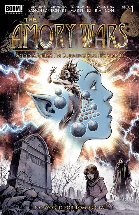
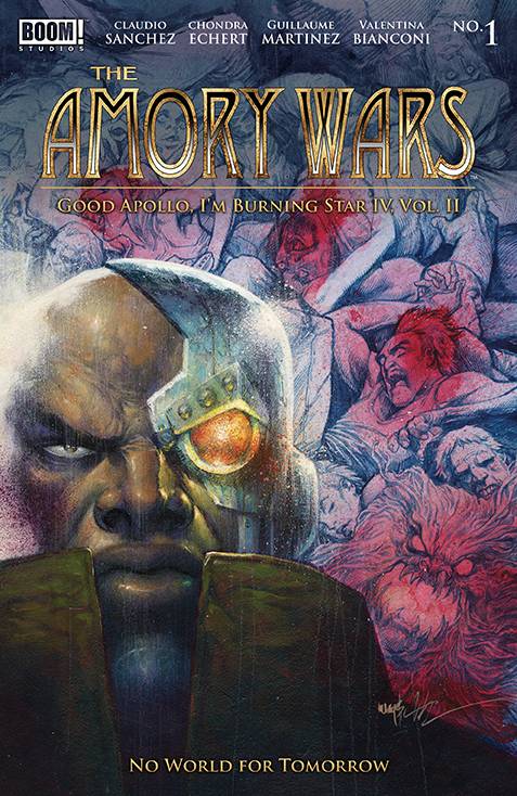
REVIEW: THE AMORY WARS: GOOD APOLLO, I’M BURNING STAR IV (VOL. II)—NO WORLD FOR TOMORROW #1 (0f 12)
In a faraway world, the story continues in this newest issue of The Amory Wars. Right off the bat if you haven’t been keeping up with the story so far, I must say that this is not the point to start reading.
In this issue, someone killed the Crowing, however as a first-time reader I have no idea of who or what the Crowing is and thus I must review this story as a rather boring installment in perhaps a way too long story that from my perspective (again as a first-time reader) makes very little sense. It is sad because there are few key things that did jump out at me that made me interested, even if just for only a second, but those things weren’t enough to make me want to keep reading.
 The pacing of the story is rather slow and features a lot of characters that I simply don’t know anything about. Whilst this is of course my fault for not being up to date with this particular series, it also proves to be a huge drawback for a #1 issue, even if it’s a volume 2, #1 issue. There is an adage that says “You are always someone’s first.” This doesn’t go for celebrity meetups, high school hookups, and of course comics and media. At any point in time, you will without a doubt stumble upon someone who is reading your work for the first time, and if you can’t explain the story thus far in a manner that is both interesting as well as explanatory; not only will it be their first time, it will also be their last. This story sadly falls into the trap of thinking that whoever is reading this will already know what is going on, and it does little to no work at catching you up to speed. This results in showing characters that don’t matter you, deliver a plotline that you couldn’t care less about, and overall just waste your time. However, this is not because there isn’t anything interesting going on, but rather because we don’t have the context to understand what is going on in the first place. With this in mind, can we still critique the comic? Well sure, we can look at the technical aspects of the work and at the very least make some observations that could help us determine if we’d like to read this again in the future, or perhaps go back and catch up with the story thus far.
As far as tonality goes we can see a lot of tension rising, there are clear good guys and bad guys and there seems to be a war going on (we can of course gather this from the title). Moving forward though there is not much to catch our attention, a comic filled with way too much technobabble and rather plain coloring makes for a boring first read. There were only three moments that stood out for me and I think they were not explored well enough to matter. The first seems to be a scene between an adult and a child burying a fallen comrade (maybe the mom, maybe their family, honestly I couldn’t tell) this was charged with some very emotional stuff but at the same time because I don’t know who these people are, well it didn’t matter that much. During this scene, however, there was a beautiful contrast between the topic of death and some really cool bright green dragonflies that were flying around the screen. These dragonflies created some beautiful contrast in an otherwise dark and grim scene but they lasted only 2 pages and they were only there to be killed by the adult character as he complained about how annoying they were. I think it would have been awesome if some sort of metaphor was explored with these dragonflies or even if we got a closer look at them as the kid explores his feelings toward death through them somehow. It felt like a lost opportunity. The last scene that really stood out to me was a close-up of something like a cryogenic tube and we got the trope of the floating body opening its eyes without the rest of the characters knowing. While this is a huge cliche in alien and horror movies, it was still nice to see it play out in a comic. The way the eyes are closed in one panel but opened in the next felt almost like a camera cut and that was a really nice trick use of the space between panels to show how comics move through time.
One thing I will say though about this comic is that the environment art is quite beautiful, it features a lot of futuristic buildings and details that make you want to be a part of the world. Speaking of things that made me want to be a part of the world, even though a lot of the script felt like technobabble there were a few characters that legitimately talked like aliens and that was very refreshing. There is a lot of lore behind these characters and I like that, but I wish someone took the time to explain even just a tiny bit of it before I jumped into the deep end. There aren’t too many interesting character designs, to be honest; most of the characters were either humans or aliens that look like humans but now they are blue with weird horns on their back. This being said though, one character did jump out at me and that was right at the end near the cliffhanger. It was a skeleton cowboy-looking guy that just looked gnarly, the moment he was introduced the tone shifted and things started to feel more interesting. Sadly though that too lasted like 2 pages before the whole comic ended so again, too little too late.
The lettering was really good for a really boring story and even though we didn’t get a lot of action there were still some nice uses of sound fx text that I enjoyed greatly. In my opinion, I think this could have been told in fewer pages and still done the same amount of work, but condescending the nothingness that happened into perhaps 6-8 pages would have given us a lot more room to work with and some nice action could happen or at the very least we could have gotten a bit more information on who these characters are and why they are where they are.
If you’ve read this story so far, which I assume someone has because I doubt Boom! is publishing this to no one , then by all means pick this up to. Be warned though, NOTHING happens in this issue, you might as well skip it and pick up the next one because literally the only interesting part was the last 2 pages and it was the set-up for the next book.
In conclusion, this was just a soft 3, alright art, alright coloring boring story, boring character designs, and some good lettering here and there.
Writing: 2 Stars
Art: 3 Stars
Colors: 3 Stars
Overall: 3 Stars
Written by: Claudio Sanches & Chondra Echert
Illustrated by: Guillaume Martinez
Coloring by: Valentina Bianconi
Lettering by: Taylor Esposito
Cover art by: Gianluca Gugliotta
Variant Covers by: Jonathan Wayshak, Marco Mastrazzo & Tula Lotay
Published by: Boom! Studios
Author Profile
Latest entries

 Comic Book NewsMay 18, 2024Puerto Rico Comic Con Full Recap
 Comic BooksMay 14, 2024REVIEW: DeadWeights #2 (of 6)
 Comic BooksMay 14, 2024REVIEW: THE AMORY WARS: GOOD APOLLO, I’M BURNING STAR IV (VOL. II)—NO WORLD FOR TOMORROW #1 (0f 12)
 Comic BooksMay 13, 2024REVIEW: Teenage Mutant Ninja Turtles: Black White and Green #1