REVIEW: The Bucket of Blood #1
 This is a tough one. I hate having to review bad indie comics because making comics is hard, and I personally believe that anyone making comics should be applauded regardless of how good or bad the project might be. It is my bias that comics hold the crown for the most difficult of art forms as it combines, storytelling, anatomy, composition, color, lettering, and cinematic pacing in order to tell a cohesive narrative that is both unique and engaging all at the same time. For this reason, I hold dearly anyone who decides to venture into the realm of comic making. However, not all comics are made equal and not all of them are good comics.
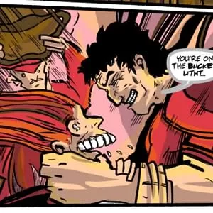
The art in this is not good, it is all made by one person and this is one of those instances where a bit more knowledge of the medium would’ve made for a better comic overall. The character designs are good, sometimes, but other times you get 3 characters that all look the same and you’re not even sure of who you are looking at. Then you have really poor line work quality and equally poor color and shading techniques and well it’s grating, to say the least. Lettering is not good either. As comic creators, we must understand that lettering is an art form all by itself and just slapping text on a couple of word balloons does not make for good lettering. In this comic, some of the word balloons are just hard to read. They are either too small or the text itself is too close together which makes for many of the letters to be unreadable. In many of the cases, they opted for big establishing shots and tiny word balloons that simply do not work and make the reading experience a very bad one, often having to almost kiss my computer screen just to read the text. Reading this physically will not be fun, and will have you reaching for a magnifying glass. They also forgot to clean up some of the white borders around the pages and you can see forgotten sketch lines and blocks of grey that were used on an overlay layer to shade the art. Which results in a very amateurish attempt at comic making.
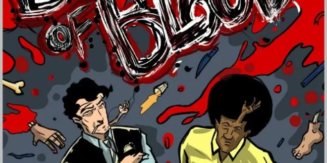
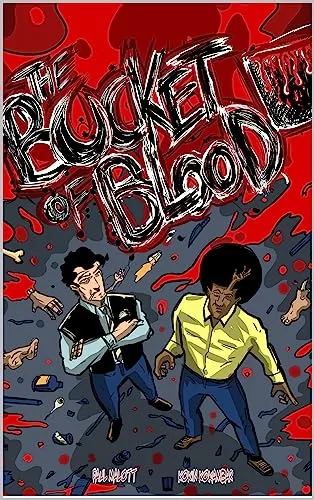
I’m going hard on this one, I know but perhaps it’s because when I saw the cover art I had high expectations for it. The cover art itself is pretty fun and has a wonderful composition with a pretty neat logo design and the characters look pretty interesting too. From the cover art alone, I knew I was going to be in for a wild and wacky ride in an equally wacky world but sadly the bad art and lettering make this almost unbearable to read. The writing itself is a bit of a mess as well, it reads like nonsense you might say after you bang your head against a wall several times. Sometimes you have moments of lucidity and things begin to make sense and look good, yet those moments are not enough to carry this book across to good territory. It features several fake ads that relate to the story and whilst that is a cool way to give extra lore to the world, I personally think that the ads are more thought out and better designed than the actual comic’s art, which makes for very jarring illustrations when contrasted to the inside artwork.
It’s not devoid of good things however, there are a few pretty good panels that are worth the look. For example in one of the panels, we see one of the characters with his guts out, and in this particular panel, I think the art style looks very good and actually mashes the bizarre nature of the story. They also did something pretty innovative that I’ve personally only seen done well in movies and that is representing a person coming in and out of consciousness during an operation. They created an eye-like clipping mask and blurred the elements that were inside this clipping mask and even blurred some of the text so that we felt like we were seeing directly from the pov of the wounded character, and I think this was a wonderful strategy and worked wonderfully in the story.
 In truth, it’s not the worse thing I’ve ever read but it comes close to it. I think the “hip” talk that the characters use gets old really fast, and it’s pretty cheesy in general. One or two panels of it could have worked but to have all your characters talk like that is just annoying. Then you have one of the characters using all sorts of technobabble that makes literally no sense at all and is just repeating famous words and names like “Schrodinger” and “quantum mechanical amplitude” in an effort to sound smart, and it just comes off as lazy writing and again, annoying. There is something here, I can see a bunch of friends coming together to make a comic in high school, and this being the result of it, but for an attempt at a professionally published comic, this is not a good one. However, I think the overall world has potential and if they fine-tune their skills and veer away from the lazy writing and amateur art style, this could be a really good story. It’ll probably take them a couple of issues to get this write, and at that point, they might consider doing a spin-off series inside the same world, but I do believe that if they stick with it they will be able to create something very interesting.
In short, this was not your best attempt, and you need to practice and work harder to truly make something awesome if that’s what you want to do. There are some really good compositions here and there that are worth a look, but overall keep working on your crafts, and don’t stop. I know a review like this can be hard to read, but trust me, as an artist myself, I know how hard it is to read this kind of stuff about something you probably spent months or years on, but take it as a point in the right direction. There is something here to be explored, but you need to work harder at your craft to be able to do justice to the stories that you have in your mind. I’m sorry for going so hard on this comic, but I hope it serves as constructive criticism and allows you to make an even better issue next time.
Writing: 3 Stars
Art: 2 Stars
Colors: 3 Stars
Overall: 3 Stars
Written by: Paul Malott & Josh Schiefer
Art by: Kokin Kokambar
Cover art by: Kokin Kokambar
Published by ABCDEFGHIJK Comics, Inc
Author Profile
Latest entries
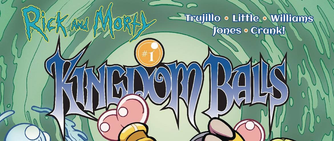
 Comic BooksApril 30, 2024REVIEW: Rick and Morty: Kingdom Balls #1
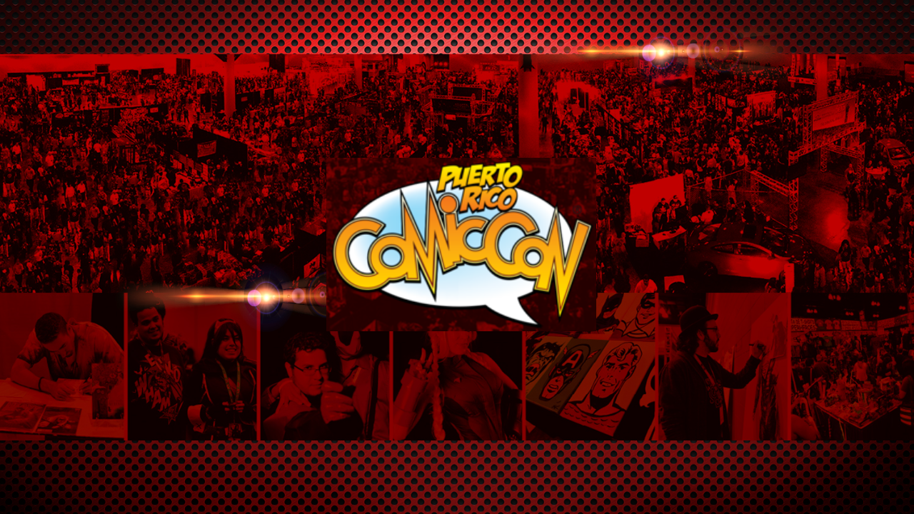
 ReviewsApril 30, 2024PRCC2024 Recap: Fans from all over the world join together in Puerto Rico to celebrate all things comics, anime and videogame
 Comic BooksMarch 30, 2024REVIEW: Monstress #50
 Comic BooksMarch 28, 2024REVIEW: Cemetery Kids Don’t Die #2