REVIEW: The Expanse: Dragon Tooth #3 (of 12)
 This is quite an exciting story. It’s been a little bit since I read a sci-fi comic and other than a few weird word-ballons and some uncanny valley in the faces, this was a fun read for me. The overall story in this issue revolves around a secret project called “Dragon Tooth” and a prisoner that knows these secrets. He is confronted by what looks like a governess or a high captain of some sort, that part wasn’t obvious, but being issue 3 it makes sense that this character was introduced before in the other issues and I don’t know who she is. Regardless of it, they have a discussion inside the prison cell and after some quick bargaining, the prisoner seems to be willing to negotiate. I honestly love how they handled the bargaining scene and the way they introduced the character they were bargaining for was very nice. I wasn’t expecting it and even not reading the first two issues I instantly realized that the prisoner would do it because this guy is very important to him, and that all goes to the writing. I think this book is written quite well by Andy Diggle and it makes up for a lot of the standard art.
I’m not exactly saying it’s bad art, because it’s not bad art. It’s just very simple for my taste. The action scenes are a little too stiff and the overall look of the book is rather trying to be realistic but not really getting there, so instead we are left with a mostly uncanny valley look. I don’t particularly enjoy it. I think my favorite bit of art in this was the hairstyle one of the character has which gives her a lot of character, I think she has the best design out of all the characters, and the second part was how they handled blood in space. Having it coagulate into floating orbs was weird on the first panel I saw it, but then I realized they were in space with no gravity and that kind of makes sense and it looks pretty unique and cool. I guess my biggest gripe with the character designs is that there’s no real variety between the characters. Everyone pretty much has the same height and the same body type, and even though we have a good mix of genders, the designs are just kinda boring overall.
The coloring however is very nice, and I love the use of rim lighting to showcase that the characters are inside a spaceship. The mix of darkness with blue and red lights feels very “techy” and I love that. The writing though carries the bulk of the weight of this story. It’s fast-paced, easy to understand and it keeps the techno-babble to a minimum, and I love that! It’s a space story but it’s not trying to cram that down your throat. Heck, it feels more like a “people that are in space” story than an actual space story. Kinda like how The Walking Dead is a story about people who are living through a zombie apocalypse rather than a zombie apocalypse story. I love it when the writing takes its time to develop complex relationships between the characters. I just wished the actual characters were nicer to look at.
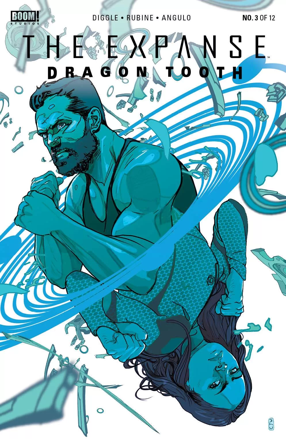
The cover art is also really good though, it doesn’t seem to have much connection with the actual pages inside, so far as it’s not showing an actual scene that happens in the book but I still think that Christian Ward came up with a very good composition and it does well to sell this book. So props to them on that. The lettering was good, although I did notice a couple of weird word balloons with bumps that looked awkward and didn’t naturally encapsulate the text but I think I counted like two or three so it’s not a huge deal. I really did like the sci-fi font they used for the establishing shots location texts, those were awesome. I wish I had seen more sfx text though. Maybe some beeps and bops from the ship, to give the reader a deeper experience of what being inside that ship would have been like but that’s about it.
If you’re into good sci-fi writing I’d pick this up. It’s also just 12 issues, so you’ll be getting a pretty good story that you won’t have to invest too much of your time into. If this was like a 300-issue book, I’d say skip it because after issue 20 if the character designs didn’t become more interesting and the action sequences more dynamic I’d get pretty bored of it. All in all, I enjoyed reading this.
Writing: 5 Stars
Art: 3.5 Stars
Colors: 5 Stars
Overall: 4 Stars
Writing by; Andy Diggle
Illustrated by; Rubine & David Cabeza
Coloring by; Raúl Angulo
Lettering by; Pat Brosseau
Cover art by; Christian Ward
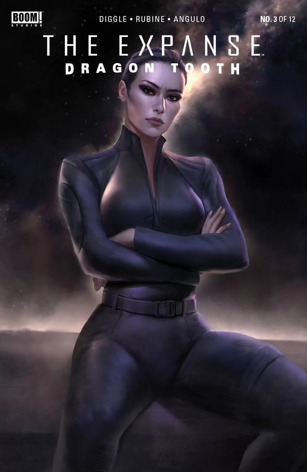
Variant Covers by; Justine Florentino, Junggeun Yoon & Jamie Mckelvie
Published by Boom Studios
Author Profile
Latest entries

 Comic BooksMarch 30, 2024REVIEW: Monstress #50
 Comic BooksMarch 28, 2024REVIEW: Cemetery Kids Don’t Die #2
 Comic BooksMarch 27, 2024REVIEW: Forgotten Runes #3 (of 10)
 Comic BooksMarch 6, 2024REVIEW: Sam and Twich- Case Files #1