Review: Time Before Time #27
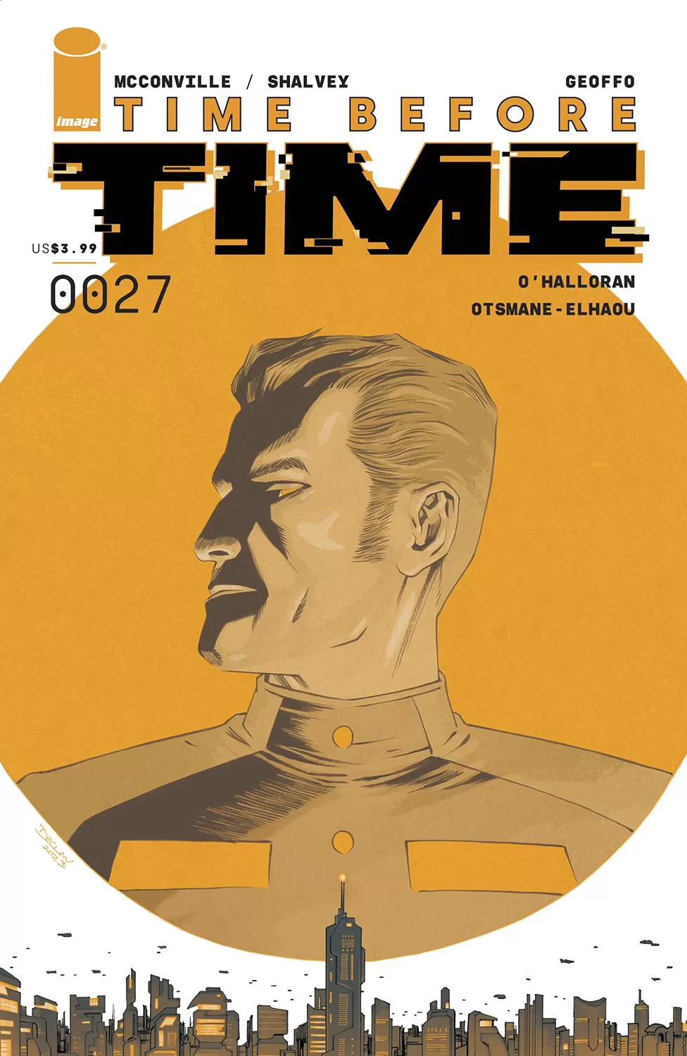 Robots, spaceships, and time travel equates to the perfect mix of sci-fi. This issue of Time Before Time has us follow robot man Kevin as he purchases a spaceship and tries his best to reconnect and hopefully help his friend Nadie Wells from being captured by the Syndicate. The art in this comic is fantastic, the textures, the lettering, the color, the character designs, the story, all of it is simply wonderful.
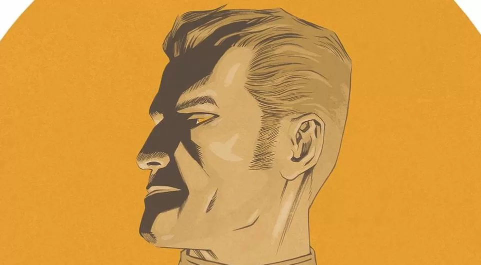
Right from the first page, we are met by a robot character with a rectangular head blue eyes, and a metallic ton of personality. His name is Kevin and even though he cares deeply about his friend Nadia Wells, they aren’t really on speaking terms at the moment. However, he knows that she’s hell-bent on taking down an evil organization known as The Syndicate. Kevin realises that if she goes at it alone, there is no way she will be coming back. Between Nadia and Kevin’s design, I was already happy; but then you look at the world they inhabit, you quickly realise that this is gonna be a wild ride filled to the brim with awesome designs. From the cool spaceships to the rest of the cast, the French comic book and webcomic artist Geoffo is a powerhouse of shape language. Geoffo’s wonderful use of lines, uniquely specific shapes, and texturing techniques help to populate the world of Time Before Time with incredibly interesting characters, props, and environments. I am enamoured with the awesome spaceship that Kevin has purchased; it looks like a spider mixed with a giant orb and I’m all here for it. Speaking of things I am all for, I love the design of Nadia Wells when she is trying to sneak into the Syndicate’s factory. She looks like Kylo Ren had a baby with Doctor Doom and then put that baby on a long trench coat and gave him a cool futuristic gun. It’s just awesome!
In fact, this book is filled with awesome things; the backgrounds are fantastic and Geoffo uses some really cool perspectives for some of the full-page illustrations that gives a feeling very similar to the emotion the character is experiencing. For example, there is one page where Nadia Wells has been surrounded and we are treated to a top-down view of the warehouse she is being trapped in; he way the composition is handled she is square in the middle of the page, and everywhere around her is either a huge rectangular box object covered in a tarp or literal enemies with huge guns waiting to move in and grab her. It’s crazy good. The palette of overall muted browns, blues, and greys that Chris O’Halloran has chosen works perfectly for the factory scene because it’s filled with action and when you place a muted color against a bright and vibrant yellow or red, the resulting effect is one of excitement and action which simply fits perfectly.
As this is a time travel story, there is a chance that you can get confused about where or rather when the characters are and what is going on during that time. However, this book fixes that issue rather quickly by preluding each time job with a huge horizontal panel that serves as both the establishing shot as well as giving you the exact year that these events are happening. This makes it very easy for us the readers to know what is going on, and not be too distracted by the sudden time jumps in the story. Another great thing that is done to keep this confusion to a minimum is to pick very specific color schemes for each time jump. For example, the year 2144, is filled with blues, greys, yellows, and a bit of orange and greens. Whereas year 3003, on the side of Kevin and space ship shop, it’s all pinks and light purples. Then you have 3003 inside the purchased spaceship which is all really light blues, and a bit of yellow and orange here and there. All in all, it just works really well to let you know where you are and when you are.
Another wonderful aspect of this book is the lettering. It’s just incredible. Hassan Otsmane-Elhaou really went crazy on this one, with a huge variety of hand-drawn word balloons, of all shapes and sizes. Really awesome sound FX’s that are all hand drawn fit the style of the artwork perfectly, we even get a couple of different fonts for the different characters. I am very much at awe with some of the sound FX’s, they are simply so cool and unique. Even sound FX’s that have the same onomatopeic wording, are still made to look different and not like a word that has been copy-pasted. Kevin himself has a very distinct font that reminds us that this guy is a robot and we should not forget about that. I think this is some of the best lettering work I’ve seen in a while. It’s really great!
The story itself is very interesting as well, but at # 27 I can’t help but feel a little out of the loop. Still, I am excited to go back and read more of this comic because even at this relatively late stage each character seems very interesting and there is no doubt in my mind that each one has a very special and interesting backstory worth looking into. Grab this issue as soon as you can!
Writing: 5 Stars
Art: 5 Stars
Colors: 5 Stars
Overall: 5 Stars
Written by: Rory McConville & Declan Shalvey
Art by: Geoffo
Coloring by: Chris O’Halloran
Lettering by: Hassan Otsmane-Elhaou
Cover art by: Declan Shalvey
Variant Covers by; Malachi Ward
Published by Image Comics
Author Profile
Latest entries

 Comic BooksMarch 30, 2024REVIEW: Monstress #50
 Comic BooksMarch 28, 2024REVIEW: Cemetery Kids Don’t Die #2
 Comic BooksMarch 27, 2024REVIEW: Forgotten Runes #3 (of 10)
 Comic BooksMarch 6, 2024REVIEW: Sam and Twich- Case Files #1


