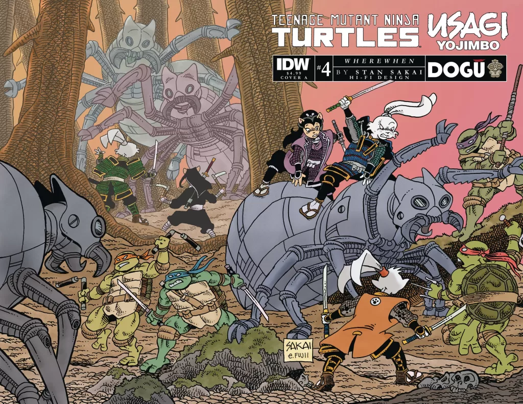
REVIEW: TMNT & Usagi Yojimbo WhereWhen #4
 Stan Sakai is no doubt a master of comic art. Starting way back in the 80’s and first publishing Usagi Yojimbo in 1984 who would’ve ever known that a story about a samurai rabbit set in feudal Japan would both garner such critical acclaim as well as stand the tests of time all the way to this day. Over 40 years later Sakai is still writing amazing stories within the world of Usagi Yojimbo and this series is just as good as all the previous ones before it. It follows not only the samurai rabbit man himself but also our favorite blade-wielding warriors, the Teenage Mutant Ninja Turtles as they fight their way through hordes of robot ants, monsters, and mecha-dragons in feudal Japan.
I myself am a huge fan of Usagi Yojimbo, always have been, and will forever remain so. Perhaps it is because I connect with the fact that most of the work on these books is all a direct product of the hand of one artist, and the trials of solo comic creators are ones that resonate with me. Perhaps it’s the beautifully composed panels or the simple and beautiful action sequences. It could be the wonderfully textured world of feudal Japan brought to life through the brushwork of Stan Sakai or the wonderfully pleasing character designs of Sakai. Whatever the reason, I simply can’t get enough of it. This issue feels refreshing even though Sakai has been making comics for well over 40 years, it feels modern and highly enjoyable. There’s something magnificent about the beautiful scenes that Sakai is able to pen down on paper, the establishing shots, the little background details, and the period-friendly architecture really transports you to a time when Japan was filled with magic and mystery. I love every second of it.
I love the way Sakai is able to create these beautifully complex and detailed backgrounds filled to the brim with cross-hatching texture and then overlay equally unique characters on top of these backgrounds and still be able to make them pop. The balance between overly detailed and big simple shapes makes for a contrasting image that is easy to read and just as easy to enjoy and understand. However do not be fooled by simple character designs, Stan is still able to create dynamic action sequences filled with real emotion, strength, and even peril for our heroes. In this issue, I particularly enjoyed the battle with the Mecha dragon because of all the awesome poses and facial expressions we get to see from the TMNT squad and from Usagi Yojimbo himself. Whilst most of the pages follow the standard white background black panel structure we’ve grown to know and love over the years it is still nice to see Stan break these shapes up with the use of word balloons and items that fall outside the panels.
Speaking of word balloons, this issue is also lettered by Stan Sakai themselves, which is a wonderful thing because it makes the text 100% part of the art, and it looks great. I did notice two very interesting things that Stan does; the first one is that whenever there’s a sound fx on the panel, it will have its own tailless word balloon. I suspect this is because due to the complexity of detail in the backgrounds, having a free-floating sound fx test would be hard to read and thus they put that word balloon on there to help the text be more readable. It works well, and it breaks away from what we are accustomed to seeing in many other comics. The second thing I noticed is that the word balloons are all hand made, no word balloon is the same, and whilst that is a great thing I personally think that a couple of word balloons here and there could have benefitted from a second pass at the brush to really tie them together. It’s nothing too major because of the overall style of the comic, but whenever a word balloon has an out-of-place line or doesn’t close quite well you can definitely notice it.
Even 40 years later the coloring on this comic still manages to feel like the original issues and I have to love that. I am sure they were colored digitally but I still love how it feels like a watercolor painting overlaid with black micron pen line art. It’s nostalgic but modern at the same time. I do wonder if Stan is actually using traditional techniques to ink these or if they went full digital a couple of years back with the advent rise of graphic tablets and art software. I loved reading this comic very much and I look forward to reading even more from this series. It is a true delight for me to know that Stan Sakai and Usagi Yojimbo are still being published and new stories are happening so many years into the future. This is one of those books that has no ending because the characters are so fleshed-out and so iconic that you can literally take them into any time period and make a great story out of them. There’s even a space Usagi Yojimbo story, and a time-traveling one too. There is no shortage of material where our favorite samurai rabbit can be in and I am very excited to see this comic continue growing and being published. Speaking of growing, you can definitely see how Stan’s artistry has continued to grow over the years and how with each passing year he grows ever more masterful at drawing these characters. At this point, it feels like every line is deliberate and there’s literally not a single extra line on the designs that does not need to be there. When your level of artistry gets to the point where you can convey true emotions with just a couple of lines I think you’ve reached the pinnacle of artistic mastery.
Writing: 5 Stars
Art: 5 Stars
Colors: 5 Stars
Overall: 5 Stars
Story, Art & Lettering; Stan Sakai
Coloring by; Hi-Fi Design
Cover art by; Stan Sakai & Emi Fujii
Variant Cover by; Kevin Eastman, Peter Laird, Steve Lavigne, Alan Quah, Sarah Myer & David Petersen
Published by IDW
Author Profile
Latest entries

 Comic BooksMarch 30, 2024REVIEW: Monstress #50
 Comic BooksMarch 28, 2024REVIEW: Cemetery Kids Don’t Die #2
 Comic BooksMarch 27, 2024REVIEW: Forgotten Runes #3 (of 10)
 Comic BooksMarch 6, 2024REVIEW: Sam and Twich- Case Files #1


