
REVIEW: Untold Tales of I Hate Fairyland #4 (of 5)
 Untold Tales of I Hate Fairyland takes us back to the IHF universe to deliver stories by artists that are not Skottie Young but use the world created by Skottie along with some of its characters to deliver new tales on the series. It is filled with creativity, beautiful art, fantastic lettering, and coloring and quite honestly the only downside of this issue is that there are only 2 stories in it.
As you might know by now, I am a huge IHF and Skottie Young fan; I am also a self-proclaimed lettering student of the works of Nate Piekos, so reading this is a no-brainer. Despite being a huge fan of the original I Hate Fairyland series, I hadn’t heard of this particular spin-off into the franchise and yet it makes so much sense considering that the IHF world is filled with truly fantastic characters, side stories and delightful designs that having other artists take a crack at the world is quite literally a slam dunk. This issue gives us two stories, one about a fighter and a princess that have to go against the horribly murderous Gertrude, and another story in which we see a variant of Gertrude, a caveman version called Grrt; go up against the lord of death. Both stories are beautifully illustrated and colored, and the second story is a little bit more action-heavy than the first and maybe double its size. I personally enjoyed the first story a little more than the second.
In the first story; Arcade Love Song, we are shown the fighter “Glam Bam” training to battle as the champion of a princess. The art style in this story is done in what looks like watercolors and it is quite beautiful, it reminds me of the backgrounds in the show Steven Universe. The story itself is very dramatic, and it climaxes in Glam Bam after all his arduous training being knocked out by Gertrude in a single blow. This of course does not sit well with the princess who swears to defeat Gertrude in honor of the fallen glamrock-styled fighter. I think the reason I like this story more than the second one is because it manages to deliver a deeply emotional connection between the princess and the fighter in very few pages. The innovative panel layouts, along with the rose-tinted flashback scenes give a feeling of love that is crushed with the mighty force of Gertrude’s punch, and it leaves us feeling rather sad at the fall and demise of Glam Bam.
This however does not mean that the second story; Fairyland Before Time, isn’t good. Quite the contrary this story is very good indeed. However, it is good in a different way. It is good at delivering action, truly crazy background art, and character designs that are out of this world. Grrt, the variant cave-woman version of Gertrude looks voracious and quite animalistic with her bone-kept green hair, her ferocious teeth, and her bulky body. Then you have the Lord of Death themselves who is not only really cool looking but is sporting some gnarly nips to match his just as gnarly skull head. Even the dragon looks awesome in this one. Overall the art of this story is miles and miles beyond what you would see in a lot of comics nowadays, it is crazy good. It is filled to the brim with blood, violence, crazy perspective, and masterful inking and coloring. Stylistically this is fantastic. The writing itself is very good as well, however, it doesn’t grab me as emotionally as the first story does and whilst it tries to get you at the end with the dragon tearing the fabric of time/space with his sadness it felt like too little too late. That being said, I don’t think that it is fair to compare these two stories on the merits of whether they grab you emotionally or not, I think that both of these stories shine in their own way. Whilst the first story was heavy with emotion, the amount of backstory, the character designs, the underlying lore, and the beautiful art of the second story makes me feel like I would very much like to read a full series of comics created by artist Jorge Corona and coloring Sarah Stern, based around these characters they’ve adopted.
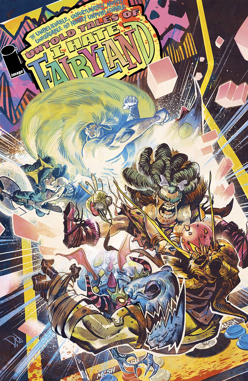
It would not be an I Hate Fairyland review without a mention of the masterful lettering of Nate Piekos. As always, Nate gives us wonderful font choices, perfectly created word balloons, fantastic narration boxes, and super sound fx design. There is no book that this man has done that has bad lettering because his attention to detail and commitment to the craft of lettering simply do not allow him to make a bad word balloon. In truth, there is only one major issue with this book, and that is that there are only 2 stories in it. I am a huge proponent of the rules of 3 and I think this book would have done even better had it ended with 3 stories by 3 different artists instead of 2. Of course, I understand that it would have made the book a little longer than your standard 32-page comic book, but reading two stories left me wanting more. Perhaps this is not a bad thing, however, as I now I must satisfy this yearning for another story in the IHF world and will very likely be looking forward to the next installment, so maybe it was all planned out in advance. Before we sign off, we have to talk a little about the cover art. Created by Mike del Mundo; this cover art is beautiful in many ways. It not only manages to capture the craziness of the IHF world but also does a wonderful job of combining both stories into a beautiful full-page image that gives you not only the basic gist of both stories but also gives you a glimpse into the art styles you will find inside. It is quite amazing how Mike del Mundo captures the essence of both inside stories in one beautiful illustration, al the way down to the “Arcade” motif.
Writing: 5 Stars
Art: 5 Stars
Colors: 5 Stars
Overall: 4.5 Stars
Created by: Skottie Young
Stories by: Morgan Beem, Jorge Corona
Coloring by: Sarah Stern
Lettering by: Nate Piekos
Cover art by: Mike del Mundo
Published by Image Comics
Author Profile
Latest entries

 Comic BooksMarch 30, 2024REVIEW: Monstress #50
 Comic BooksMarch 28, 2024REVIEW: Cemetery Kids Don’t Die #2
 Comic BooksMarch 27, 2024REVIEW: Forgotten Runes #3 (of 10)
 Comic BooksMarch 6, 2024REVIEW: Sam and Twich- Case Files #1


