REVIEW: Weird Work #1 (of 4)
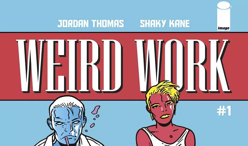
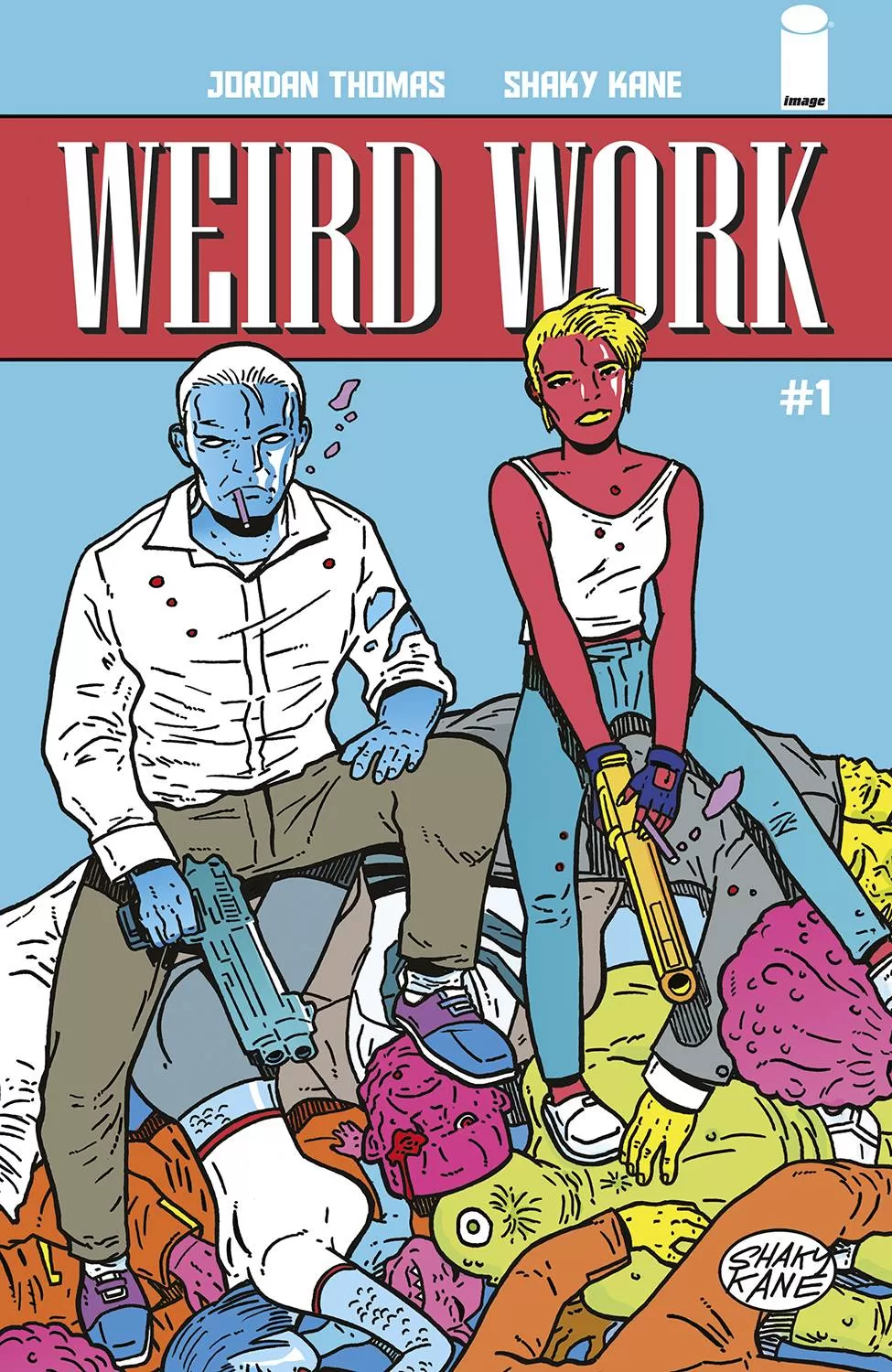 If you’ve ever wanted to read an Adult Swim tv show, this is probably as close as you’re gonna get. Weird Work is a detective story set in a different world filled with all sorts of alien species. Although I’m sure in their world we would be the aliens, the character designs are crazy fun! From pig-headed politicians to insect singers and literally blue-neck detectives, this comic has all sorts of cool characters. I am a huge fan of this kind of stuff, it’s weird and it embraces it everywhere it can. The story itself is very interesting right from the get-go and sets up a very fun-filled adventure for the reader right from page one, which is great with this being issue one of a longer story. A very wise person once told me, “Start and End Strong” and this follows that idiom very well. I am a fan of this world, it is fun, and it feels very adult swimmy, in its writing and joke delivery, so think of this like an adult cartoon show. Speaking of which I could definitely see this comic having an animated version someday, the character designs would translate very well to animation.
I’m not particularly a huge fan of the colors, even though I understand what they are going for with the flat coloring, I think the colors are a little too saturated and at least on the screen (which is where I read new comics) it hurts my eyes a little, I’m using gamer glasses and it still feels hard on the eyes. It does help to further push the adult cartoon aesthetic but perhaps it’s something that could just as well be toned down a little and nothing would have really changed of it. The art is honestly very fun, and sometimes it borders on grotesque which makes for a wonderfully contrasting experience to the more serious tone of the detective story. I have to agree with their choice though, it makes this story pop at you at 100 miles per hour. The lettering on this is also really good, like really freaking good. Letter Squids did an amazing job with sound fxs, exaggeration text, and word balloons. The font choice for the dialogue is also very good, the only places I didn’t like the choice too much was during the beginning narration boxes. I think those couple of pages the font was a little too close to each other and sometimes the s’s would look like e’s and vice versa, which made me have to read a couple of narration boxes more times than I would’ve liked.
This story also has the aesthetic of a really good webcomic, which as a proud reader of webcomics I enjoy greatly. This type of stuff really catches my attention because first off, it looks very fun and easy to read; and second off, there is literally something of value happening on every page. This is something that webcomics do very well because many times you get to read them one page a week, so something fun HAS to happen on every page. Whether it’s a box falling on top of a background character, or a super satisfying panel of a glove being put on, you’re turning pages like a desperate addict yearning for their next fix. I have to take a turn back to the lettering because this comic does sound fxs so well! From simple emphasis text right inside the word balloons to the actual extra sounds the city makes, it’s filled to the brim with creative textual choices. Those Squids really do know what they are doing and I appreciate it greatly.
The writing is fun, it’s not joke heavy, which is interesting because based on its art style you would think it to be a wacky sort of story, but it still has its funny moments. I would actually say that it has more visual gags than actually written jokes, and that’s awesome because, at the end of the day, comics are a heavily visual medium, so using the background characters to tell a joke or two and tie that all back to the main narrative is very endearing as well as innovative. This is a very pleasurable read and my only issue with it was the saturation of the colors, other than that this is a must-read for pretty much anyone. I’m excited to read the full thing because the characters too are so interesting and unique that you want to learn more about them. In just a couple of pages, you are immediately rooting for the down on its lucky washed-up detective with space Parkinson’s. It’s some really powerful storytelling dressed in a very colorful and weird outfit. I dig it. I also really like what they did with the summary of the story, having it on the back cover is such a smart move. Sure, novels and other books have been doing that for ages but comic books usually never have an excerpt in the back but that’s such a better choice than having a “what’s happened so far…” page. If my voice matters at all in the world of comics, I vote for more books that have this sort of information in the back. I literally do not care to read a page of exposition when I open your comic book, just let me read comics! Oh also, the credit page looks really fun. They designed it in such a clean way, they even managed to throw in a full body of the main detective character and I love that a lot. So what are you waiting for? Go get this comic today, I think you’re gonna enjoy it a lot. Do let me know if the colors look better on print, that’s something I will be wondering for a while.
Writing: 5 Stars
Art: 5 Stars
Colors: 4 Stars
Overall: 5 Stars
Written by; Jordan Thomas
Art by; Shaky Kane
Lettering by; Letter Squids
Cover art by; Shaky Kane
Variant Covers by; Michael Allred, Laura Allred, Javier Rodriguez, Geof Darrow & Jason Wordie
Published by Image Comics
Author Profile
Latest entries

 Comic BooksMarch 30, 2024REVIEW: Monstress #50
 Comic BooksMarch 28, 2024REVIEW: Cemetery Kids Don’t Die #2
 Comic BooksMarch 27, 2024REVIEW: Forgotten Runes #3 (of 10)
 Comic BooksMarch 6, 2024REVIEW: Sam and Twich- Case Files #1


