REVIEW: X-Men Red #15
 I have no idea what happened to the X-men after the last couple of movies came out, but dang, I like what I see in this new X-Men Red issue. First and foremost I am not at all caught up with the lore of the X-men much less what’s going on in this series, so I can’t truly speak directly to the story or how it’s unfolding in this, issue #15, however, I can talk to the fantastic art direction, the wonderful character designs, the incredible pacing and narrative structure, and the wonderful colors.
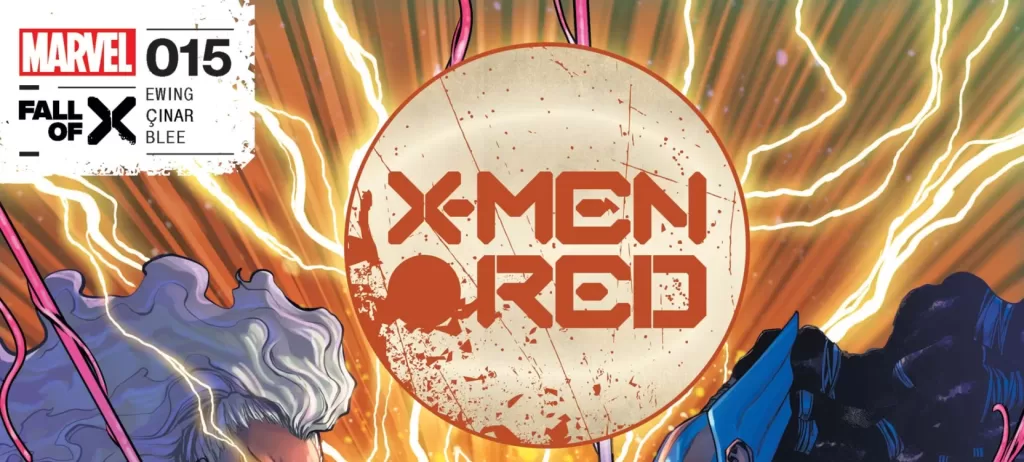
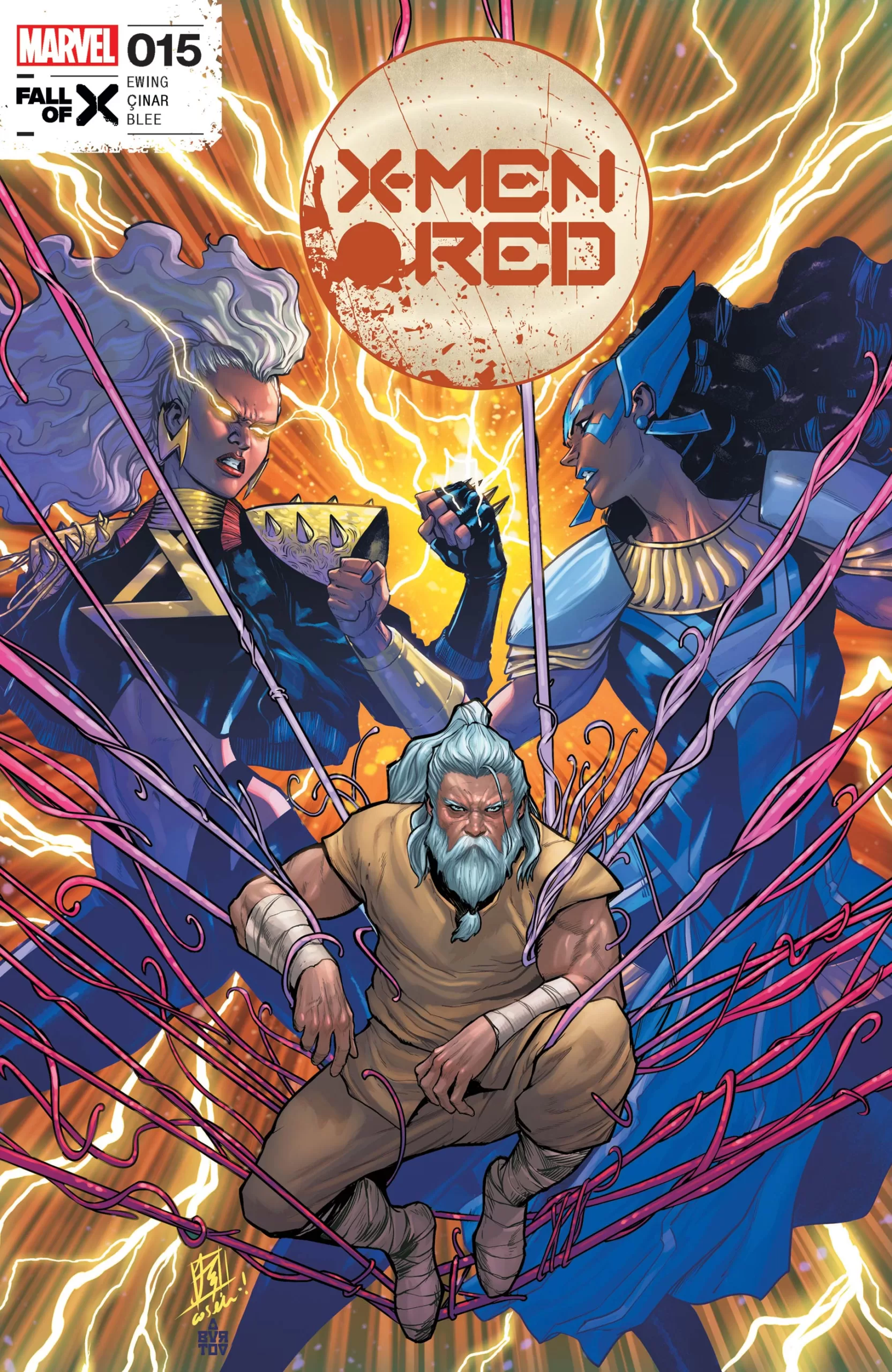
We start this issue with a beautiful cover by artists Stefano Caselli and Jesus Aburtov and as soon as we open to the first page we are launched into a vision of grotesque magnificence. In it we see a mutant creature with a huge visible brain covered in mouths and chained to a wall, this creature is being fed by a 6-year-old boy who will be the narrator for the rest of the story, his name is Fisher King. After we’ve seen this memory we come back to the present world to see that some mutants are in the middle of a war with another group of mutants. The “good guys” are led by the one and only Ororo Munroe, aka Storm. Right from the get-go, huge props have to be given to artist Yildiray Cinar for their beautiful design choices, they are able to create some truly compelling character designs even with Storm’s quite established aesthetic they are not holding back and are pushing the boundaries, and creating characters that simply look awesome! This issue is filled to the brim with interesting characters, from the adult worm-ridden body of Fisher King to the blue, brown, and pink demons, goblins, and djinns, all the way to two-headed centaur Lycans and humanoid axolotls, it is truly a world of unbounded creativity and I love all of it. Whenever I see inventive characters like these, I can’t help but be filled with excitement and glee imagining all the possible stories these characters are living in their own lives. Just consider the life of a humanoid axolotl, do they have a family? Do they eat regular food? Would they like caviar or would they be outraged by such a thing? Personally great character design is a huge win in my book, and when all the characters look awesome even NPC’s you know that you have the making of a great comic in your hands.
Now pair these creative character designs with equally creative and wonderful coloring and you have something truly amazing. Even though this book is essentially a war story between two enemy factions of mutants it is not at all a muddy or dark book. The colors are bright as ever and it work wonderfully well with the huge amount of characters in the story. From green beings to yellow beings to kaiju fish monsters, everything looks bright and awesome through and through. There is also a huge use of a yellow and orange palette that is carried throughout the whole book and ties the huge plethora of colors together very well. This yellow-orange palette does a wonderful contrast against the blue water upon which this war is being fought. One small upsetting note for me was the page that tried to explain the “New History of Arakko”. I honestly did not care for it, not because it was badly written, but simply because it felt out of place. For me, if I sit down to read comics I want every important piece of the story to be shown to me with visuals, and every piece of text inside a word balloon or narrator box, I have very little interest in reading a full page of text with no drawings, for that I would read a novel. On top of that, you have a calligraphic font that whilst looking very pretty is almost unreadable when it’s bold and it just makes for a truly weird page that personally could have been delivered in a different way, it even cuts the story right in the middle of the action.
Speaking of text and letters, we should talk a little bit about lettering for this book. It’s good, but it’s not great. It’s not well, it’s not interesting. The rest of the illustrations are truly beautiful and the colors, characters, and backgrounds are simply magnificent and then you have word balloons that feel like stickers on top of the art. No texturing on the word balloon outlines, very little change overall (other than a couple of different color narration boxes and some bold text), and basically no Sfxs at all. Sometimes I can understand why you would choose to not have any sound fxs for a comic book, especially in really serious stories, because there is a tendency to see sound fxs as gimmicky or “too cartoony” but I don’t know, I think there were some key moments on this book that would have been amplified by more creative lettering choices. I also think that sound fx allows you to hear the comic instead of simply hearing it, and that helps a lot with the immersion of the story because suddenly these aren’t just words on a piece of paper with pretty pictures, suddenly everything comes alive and you are now peering into a new world filled with unique beings, unique sounds, visuals and sometimes (through descriptive imagery and writing) even unique smells.
This all being said, however, the lettering works and whilst it’s not the most creative lettering, it does get the story across and the story is very good. It also doesn’t clash too much with the beautiful illustrations so the experience of reading this book is still very satisfying. I highly recommend you take a look at this issue, and if you’re a character designer there are definitely some really cool choices being made here that could inspire your designs too.
Writing: 5 Stars
Art: 4.5 Stars
Colors: 5 Stars
Overall: 4.5 Stars
Written by: Al Ewing
Art by: Yildiray Cinar
Colors by: Federico Blee
Lettering by: VC’s Ariana Maher
Cover art by: Stefano Caselli & Jesus Aburtov
Varian Covers by: Nicoletta Baldari & Jeff Dekal
Published by Marvel Comics
Author Profile
Latest entries

 Comic BooksMarch 30, 2024REVIEW: Monstress #50
 Comic BooksMarch 28, 2024REVIEW: Cemetery Kids Don’t Die #2
 Comic BooksMarch 27, 2024REVIEW: Forgotten Runes #3 (of 10)
 Comic BooksMarch 6, 2024REVIEW: Sam and Twich- Case Files #1


