Advance Review: Jane Foster & The Mighty Thor #1 (of 5) (Lgy #20)
 Synergy is a dangerous word, especially around comic book properties; especially when there is a movie due out. Synergy, at the billy basic level, means that two things work together in unison towards a common goal. In the comic book world, synergy means forgetting one of the best eulogies ever written to a very emotional story in order to tie-in to a movie!
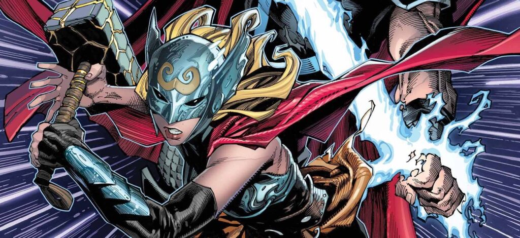
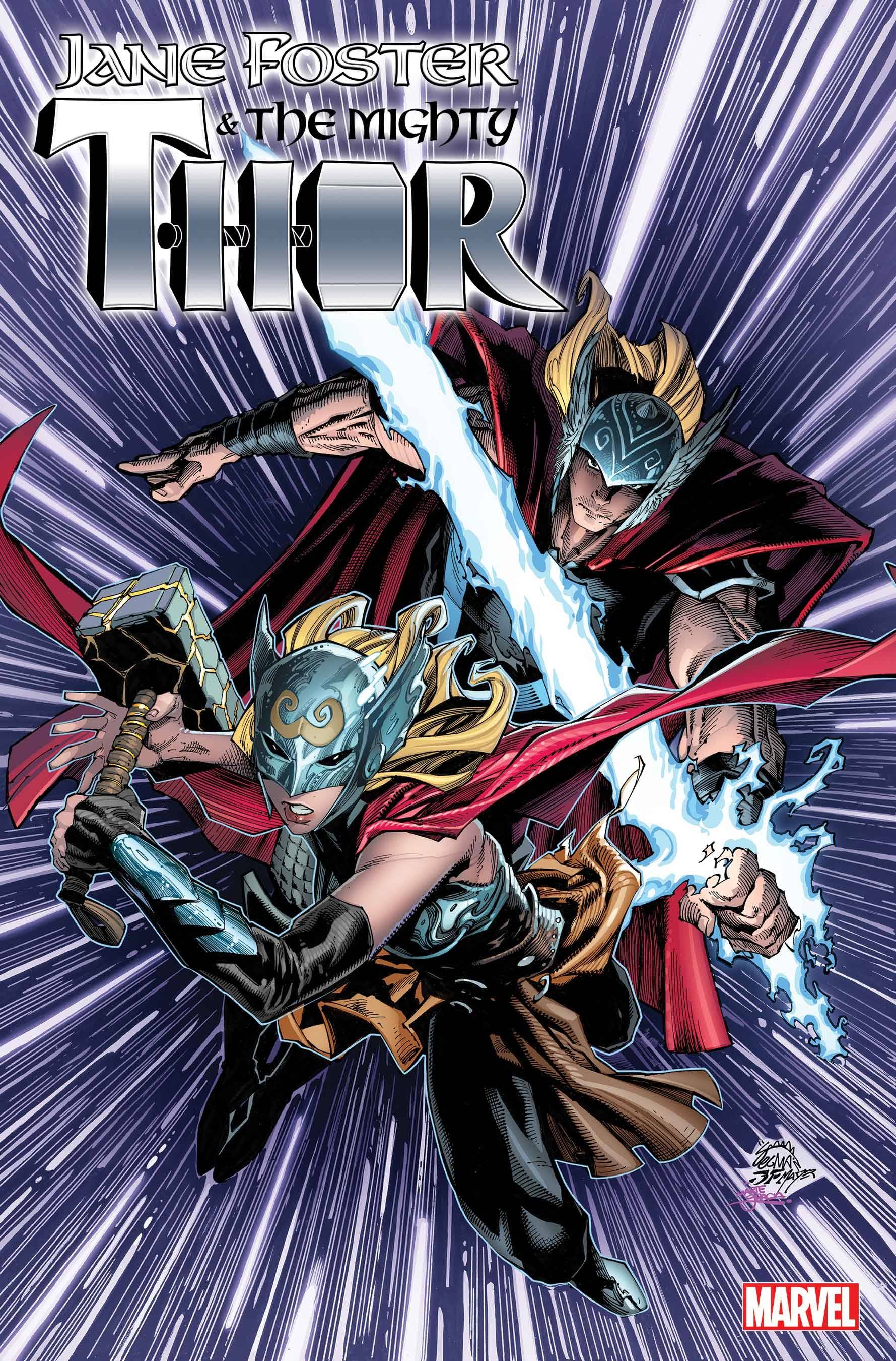
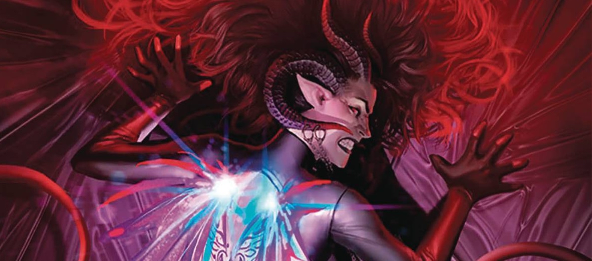
Jane Foster has a life, both as Jane and as Valkyrie. With her powers that are linked to death and a persons final journey, she is formidable to say the least. But as Asgards enemies plot its downfall, in part by capturing King Thor, she has a startling reunion; the mystic hammer Mjolnir returns to her that is worthy. Now armed with her power and that of the Mighty Thor she is ready to heed Asgard’s battle cry!
Writer Torunn Grønbekk displays a nice touch in setting this first issue up. We get to see the plot unfurl, Jane in action, a host of villains and Asgardians. There is the usual need for humour that Marvel seemingly insist on, which isn’t that funny; talking animals work better in the Strange book. Grønbekk writes a Jane who is content with her place in her own life. That is until the hammer brings back the wondrous powers of Thor. Now, bearing in mind the impact of such a power had on her the first time; will this aspect be brought back? I am not sure. I don’t ever seem to remember Don Blake suffering from cancer from wielding the power of a god. With only five issues to play with Grønbekk will need to get a move on, pace wise. It seems that Jane’s focus will be finding Thor Odinson, which means that the battle for Asgard may end up being nothing more than a distraction.
Michael Dowling’s art is a bit of a mixed bag. At times he provides what you could consider straight up lines, and on others, he delivers a photo style of art as if using images of people as inspiration. The impact is that at times the book doesn’t know what it wants to look like. Dowling also uses a less is more approach to faces which can leave everyone looking a tad wooden. There is also an odd aspect to some body poses. Colors are supplied by Jesus Arbutov who goes for depth of colors which gives the book a deep and rich feel that suits the otherworldly aspects of the Nine Realms. VC”s Joe Sabino gets to have fun with different fonts, some which you would expect given it is a Thor book.
I am at a bit of loss with this book. The first Lady Thor book was a masterpiece; going back to having Jane as Thor again feels like a backward step for her character. Throw in the fact that this book has a legacy number, serves to show that any character is classed as legacy. The book will garner a lot of attention due to the movie, I think I would have preferred to have the original run reprinted in a hard case collection.
Writing – 3 Stars
Art – 3 Stars
Colors – 4 Stars
Overall – 3 Stars
Written by; Torunn Grønbekk
Art by; Michael Dowling
Colors by; Jesus Arbutov
Letters by; VC’s Joe Sabino
Published by; Marvel Worldwide Inc.
Author Profile
- I am a long time comic book fan, being first introduced to Batman in the mid to late 70's. This led to a appreciation of classic artists like Neal Adams and Jim Aparo. Moving through the decades that followed, I have a working knowledge of a huge raft of characters with a fondness for old school characters like JSA and The Shadow
Currently reading a slew of Bat Books, enjoying a mini Marvel revival, and the host of The Definative Crusade and Outside the Panels whilst also appearing on No-Prize Podcast on the Undercover Capes Podcast Network
Latest entries
 Comic BooksMay 8, 2024Review: Fine Print TP Vol #2
 Advance ReviewApril 30, 2024Advance Review: Space Ghost #1
 Comic BooksApril 19, 2024Review: Jill and the Killers #4
 Comic BooksApril 11, 2024Review: Deadweights #1 (of 6)