Review: Deadweights #1 (of 6)
 Imagine when enough is enough; be it your day job, a hobby or what used to be a passion. What would you do? Walk away? Struggle through it? Give up and try something else? When it comes to a couple of villains, how can they take a step back into the real world when all they are faced with is the distrust, impacts and ramifications caused by their actions? Are we really all only as good as our last bad decision?
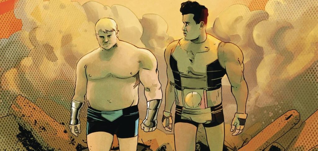
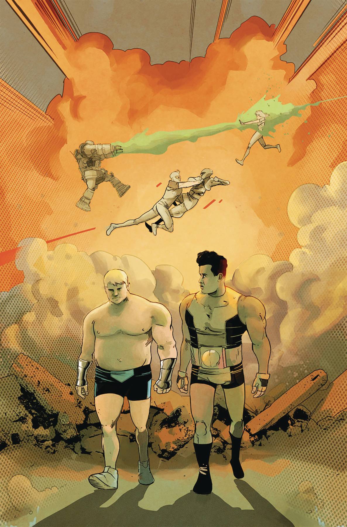
When yet another villainous plot goes awry, a group of bad guys start laying the blame. When Cannonbulk becomes the main culprit of their culminate failure, Bounders resounding “it’s him or us” becomes “it is you both”, the pair need to deal a life more ordinary. yet with a broken town and coloured, yet once correct, perceptions as barriers can the two ever step back and start over?
Writer / producer Tyrone Finch of Station 19 fame continues to mine the Ahoy Comics trend of deconstructing comic books, started with Wrong Earth, with a book that seems simple in idea yet quietly builds to complex level of tension. Emotional aspects are well covered from the outset with Bounder standing up for his friend, through the building of additional relationships, each fraught with with their own risks of hurt constantly in play. Throw in the realism that you can’t always go back home, Finch delivers a smouldering pot of what people want, contrasting in want people see, set against the backdrop of what people have done! Confused? In reality, you won’t be. Each twist and turn is well paced, like waves building to a crescendo.
The art and colors are provided by Sebastián Piriz in a kind of less is more style that intimates rather than directly shows. Angular at times, there can be offset body lines which adds in a consistently inconsistent manner, which for the feel of this book works really well. Think the odd shapes of the characters in The Incredibles and you will get the idea. Whilst the art may or may not be your cup of tea for a superhero book, the water color effect that Piriz creates are outstanding! I love the setting of the book, the rural browns and greens leading to the outskirts of a city, all work to challenge the readers perception. Its looks great, yet the writing is dark. This mish-mesh of contradictions work perfectly. Remember Dancing in the Dark by Bruce Springsteen is not a happy song! Letterer Rob Steen gets to have fun with the font and word balloons. There is humour on show, Steen does well keeping the flow of the conversation out of the way of the art.
I looked at this book a couple of times before choosing to put, erm, digital pen to digital paper. Ahoy books look to mess with your idea of the world. It is great to see that this modus operandi is still in full swing.
Writing – 5 Stars
Art – 4 Stars
Colors – 5 Stars
Overall – 4. 5 Stars
Written by; Tyrone Finch
Art & Colors; Sebastián Piriz
Letters by; Rob Steen
Published by; Ahoy Comics
Author Profile
- I am a long time comic book fan, being first introduced to Batman in the mid to late 70's. This led to a appreciation of classic artists like Neal Adams and Jim Aparo. Moving through the decades that followed, I have a working knowledge of a huge raft of characters with a fondness for old school characters like JSA and The Shadow
Currently reading a slew of Bat Books, enjoying a mini Marvel revival, and the host of The Definative Crusade and Outside the Panels whilst also appearing on No-Prize Podcast on the Undercover Capes Podcast Network
Latest entries
 Advance ReviewApril 30, 2024Advance Review: Space Ghost #1
 Comic BooksApril 19, 2024Review: Jill and the Killers #4
 Comic BooksApril 11, 2024Review: Deadweights #1 (of 6)
 Comic BooksApril 10, 2024Review: Jim Henson’s Labyrinth Archive Edition #1 (of 3)