Best Covers for the Week of 1/9/2019
Welcome to a new series where I look ahead to New Comic Book day to pick out my favorite covers of the week. Some things to consider with this is that my picks have nothing to do with speculation or what I believe my increase in value. This is simply based on the appreciation of the image itself. In addition for the sake of diversity if a comic had multiple covers I just picked my favorite one out of the bunch.

Bettie Page #2
Cover By:Â Scott Chantler
What I love about this cover is the dichotomy of style that exists. Contrasting a classic pinup figure like Bettie Page with a more modern scene, and using an art style that fits someplace in-between. I tend to prefer covers that have some type of story or at least give you a sense of character. This image does just that. I have never read a Battie Page comic before a cover like this could easily change that.Â
 Captain Marvel #1Â
Cover By:Â David Nakayama
With the movie coming up shortly Marvel is, of course, relaunching Captain Marvel yet again. With that relaunch, there are a ton of covers as is often the case. I like nearly all of them but felt David Nakayama’s was the most unique and had the most personality. The others simply look too similar or were trying to accomplish similar goals. Plus I never wanted to ride on a meteor before but this does make it look rather fun. Also helps it has my personal favorite out of all the different Captain Marvel’s many costumes.
 Go Go Power Rangers #16
Cover By:Â Gleb Melnikov
He did it. He officially did it. Gleb Melnikov may have constructed the most 90’s image in the history of mankind as he combines the world of Power Rangers and Clueless. Both helped define the decade with their style and popularity. This oozes 90’s nostalgia so much I would not be surprised if it comes with a special edition pog. I am a sucker for a good movie reference poster and doing the Power Rangers in the spirit of a 90’s works. It may not be the most complex cover out of the bunch but it is a simple idea that works.
 Martian Manhunter #2
Cover By:Â Joshua Middleton
There is so much I love about this image. Right away the sheer amount of physical torment that is captured elicits a physical reaction. The agony is rendered with such detail you may begin to experience physical pain yourself if you stare at it for too long. If you can bear it you will notice some great detail. From the slight reflection of a person in Martian Manhunter’s eye to how his mandible is beginning to tear itself. Also, have to commend him on his pearly whites. Those are teeth any dentist would be proud of having. Â
 Thor #9
Cover By:Â Michael del Mundo
Call me a purist but I tend to prefer it when the cover artist and the interior artist are the same person. When they have drastically different styles it can be a little unsettling at first until you settle into the general look of the book. Personally, I love Michael del Mundo’s work. I know there are those that do not as his style is out of the norm especially for the big two. What I love about this image is rather simple. It just looks fun. Thor flying headfirst into the mouth of the beast with his comedically oversized hammer. Feel like Jack Kirby would be proud.Â
 Rose #16
Cover By:Â Mike Krome
There is such a silent beauty to this cover. Seeing these two figures embracing in such a manner brings with it a still calm. As someone who is very far behind with this series it has me asking a lot of question. I sense a possible sadness here. Is this a final embrace before an inevitable end or is it simply a tender moment of two beings who care for one another? Either way the term beautiful perfectly fits to describe it all.Â
 Man Without Fear #2
Cover By: Greg Smallwood
The use of the human skull can be overdone. If it makes sense it can still work and it does for the Man Without Fear series. The first issue was a surreal exercise into the broke psyche of Matt Murdock so an image of a skull wearing the costume of Daredevil makes perfect sense. Matt Murdock is fighting for his life and an image like this empathizes that fact. Also, love the color choice especially that striking read. The shadow work gives it additional life. It all comes together to make one haunting cover.
 Young Justice #1
Cover By:Â Jorge Jimenez
Maybe it is a little cliche to take a popular internet meme and transform it into a comic book over. It might be a gimmick, but gimmicks sometimes work. Maybe my age is showing but it took me some time to catch this was a spoof on the District Boyfriend meme, and I can tell you it works even without that information. Plus its Superboy in all of his 90’s glory. With this and the Power Rangers cover its a big week for my childhood. Also with this one image, I have a decent understanding of the personality of Superboy in this new series before I read a single page.Â
 Friendly Neighborhood Spider-Man #1
Cover By:Â Artgerm
Artgerm is probably the biggest name when it comes to comic book covers today and his cover for the Friendly Neighborhood Spider-Man #1 is the reason why. I too love his work but never thought his style would work as well as it does for the character of Spider-Man. Just that small wink gives it that snarky personality Spider-Man is known for. Also, that overextended pose shows off his amazing flexibility. If there was one comic I would pick up this week just for the cover this would most likely e it.
 Murder Falcon #3
Cover By: Daniel Warren Johnson
I became a massive fan of Daniel Warren Johnson with his work on his Extremity series. There is a lot to appreciate with his work and what I find the most impressive is his way to exhibit scale. The creatures he designs have a larger than life aspect about them and this cover is an example of that. Taking the David vs Goliath trope and blowing it up to extreme proportions. Love the creature design and how it dominates the page with our hero position perfectly for what seems like an impossible challenge.Â
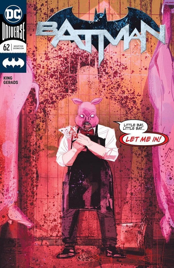
 Batman #62
Cover By: Mitch Gerads
If your cover has dialog boxes on it there is a good chance I am going to like your cover. There is no lofty reason why. Simply that I miss when it was the norm with covers. There are real reasons I love this cover as well. Starting with how it is so out of the norm for a Batman comic. It has a more horror vibe which fits for the current arc. The bloody Batman silhouette inside this dingy butchershop is grotesque in the best of ways. Easily one of the more original Batman covers in some time.Â
Author Profile
- A fan of all things comics. Growing up on a healthy diet of 90's Batman and X-Men cartoon series ignited a love for the medium that remains strong today.
Latest entries
 ColumnsSeptember 8, 2021What Big Fan teaches us about Fandom
 Comic BooksSeptember 2, 2021Review: Second Coming: Only Begotten Son #4
 Comic BooksAugust 12, 2021Review of Spider-Man: Spider’s Shadow #5
 Comic BooksAugust 5, 2021Advanced Review: PRIMORDIAL #1 (OF 6)