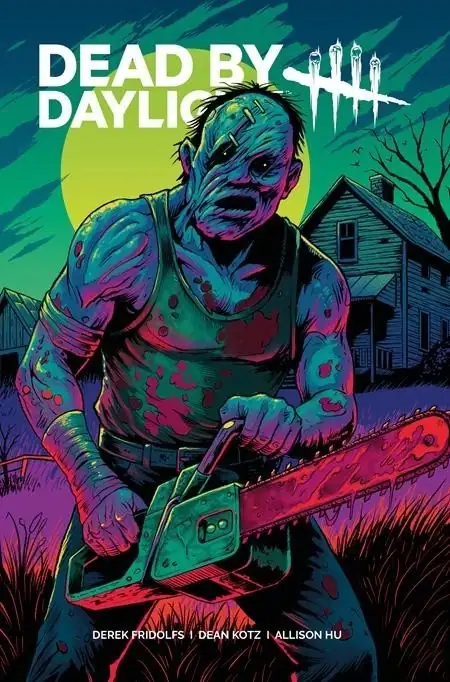
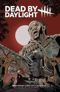
The Hillbilly stalks into comics with a gritty, dread-heavy horror debut.
Dead by Daylight: The Hillbilly #1 Review | Horror, Dread, and a Killer Debut
 Dead by Daylight: The Hillbilly #1 makes a strong first impression because it understands something a lot of licensed horror comics forget: being loud is not the same thing as being scary. Instead of rushing to throw the Hillbilly across every page in a blood-soaked highlight reel, this issue takes its time building tension. That patience pays off. The dread has room to breathe, and when the violence does hit, it feels earned instead of cheap.
One of the smartest choices in the issue is putting the focus on Officer Darnell Hollis. Rather than making the Hillbilly the only thing that matters, the comic gives readers a grounded perspective through someone trying to make sense of a world that is starting to feel very wrong. That human angle gives the story weight and helps pull readers into the fear instead of just making them spectators to it.
That approach also makes the Hillbilly himself far more effective. He is not overused, and that restraint gives him real presence. The comic treats him like an approaching nightmare instead of just a familiar franchise mascot, and that makes all the difference. By the time he begins to emerge more clearly, the issue has already built enough pressure that his presence lands with real menace.
Writer Derek Fridolfs deserves credit for that pacing. The script moves well, but it never feels like it is sprinting past the atmosphere just to get to the next kill. There is a steady sense of unease running through the issue, and the story does a good job of letting that discomfort settle in. It also helps that the comic does not over-explain itself. That uncertainty becomes part of the horror.
Artist Dean Kotz brings the right level of grit to the book. The world feels rough, unstable, and lived in, which is exactly what a comic like this needs. The horror imagery works because it is not trying too hard to be flashy. The Hillbilly looks twisted, brutal, and unsettling in a way that feels natural to the tone of the story. Allison Hu’s colors also do a lot of heavy lifting, grounding the early scenes so the later violence feels even more disruptive.
Overall, Dead by Daylight: The Hillbilly #1 is a smart, nasty debut that understands how to build fear instead of just yelling horror at the reader. It captures the tension and vulnerability that make the game work while still standing on its own as a comic. This is a strong start, and more importantly, it leaves room for the series to get even meaner from here. Big WEPA.
Crusaders Score:
3.5/5
Writer: Derek Fridolfs
Artist: Dean Kotz
Colorist: Allison Hu
Author Profile
![]()
Latest entries
 Comic Book NewsApril 9, 2026White Cat Entertainment Expands Its IP Development Strategy
 Comic Book NewsApril 9, 2026A NEW HERO WITH UNRIVALED POWER TURNS THE TIDE OF BATTLE IN AVENGERS: ARMAGEDDON #2!
 Comic Crusaders PodcastApril 9, 2026Samantha Thompson aka Lady Leo Films Talks Hustle & more… on Comic Crusaders Podcast #682
 Comic Crusaders PodcastApril 9, 2026Conor McCreery on The Last Witch: Blood & Betrayal | Comic Crusaders Podcast #681