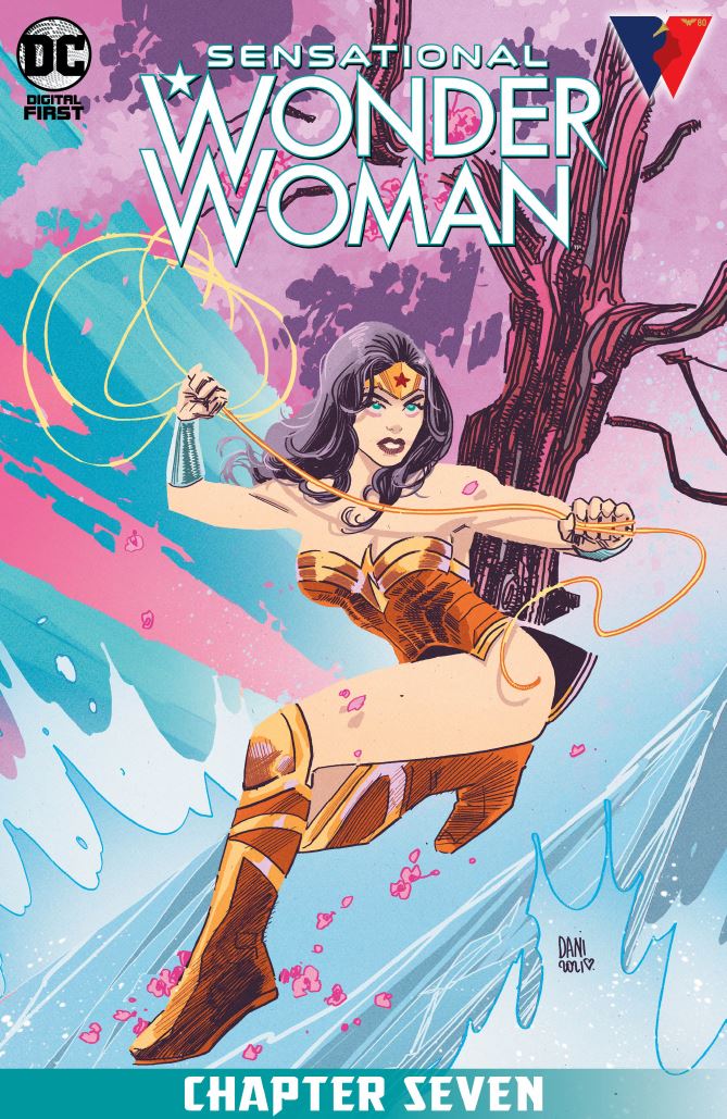
Sensational Wonder Woman #7 opens with Wonder Woman attending a conference on climate change. I appreciated this approach from Bechko and it hearkens back to an episode of Justice League Unlimited (To Another Shore). Wonder Woman, from her inception, has often been on the leading edge of social causes. Wonder Woman, seeking to protect farmers attending the conference, accompanies them to see a product demonstration. This product seeks to alleviate the affects of climate change. As the plot unfolds, the mid-tier villain is revealed to be Blue Snowman. Blue Snowman is an underused villain dating back to the Golden Age Wonder Woman. She is often depicted as being part of the LGBTQ community (bisexual or transgender) and I think the possibilities for this character are interesting. This book is the beginning of a new story arc so there is not a of depth to the story yet as we are being introduced to the power players. However, the story is perfectly acceptable….presenting us with all of the story elements needed. Protagonist seeks to help those in need, a crisis is introduced and an antagonist with an unknow motivation comes forward to challenge the protagonist. Bechko has left a number of questions unanswered and her writing makes we want to know more.
Unfortunately for the story, the artwork and color go from barely passable to unacceptable. Let me begin with the art style itself. The best way to describe this style is surreal minimalism. I will admit that this style of artwork in any medium does not appeal to me. However, this artist, Dani, has used this style before in other books and pulled it off. While
It is really unfortunate that the book has so many technical problems as the story holds promise. I would like to know more but, personally, I would not pay money for this book as it is. I’m confused by the choices made by the art team and hope they correct course in future issues. I can’t recommend this story unless you are deeply invested in Wonder Woman and, even then, I would wait to pick it up at a lower price point.
Writing – 3.5 of 5 Stars
Art – 2.5 of 5 Stars
Inking – 1.5 of 5 Stars
Color – 2.5 of 5 Stars
Overall – 2.5 of 5 Stars
Writer – Corrina Bechko
Artist – Dani
Colorist – Mike Spicer
Letterer – Ferran Delgado
Publisher – DC Comics Digital First
Nemesis Ratings Explained
1 – Amateur
2 – Below average, seriously flawed
3 – Average
4 – Above Average, stands out
5 – Outstanding
Author Profile
-
Nemesis is a poet, writer and author of the upcoming novel The Long Game. He is a writer of science fiction and supernatural thrillers. Besides novels and short stories he writes for UK based ASAP Comics developing new stories for Level 8 and OPSEC. Nem is a graduate of the United States Military Academy at West Point and tries to bring those experiences into his writing.
He lives and works out of his home in Riverside, California with his wife and three children. When not writing he enjoys reviewing comic books and graphic novels for ComicCrusaders.com and living the Southern California life with his family.
Latest entries

