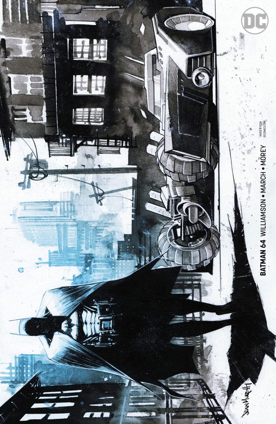
Holy Amazos. The art in this issue was something very refreshing and invigorating. There were interesting juxtapositions of foreground and background, frames set up on oblique angles, and numerous inventive dynamic figures and interactions between figures. It“s like hearing a well-tuned engine run. Sure any old engine can move the car down the road, but one that is freshly tuned is a magical blend of power, harmony, and efficiency. That“s what good art and layouts do for any story – and artist Guillem March and colorist Tomeu Morey do not disappoint.
Storytelling in Comics is not only a visual medium, but a kinetic one as well. There needs to be a palpable sense of motion or travel within the reader“s mind ”” something needs to move or be moved by the story and art. If that process never occurs then the book never really springs to life. It“s like the difference between looking at a picture and looking out from within the picture ”” actually feeling like you are in the frame amidst the action.
Kinetic action with real stakes. Foreground and background elements rendered in beautiful contrast. A punchy spare script that doesn“t get in the way of the action? Yes! March Morey and Williamson deliver in BATMAN #64 “Price of Justice”“ Part 1.
The joy of comics comes when that state is entered into easily and carries you all the way across the staple to the final page. When this kinetic force is activated – you can pick up an issue of something that you are not following – not know all the details – and still get caught up in the action, drawing your own conclusions about a larger context for the adventure. BATMAN #64 had this exact impact on me, it had the rhythm and timing of a classic superhero story with very contemporary and multi layered visual style.
The single fault I find with the presentation of the art is the use of what looks like a ”˜motion blur“ filter tacked on to two panels to make the background seem out of focus. The ”˜motion blur“ looks like it was added late in the process and distracts from the continuously amazing lineart by Guillem March that it covers-up. That kind of smudging or blur can be done organically at the line-art and inking stage, and March shows an amazing talent for handling close foreground and deep background action simultaneously – as in the awesome splash pages on pg. 9 and 10.
Among the many elements of March“s style that I really enjoy is the rapid ”˜back and forth“ strokes that are used for shadow and texture – they reveal the play of artists hand like visible brush strokes do on a painting by Renoir ”” both adding dimension and also reminding you that you are looking a the work of human hands, not a sketch-up or 3D model. I see too many comics these days whose style is clean open flat and generic. Both backgrounds and main characters are like outlines without three-dimensional weight and grit. This book and also Liam Sharp“s recent work on The Green Lantern – which I love – are the complete opposite of that flat and depth-less style, with line work that is so richly developed that distance, weight, and forms are created by the strokes themselves – not simply items outlined and colored in later. There“s no debating style and different styles work in different genres of course, but this book gave me the feeling of a full textural and visual experience, even without factoring in the script.
Now to the script. I want to praise the writer, Joshua Williamson for his economy and focus. The script of the book, is where so much of the decisions are made, decisions that establish tone and pacing – as well as characterization ”” these factors matter more than PLOT because these are what create the possibility of entering believabley into the plot itself. If all panels are too wordy, or if all characters seem to have the same ”˜voice“ then the plot will not be enough to achieve ”˜lift-off“ in the reader’s mind. I am sure someone else has come up with a variation of this idea ”” but I imagine an equation of comics-density: (#words /#captions /#panels) per page. For instance the final page of this issue is a splash with one word balloon and three words. In my system that would be classified as a (3/1/1). A page like that has the power to be highly dramatic since all action hangs on a few words, in a single utterance, in a single image. Where on pg. 8 we find all of the characters talking at once after a battle, just venting the stress of what took place, and giving out some exposition. Here the density equation is totally different: 127 words in 14 captions over 6 panels (127/14/6) which slows us down and gives us time to enter into all of the varying voices and perspectives of the team. At the script stage the writer has the unique opportunity to play with this balance and therefore control the tempo and density of the reader“s eventual experience. This is a central talent of good comic writers! After the density of pg. 8 the script opens up to a very sparse and economic style letting the splash pages and action scenes move without undue talking, and it is wonderful.
Pages 10-13 have the visually lyrical quality of images and kinetic action because the words are so few and so well-chosen. The comics-density of those pages in order is (1/1/3) (16/9/6) (3/2/3) (2/2/7) which means that many pages had only 1-3 words on them, and this a bold choice for a writer, but allows a more enveloping control of pacing and cinematic scope since we are ”˜shown“ more than we are ”˜told.“
The plot of the issue is interesting because it is a crossover with The Flash and there are images sprinkled throughout that will tug at the heartstrings of Flash fans. Highly recommend this book and look forward to seeing the rest of this four-issue “Price of Justice”“ story arc. This book does what hero comics should do and the creative team achieved it with the artful deploying of the techniques inherent in the medium itself. Bravo!
Strongly recommend. Superhero storytelling done right! Must read for Flash fans! 5/5!
[yasr_overall_rating size=”large”]
(W) Joshua Williamson (A) Guillem March
Author Profile
Latest entries

