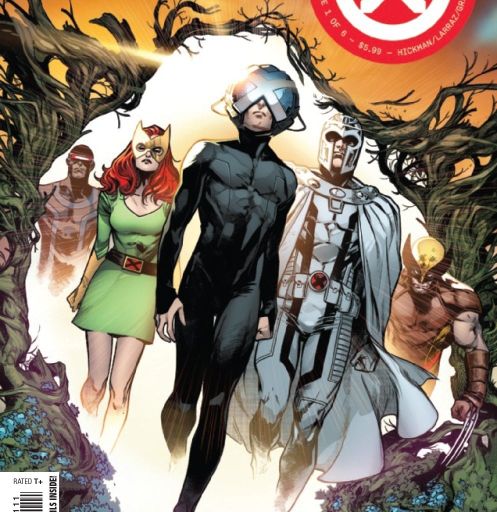
From the outset, things have changed. Krakoa is now a mutant haven of sorts, with free passage around the world exclusive for mutant use. Of course, there are other advantages and benefits to be had; in this case its the flowers of Krakoa that can help the human race; the price, leave the mutants alone on Krakoa. Of course this being the X-Men and of course where there is Magneto and humans there is always going to be friction. But there are deeper mysteries to uncover, no more so than the Sentinel head acting like a space station!
Jonathan Hickman is synonymous with quality story telling for Marvel, especially when it comes to team books such as Avengers and Fantastic Four. Of course the latter books do not have the undercurrent of distrust that the X-Men seem to engender, so this is a different ride altogether.  Story wise, I am old enough to remember Krakoa the first time around, so I am not completely on board with the seemingly altruistic nature of the living island for both humans and mutants. As a first issue, the changes from the last series of Uncanny and the lame duck series of the various Age of X-Man books, are dramatic to say the least. I have my suspicions as to what is going on. I am hopeful that with a myriad of subplots, there is enough story to cover this six issue run, along with it’s sister book Power of X.
The art is provided by Pepe Larraz who displays strong lines throughout the book, that kind of remind me of David Finch, especially as some of the pages look to utilise quite heavy inks. The characters frames are strong, with maybe the women seeming waifish at times; I didn’t recognise Emma Frost at first. Maybe Larraz is going for classic themes for his characters. The result is a book that look quite mature, at least for a superhero book. But hasn’t that always been what the X-men used to be about? A thinking persons superhero book, set away from the glitz and glamour of the Marvel Universe as whole (with maybe the exception of Dazzler). Adding the weighty feel of the book is color artist Marte Gracia. Gracia’s colors are, for the most part honed down to there darkest versions. Even Magneto’s white suit carries an air of menace. Finally letters are provided by the usually fantastic Clayton Cowles. Here, with the desire to deliver something unique akin to Hickman’s own code, Cowles might have gone a little too far as the early fonts are hard to read. This font may be clues about Krakoa down the line, so I will try and not be to judgemental at this point.
So the X-Men are back, yet in all reality, they are not quite back, given that this book will lead to the start of a new wave of X-books. Fans will have to wait for yet another two mini-series to run their course before you get to see them in all their ZZAP, SNIKT and BAMF glory. At least with Hickman involved here and in future books, there feels likes there is some point in actually reading both House Power of X.
Writing – 4.5 Stars
Art – 4 Stars
Colors – 4 Stars
[yasr_overall_rating size=”large”]
Written by; Jonathan Hickman
Art by; Pepe Larraz
Colors by; Marte Gracia
Letters by; VC’s Clayton Cowles
Published by; Marvel Worldwide
Author Profile
-
I am a long time comic book fan, being first introduced to Batman in the mid to late 70's. This led to a appreciation of classic artists like Neal Adams and Jim Aparo. Moving through the decades that followed, I have a working knowledge of a huge raft of characters with a fondness for old school characters like JSA and The Shadow
Currently reading a slew of Bat Books, enjoying a mini Marvel revival, and the host of The Definative Crusade and Outside the Panels whilst also appearing on No-Prize Podcast on the Undercover Capes Podcast Network
Latest entries

