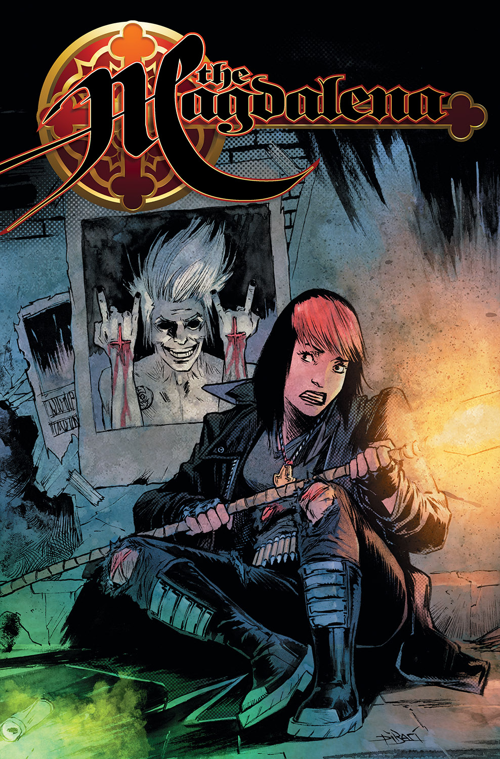
The new series is drastically different from the old even though the story is sort of the same. It“s like comparing apples to bunny rabbits, but luckily, I specialize in this. The story basically consists of the current Magdalena, a sort of powerful biblical badass named Patience (ironically) training a successor named Maya. The two have to fight against a guy who is a supposed “wannabe Crowley”“ as he summons demons and tries to look super cool or something along those lines.
The story is a bit hard to keep up with, and I wasn“t sure where the rising and falling tension was supposed to go. I liked certain parts about Maya, but Patience seemed achingly drab and boring, which is completely opposite of what a Magdelena should be. The woman fights the unholy, faces the most evil of monsters, and has zero personality. She is every token “person in charge”“ who has little time for comedic relief and doesn“t grasp storylines in modern movies because she“s not from this world-get it? Humans are so weird.
Maya and another character named Shilpa are painfully hard to distinguish from each other as far as dialogue goes, and they“re not very fleshed out as far as individual design goes either. Pretty sure Shilpa is younger but I“m not sure what she“s supposed to do and what she“s there for. The artwork doesn“t help that one bit and the two look identical in a lot of panels.
In fact, the artwork doesn“t help much at all. A lot of it seems lazy and rushed, and the characters“ faces from a distance are composed of ridiculously-looking dashes and dots. I know it“s drawn using distance in mind (at least I think”¦) but really? You would think a story with a lot of demons would have some pretty great designs, right? You know where this is going. Many of the monsters just seemed thrown together, and usually consist of one shade of purple and blue sort of blended into each other. There is no graceful shading or contrast, and none of the art even seemed cleaned up after initial sketching. It all felt so rushed and hasty.
The shadowing is point-blank the biggest problem with the artwork, as it“s not exactly god awful, but it“s low-grade meh. Meh is not good, who needs it? Most of the time I didn“t know what kind of setting the characters were supposed to be in, and there were frequently many lines on faces when there was none in the last panel, yet the setting had not changed. Where did the sun go? How old are these people? What emotion are they feeling? Shadowing does not just magically appear when a person says something ominous, and it feels like a reach for emotion that was just not able to be executed. Towards the ending it gets worse, and I have no inkling what the hell was going on. There“s a monster, it“s mad, and it goes boom. Why or how or what happened is beyond me but I get the impression that it“s…bad?
Yep, it“s bad. The end.
Story: 2 Stars
Artwork: 2 Stars
Colors: 2 Stars
Cover:2 Stars
[yasr_overall_rating size=”large”]
(W) Tini Howard, Ryan Cady (A) Christian Dibari (CA) Christian DiBari
Author Profile
Latest entries
