Review: Antarctica #3 (3 of 5)
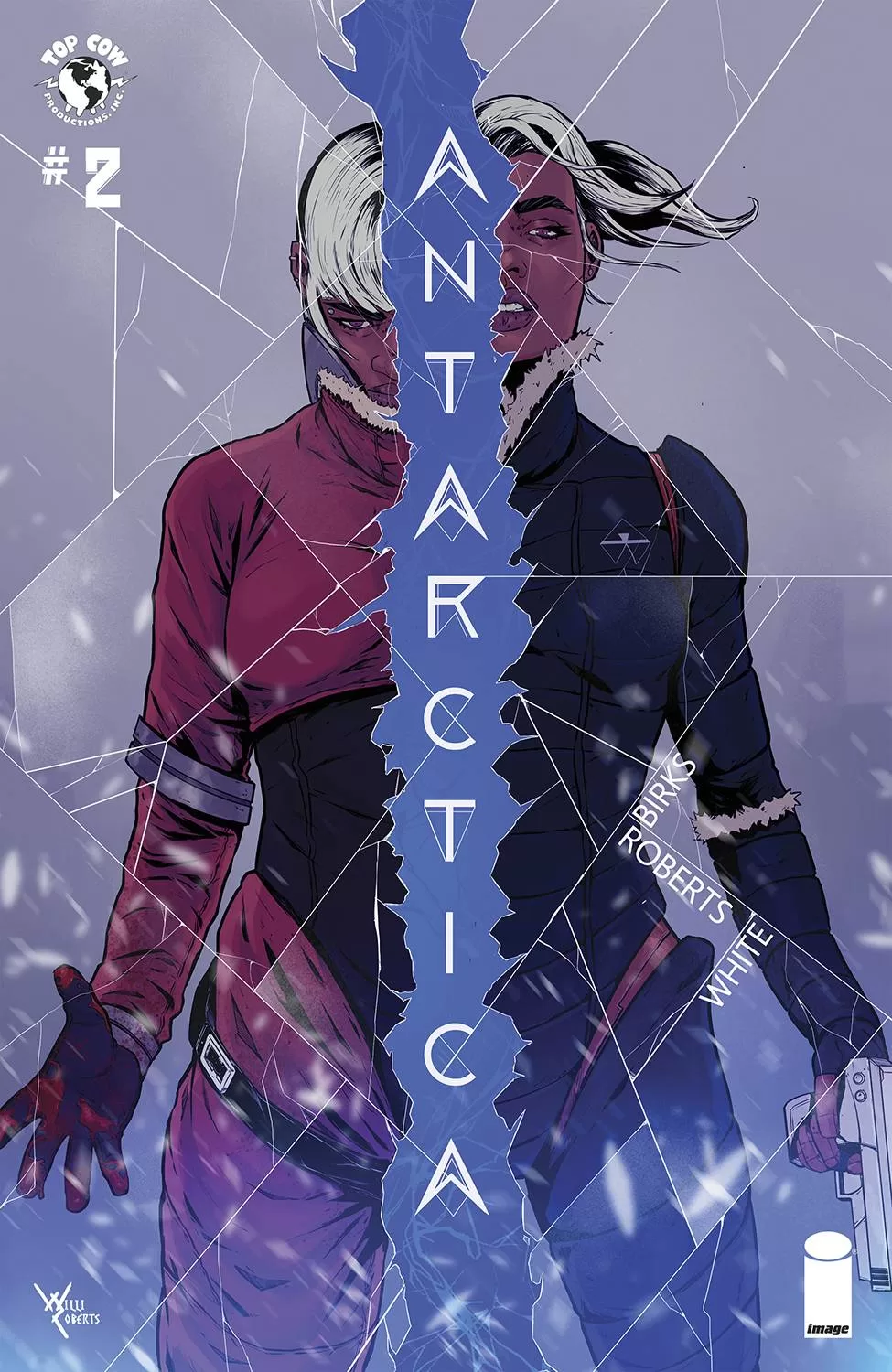 The third issue of Antarctica sees our heroes entering into a new dimension with their doppelgängers trying to kill them, well that and the blistering cold of the Antarctica tundra. Personally, I enjoyed this issue a little bit more than I did the first issue; the series itself is a very enjoyable read. The lettering is very good, and I love all the different word balloons shapes as well as the fact that they don’t use outlines. This is another example of when a muted palette of colors makes the white word balloons pop right at you.
The art itself is very good, Willi Roberts is quite talented. The one thing I do not really understand is why he adds so many marks to the faces, especially around the lips. To me, it makes the faces look dirty and ugly looking and it makes the lips always look like they need a whole stick of chapstick! At first, I thought it was an intentional choice, something that was being done as part of the story, because if you consider that the characters are in Antarctica, and it’s incredibly cold there, it would make sense for them to have really chapped lips. This theory however was quickly dismissed when during the flashbacks the Dad and the little girl had equally chapped lips, which honestly is just weird. It’s a tiny little detail that personally I think could be done without altogether and all the faces would be easier to look at especially as the rest of the art is splendid.
The coloring is also very good, and I love how they use reds and yellows to contrast against the blizzard tones of blues and whites of the snowy landscape. It works perfectly and it makes every panel that much more exciting. I also really like that Roberts is using a semi-cel shading start for this comic because it works very well for a story about parallel dimensions and sometimes cartoony antics. I am a huge fan of creator Jeff Smith with this story reminding me a lot of RASL with its thematic approach to dimensional traveling and cartoonish realism. I enjoyed the flashbacks very much, they were a nice change of pace and they served as a palette cleanser delivering an inside look at the main character’s mind. I also appreciated how the flashbacks were much more colorful though they still have a bit of a tie-in to the wintry wonderland the characters were in, with the little girl wearing penguin pajamas.
I gotta say that I am a huge fan of the lettering done by Lyndon White. The hand-drawn word balloons mesh really well with the rest of the art style and I think the font White used for the dialogue is fantastic. The fact that all the word balloons were basically hand-drawn meant that no two-word balloons were alike even if they all were ovals, which added a nice layer of diversity in each panel. It’s easy to read but still has enough of a unique characteristic that it almost feels hand-drawn. The sound FX’s huge in a different more Japanese brush-style font, but it still works very well with the rest of the art and text because it manages to retain the sharpness that many of the dialogue letters have. The narration boxes were perfectly rectangular and they all look very good together. We also saw a nice use of radio word balloons.
In conclusion, I am enjoying this story and the series as a whole as each new twist and turn adds that much more. This is one of those stories that you should try your best to follow along with, because it’s getting better and better!
Writing: 5 Stars
Art: 5 Stars
Colors: 5 Stars
Overall: 5 Stars
Written by: Simon Birks
Art by: Willi Roberts
Lettering by: Lyndon White
Cover art by: Willi Roberts
Variant Covers by; Alison Sampson
Published by Image Comics
Author Profile
Latest entries
 Comic BooksApril 30, 2024REVIEW: Rick and Morty: Kingdom Balls #1
 ReviewsApril 30, 2024PRCC2024 Recap: Fans from all over the world join together in Puerto Rico to celebrate all things comics, anime and videogame
 Comic BooksMarch 30, 2024REVIEW: Monstress #50
 Comic BooksMarch 28, 2024REVIEW: Cemetery Kids Don’t Die #2