Review: Bone Orchard Tenement #4 (of 10)
 Jeff Lemire is one prolific guy! Right at the end of this book, you get the ads for the next issue, 3 other issues that look very cool and then one extra page that has 40 other comics he’s worked on! That is intense! I love it. Let’s talk about Bone Orchard #4; if you read my previous review, you know I have a bone to pick with the art, because it almost feels like photographs drawn over, and I do not like it. That being said, the design of this book is fantastic! There are some pages where the panel layouts really take you on a journey, whilst the use of color in this issue is spectacular! The lettering could use some work here and there, there are barely any backgrounds to speak of, though these touches, or lack of, feels so intentional.
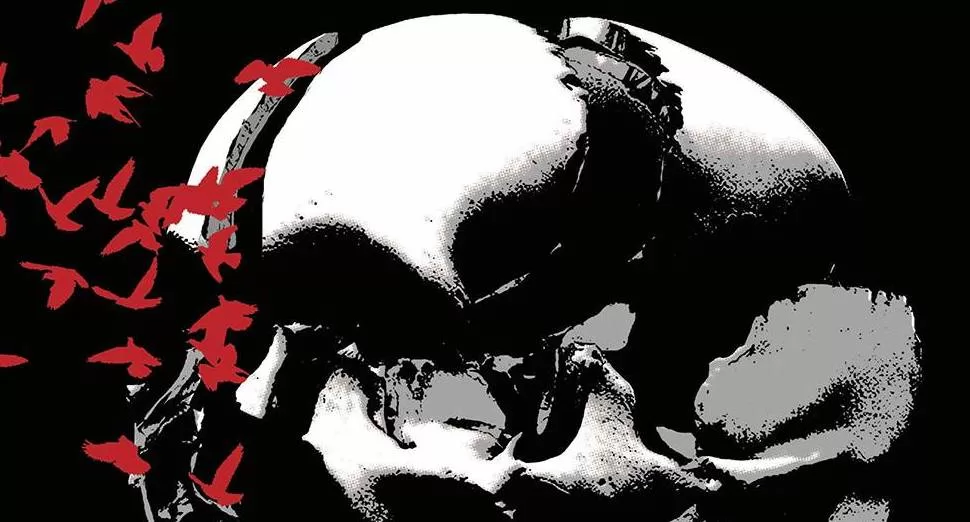
We continue the story with our group of characters who live in a building and have been transported to what looks like a devilish version of their home. Filled with traps, snakes, poison smoke and lots and lots of birds. They are being harassed by masked creatures that can take the form of their loved ones, what these creatures want with them I do not know but it is not good. I won’t talk too much about the character design, or the overall line work because I do not like it that much, as mentioned previously. That being said, I think I’m starting to really like the color schemes they are used as well as the heavily textured backgrounds. The backgrounds all feel like we are inside a cave in another dimension, and the muted hues of blues, browns, and greys really allow for amazing effects to pop at you when Dave Stewart stars using vibrant yellows, explosive oranges and bloody reds. Another thing that really pops out on these muted color schemes are the word balloons! They look really good, easily readable and the eye has no problem following them at all. The fonts in them are pretty good too as it seems like they were drawn by the artist themselves, fitting perfectly with the art style rather than feeing like stickers, which is a problem many modern-day big-brand comics have. There are even a couple of sound FX’s here and there that feel more like graphic design elements than lettering but they work wonderfully. My quarrels with the lettering are that the one narration box just looks weird. I think it’s because it’s too vertical when it should be horizontal, with the other issue being that there’s no word ballon variation. We are only looking at ovals throughout the whole comic and I think there could have been a time when a couple of exaggerated word balloons with equally exaggerated fonts would have worked great.
The writing is incredible! It is quick, precise, witty and dramatic. It’s really good, it reads so well because all the fat from the dialogue has truly been trimmed out. Another great thing about Jeff Lemire’s writing is that even when you have a big cast of characters each one has a very distinct voice that is easy to follow, it doesn’t feel like two characters are speaking in the same voice. Right from the first page, you already know who the “asshole” of the group is just with two or three lines of text. You know who the kid is and who the mom is; you know everyone is different and you know that not everyone is a friend. It’s just really cool to see this sort of writing, seeing all the other books this guy has collaborated in, I’m very excited to see more of their work.
Let’s go back to the panel layouts for a bit, and to the design of the book which I think is quite fantastic. First off, these panels don’t have your standard black outline on a white background. Instead, you get red outlines on black backgrounds, and it works perfectly with the rest of the art since all of it is so dark and gritty. It literally feels like the whole book is inside this cave area and the red works wonderfully to foreshadow the upcoming bloodiness you will witness on these pages. Interestingly enough a couple of panels do have black outlines, but this only happens when they sit atop other panels in which the red color is predominant and it works very well at showing you what comes first and what comes after. I think the reading journey of this book is very well thought out, there are some other books where you could be lost and end up reading a different panel than you are supposed to. But in this book, you know exactly how to move your eye to get to the juicy parts of the story. Speaking of juicy parts, this book has for me, 3 very interesting parts that stood out for me greatly. The part where the birds attack, is told solely with red silhouettes and it just looks awesome! The part with the yellow smoke is equally fantastic, looking intense! Lastly, the part where right before the birds attack, where they look through a broken window. The combination of black, reds, and yellows on this page really makes it stand out and it almost feels like that scene from the Shinning; “Here comes Johnny!”. It’s scary as all hell honestly.
The book is great, and whilst I don’t particularly like the art style used for the characters, I think there are a lot of very good moments, with writing that is so good that these little issues with the art,(which really is just on the characters because there are pages in which the art style works wonders) can be overlooked and you have in your hands a marvellous reading experience worth every minute of your time.
Writing: 5 Stars
Art: 4 Stars
Colors: 5 Stars
Overall: 4.5 Stars
Written by: Jeff Lemire
Art by: Andrea Sorrentino
Colors by: Dave Stewart
Cover art by: Andrea Sorrentino
Variant Covers by; Christian Ward
Published by Image Comics
Author Profile
Latest entries

 Comic BooksMarch 30, 2024REVIEW: Monstress #50
 Comic BooksMarch 28, 2024REVIEW: Cemetery Kids Don’t Die #2
 Comic BooksMarch 27, 2024REVIEW: Forgotten Runes #3 (of 10)
 Comic BooksMarch 6, 2024REVIEW: Sam and Twich- Case Files #1


