REVIEW: Cobra Commander #1
 STORY
STORY
I have to admit that I’m not current on GI Joe and Transformers comics. While I did enjoy what was being done with Transformers as well as a number of other IPs from the 80s their GI Joe never caught my eye. I just wasn’t feeling it. But I can say that about a number of other previous publishers with my most satisfactory experience still being when Marvel Comics held the license. That said, the first and most positive thing I can say about this comic right away is it is a fantastic jumping off point if you know anything about GI Joe and Transformers or nothing about them at all.
This issue does a fair amount of world building in a very short time without it feeling like an exposition dump. While there is exposition it is backed by strong visuals which tell as more or more story that any wall of text could. This is so refreshing as writers from the Big 2 of the last several years have clearly come from the YA market. They are used to writing everything, even after five or ten years at the biggest companies in the industry they don’t know how or when to let the artist tell the story.
This is not the case here, Williamson allows the story to live and breathe through the art while the artists are free to build the world visually for us. Entire pages with not a single word balloon allow the reader to take their time and drink in the visuals. Because of this when Williams does put prose to paper it becomes significant instead of wordy or needless. Everything is precise, everything on the page serves the story.
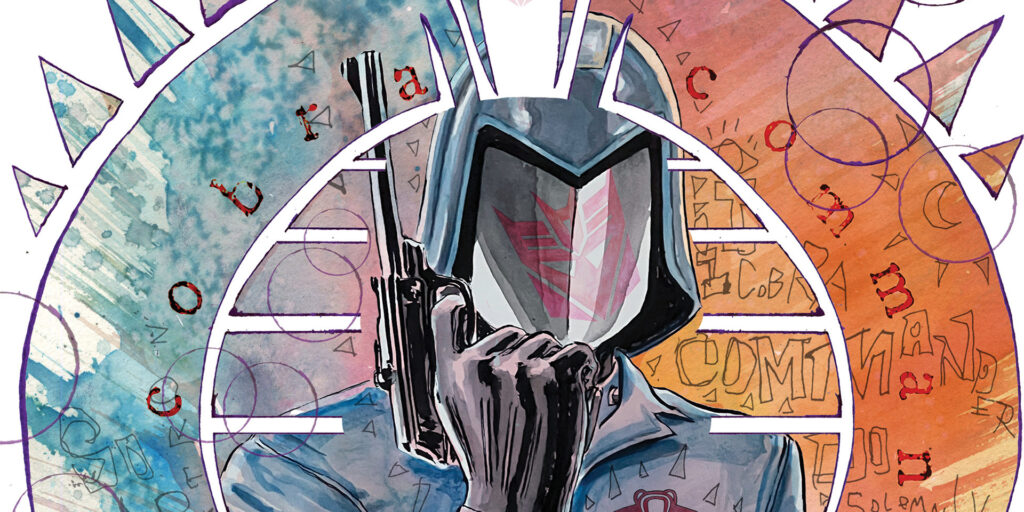
Best of all the world is built beautifully for us piece by piece, layer by layer, setting up what is to come with exquisite sense of pacing. It’s quite cinematic in that respect with a prologue whetting the appetite before the obligatory opening splash page. The story is tight with no fat on it at all and character and motivation are clearly defined from an individual perspective to a cultural one. While there is plenty of mystery to be had there is also no guessing to be done. A particularly clever but I thought was explaining the origins of Cobra Commander’s signature sibilant hiss when speaking as well as why he hides his face. It all fits quite nicely within the context of the world seen here.
ART
The art is quite good for the most part, the established look feels gritty and lived in with the palette seeming a rendering in dirty water colors. This isn’t the brightly bombastic world of superheroes. This is a world that is forebodingly dull punctuated by bright splashes of crimson to indicate the violent loss of life. The lines and colors are some of the best pairing of this more somber approach I’ve seen since the first Dark Knight series by Miller, Jansen and Varley. Everything gells nicely to create a complete package.
LETTERING
Lettering can be the unsung hero or villain of many a comic and in this book it is outstanding. Wooton doesn’t go in for a lot of flash with his work but is classical in his approach, reminding me of the best lettering of Marvel in the 80s. It’s crisp and functional with emphasis where needed with emboldened and sometimes subtly colored words. His sound effects are nice and blend with the art. In fact, nothing he does obscures the art but helps to lead the eye around the page from element to element.
OVERALL
This is a fantastic gateway into the Energon Universe. It was informative and entertaining. My only negative comes from the sequence in Cobra-La where I did not yet understand the world some of the images become confusing in the organic kingdom as I tried to determine what I was seeing, similarly this affected the clarity of a couple of the pages as far as storytelling went, having only a sound effect to indicate why the citizens were running in fear. But this is a minor hiccup and it passed quickly.
4.5 out of 5
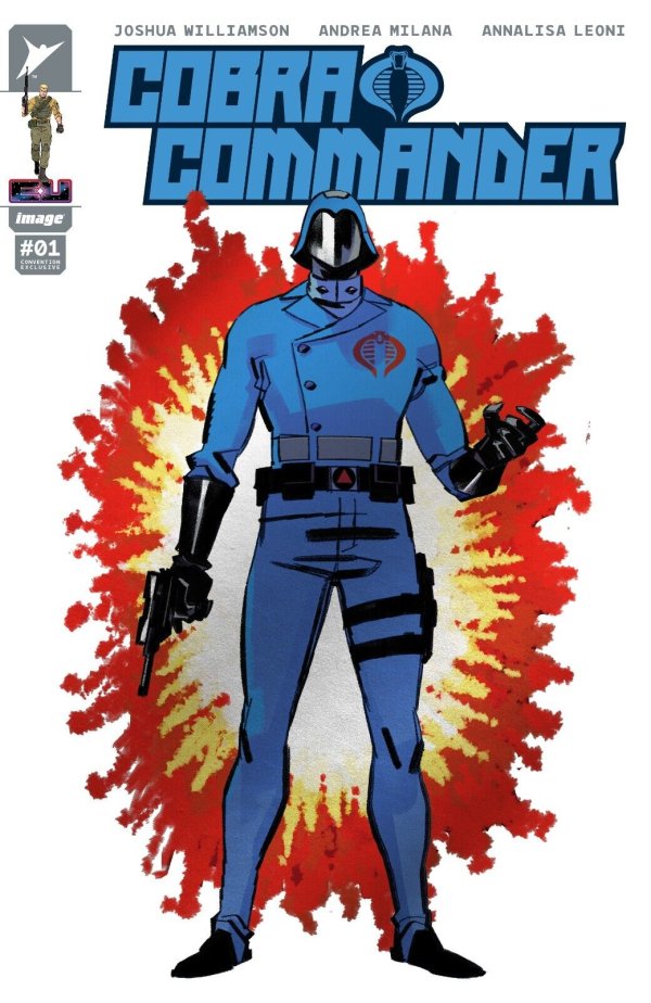
WRITER: Joshua Williamson
ARTIST: Andrea Milana
COLORIST: Annalisa Leoni
LETTERER: Russ Wooton
PUBLISHER: Skybound Entertainment
Author Profile
Latest entries
 TV & MOVIESJanuary 16, 2024Indie Movie Review: Amends of the Father
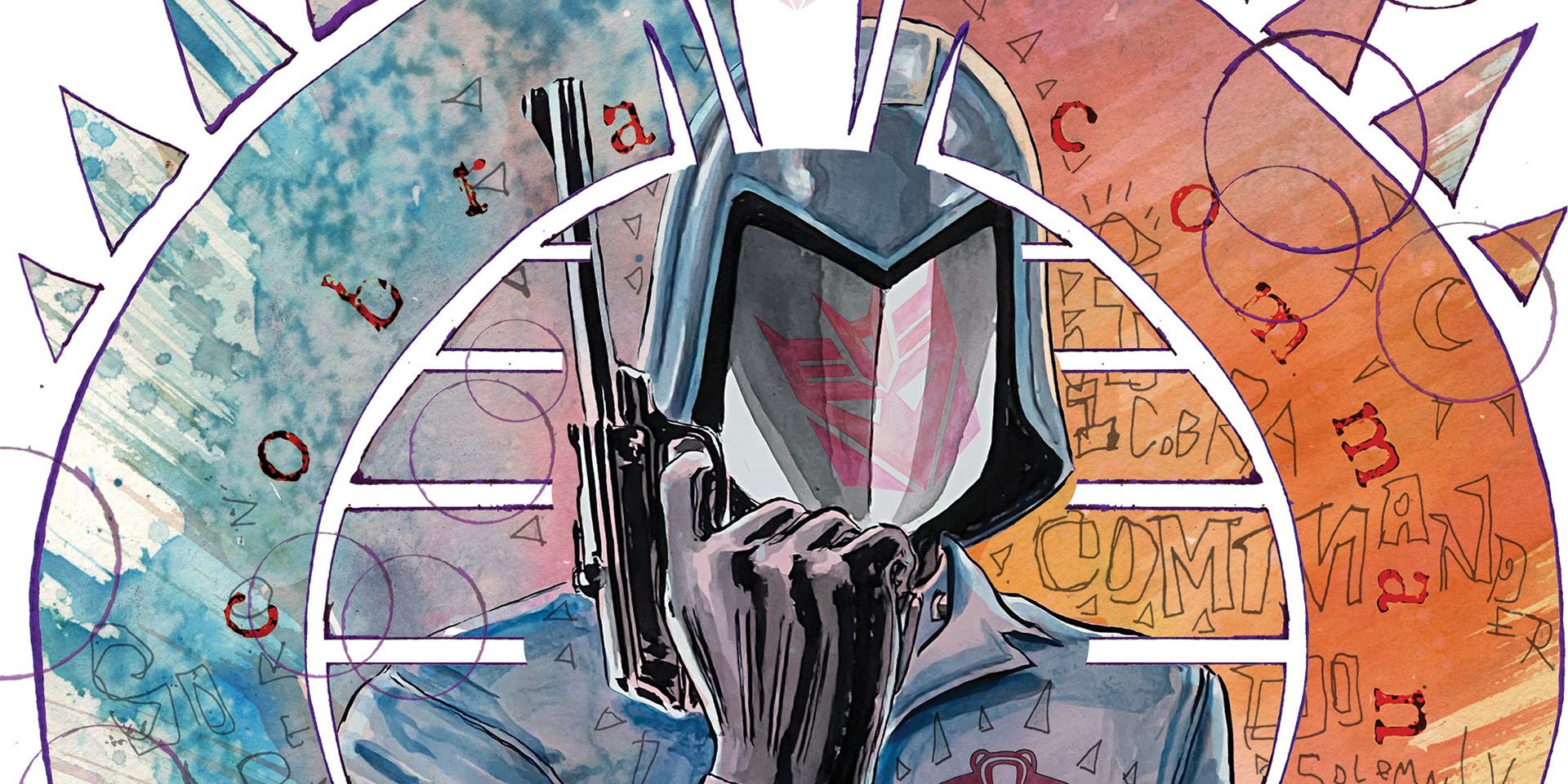
 Comic BooksJanuary 15, 2024REVIEW: Cobra Commander #1
 Cinema CrusadersJanuary 5, 2024MOVIE REVIEW: DISTANT TALES
 Movie ReviewsJanuary 3, 2024MOVIE REVIEW: REBEL MOON


