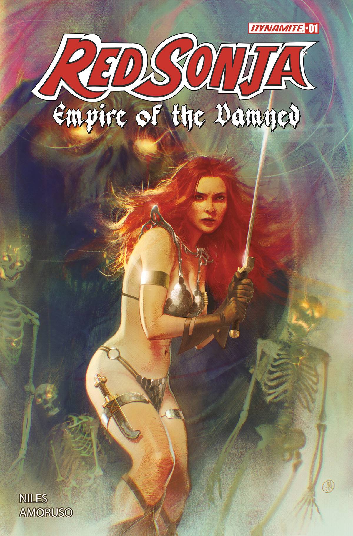
Review: Red Sonja Empire of the Damned #1
 It’s been a while since I have checked in on the buxom barbarian known as Sonja, even longer since I bought a book. This week sees the launch of a new Sonja series, Red Sonja Empire of the Damned from Dynamite Entertainment.
Following a standard night out for Sonja, she finds herself in less than luxurious accommodation, along with a cellmate with a plan. One history lesson later finds Sonja more than along for the ride, with the promise of riches.
Horror writer Steve Niles promises magic, monsters and more, though starts in a familiar setting, at least for Sonja. The opening pages give some context to the main thrust of the book, whilst their inclusion adds to the reality of the story that Sonja hears in prison. Consider, if a jail rat told the story, as a reader we would have a sense of distrust. Having seen it however, we start to believe and give credence to the possible tall tale. When it comes to writing Sonja, I imagine that there are aspects that are easy and others are difficult. Niles handles the dialogue elements well, its Sonja in a bar for chrissakes! Niles sets the table for an adventure where the situations are going to be the driving force, almost as much as Sonja herself. It is these situations that will add gravitas to what is essentially a quest book.
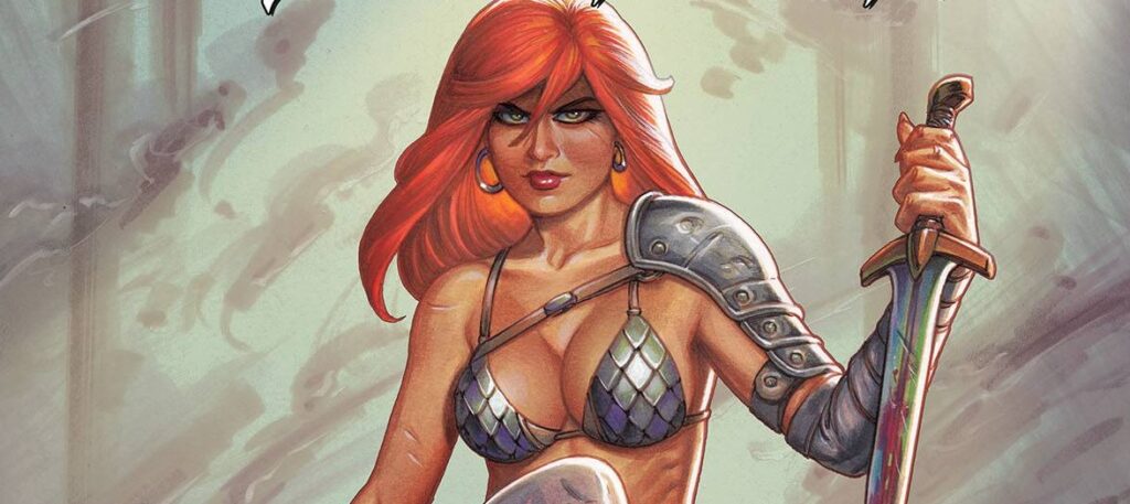
The art is provided by Alessandro Amoruso who does a great job garbing Sonja in something that is both a classic look with a touch of common sense. Sonja herself, obviously the main draw of the book, looks great in most of the panels. Clever camera angles ensure that she is shown in the most dynamic, and at times, savage ways. I am a fan of the female form; I just didn’t expect to see so many used for one character! Simply put, there are inconsistencies in both body frames, styles and facial elements. The various looks work well, I just wish that Amoruso picked one and stuck with it. Amoruso does a great job with the environment and spends quality time with the whole range of cast, which can be something of problem with modern artists. Colors are provided by Salvatore Aiala who adds a deep richness to the opening pages before settling on a semi green and brown tinged interior, fitting for the Hyborian Age. Dave Sharpe provides his usual high standard of letters, in staccato fashion as there are times where the art and panel designs tell the story unencumbered by word balloons, a testament to Niles and Amoruso’s storytelling abilities. Finally, there are a raft of covers to choose from; if you know me you know I will always choose Joseph Michael Linsner (see banner), but the main A cover from Joshua Middleton (remember those gorgeous Batgirl covers a while back?), is equally well presented.
A warlord that caused a curse, could it be Kulan Gath? Niles will need to work hard to move away from the expectations set by previous series. Following this well paced first issue, with it’s initial set-ups, I have every faith that we are in for an intriguing and surprising quest. May be we will be damned if we do and damned if we don’t!
Writing – 4 Stars
Art – 4 Stars
Colors – 5 Stars
Overall – 4.5 Stars
Written by; Steve Niles
Art by; Alessandro Amoruso
Colors by; Salvatore Aiala
Letters by; David Sharpe
Covers by; Joshua Middleton, Joseph Michael Linsner and others
Published by; Dynamite Entertainment
Author Profile
- I am a long time comic book fan, being first introduced to Batman in the mid to late 70's. This led to a appreciation of classic artists like Neal Adams and Jim Aparo. Moving through the decades that followed, I have a working knowledge of a huge raft of characters with a fondness for old school characters like JSA and The Shadow
Currently reading a slew of Bat Books, enjoying a mini Marvel revival, and the host of The Definative Crusade and Outside the Panels whilst also appearing on No-Prize Podcast on the Undercover Capes Podcast Network
Latest entries
 Advance ReviewApril 30, 2024Advance Review: Space Ghost #1
 Comic BooksApril 19, 2024Review: Jill and the Killers #4
 Comic BooksApril 11, 2024Review: Deadweights #1 (of 6)
 Comic BooksApril 10, 2024Review: Jim Henson’s Labyrinth Archive Edition #1 (of 3)