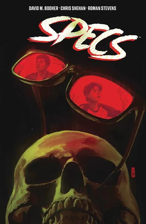
Review: Specs TPB
 One of the problems I have as a reviewer for Comic Crusaders is that with the sheer volume of product that comes out every week, it can be hard to see a mini series or run through to its conclusion. For me then, as with everyone else, trade paperbacks are a great way to catch up on stuff I may have missed. Spec is a great example of this; I originally reviewed the first issue 9 months ago (Click here to read) and loved it!
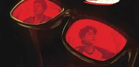
Small town Ohio in 1986 sees Kenny and Ted living the desperate lives of those not wanting to be noticed by the wrong crowd. However Ted is the star pitcher and Kenny is his geeky best friend with a huge secret. As the pair suffer at the hands of the school bully, Kenny receives a pair of magic glasses, the kind you see in every old school comic books. These glasses allow the wearer to make a wish which will come true. But you know the old proverbs about be careful what you wish for and we all know what the road to hell is paved with. First a wish to make the bully leave Kenny alone, secondly an increase in fastball speed both have impacts for the friends as their goal have unexpected consequences.
Co-creat0r/writer David M. Booher delivers a story that flows from Wonder Years shenanigans to the macabre at warp speed. The way in which the wishes intentions are subverted and how they contradict with Kenny and Ted’s life. Throw in the small town nature and the time period, other aspects are realised in stark fashion. Kenny and Ted’s lives is a fully realised piece of 80’s kitsch come horror, with well observed high school tropes mixed in with unrequited love.
Chris Shehan’s art has an air of the recent work from Mike Deodato Jr., where realism has taken over from the more pin-up style of the 90’s. Shehan’s work has a dingy style, mainly to deliver the dinginess of the characters lives. Hey, if their lives were perfect the guys wouldn’t need magic glasses, right? There is a depth to the characters, a key for a book that is more character focused than action. Roman Stevens adds to the quiet horror waiting to unfurl with a color scheme to match the overall vibe. Jim Campbell delivers his usual high standard of lettering, not impeding the pace of the story.
All in all, Specs is an enjoyable romp, with a clever twist on the “be careful what you wish for ” idea.
Writing – 5 Stars
Art – 5 Stars
Colors – 5 Stars
Overall – 5 Stars
Co-created & written by; David M. Booher
Co-created & art by; Chris Shehan
Colors by; Roman Stevens
Letters by; Jim Camp bell
Published by; Boom! Studios
Author Profile
- I am a long time comic book fan, being first introduced to Batman in the mid to late 70's. This led to a appreciation of classic artists like Neal Adams and Jim Aparo. Moving through the decades that followed, I have a working knowledge of a huge raft of characters with a fondness for old school characters like JSA and The Shadow
Currently reading a slew of Bat Books, enjoying a mini Marvel revival, and the host of The Definative Crusade and Outside the Panels whilst also appearing on No-Prize Podcast on the Undercover Capes Podcast Network
Latest entries

 Advance ReviewApril 30, 2024Advance Review: Space Ghost #1
 Comic BooksApril 19, 2024Review: Jill and the Killers #4
 Comic BooksApril 11, 2024Review: Deadweights #1 (of 6)
 Comic BooksApril 10, 2024Review: Jim Henson’s Labyrinth Archive Edition #1 (of 3)