
Tank Girl: Blue Helmet #1 Review – Punk Chaos Still Rules
·Al Mega
WEPA! Now THIS is the Tank Girl I remember. Tank Girl: Blue Helmet #1 comes flying out of the gate like somebody stole a car, filled the trunk with bad decisions, handed Alan Martin the map and told Jamie Hewlett to draw whatever the hell happened next. Titan Comics is bringing this classic material back to readers, and what immediately got me is how little the years have dulled its personality. This thing is loud, crude, funny, visually filthy in the best possible way, and completely uninterested in behaving itself. More importantly, underneath all that beautiful madness is a comic constructed by two creators who understood exactly how far they could push the medium without losing control of the story.
Martin’s writing is deceptively sharp because Blue Helmet wants you to believe it’s just screwing around. Tank Girl bounces from one increasingly ridiculous situation into another, with conversations becoming arguments, arguments becoming violence and violence becoming another setup for a joke. Yet Martin never turns Tank Girl into a passenger inside her own comic. She’s the chaos generator. Her attitude drives the rhythm, and even when the supporting cast barges in and the story takes another bizarre left turn, you still feel her personality controlling the temperature of every scene. Martin doesn’t waste time explaining why this world operates the way it does. You either grab onto the bumper or watch this crazy shit disappear down the highway.
That’s also why I don’t want to summarize the plot and ruin the fun, because Blue Helmet works through escalation more than conventional point-A-to-point-B storytelling. A robbery sequence is a perfect example. Martin gives Hewlett enough room to turn a relatively simple confrontation into an absurd chain reaction involving guns, threats, bodily humor and facial reactions that somehow get funnier the worse everything becomes. The joke isn’t simply what happens. It’s how long these maniacs can keep making a bad situation worse. That unpredictability carries through the book and keeps the comedy from feeling like a collection of disconnected gags.
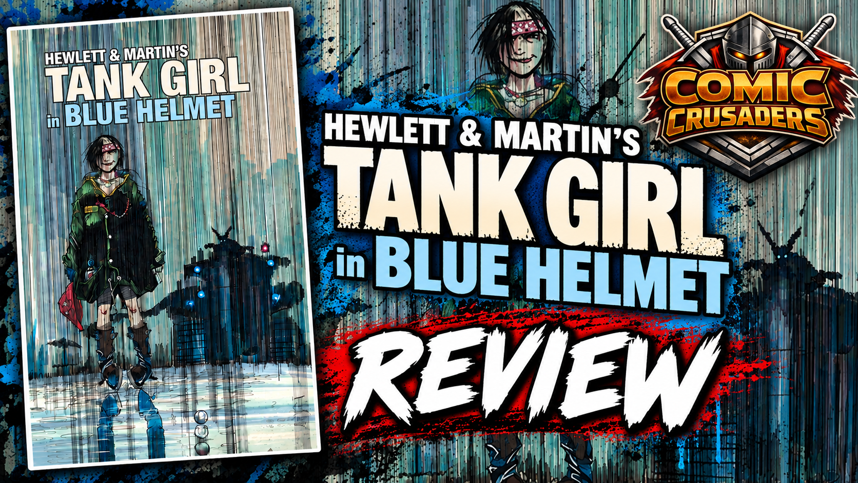
Then we get Jamie freaking Hewlett. Fam, some artists illustrate a script. Hewlett attacks the page. His characters stretch, bend and practically vibrate inside panels, while backgrounds, captions, sound effects and little visual jokes compete for your attention without completely destroying readability. The early pages are packed with color and clutter, but watch how differently Hewlett handles the rainy second half. Suddenly those heavy blue vertical strokes are cutting through panels and connecting separate moments visually. Characters become silhouettes behind the weather, expressions peek through the downpour, and the environment starts controlling the page. That’s not random punk-rock scribbling. That’s a cartoonist who understands atmosphere and visual rhythm at a ridiculously high level.

The sequencing may actually be my favorite part of the book because Hewlett constantly screws with conventional layouts while keeping the eye moving. Large establishing images get surrounded by tight reaction shots. Narrow panels accelerate an exchange before a larger image delivers the payoff. Characters sometimes feel like they’re invading neighboring panels, and the little strips running beneath several pages act almost like another comic heckling the main comic. That’s some wild shit, but it works. There are moments when the density can become exhausting, particularly when Martin’s dialogue, background details and Hewlett’s visual gags all demand attention simultaneously. A few pages made me slow down and reorient myself, so readers who prefer clean modern layouts may struggle with it. For me, that’s a legitimate knock, but it’s also inseparable from the book’s identity.
Color is doing serious work here too. Instead of trying to make everything harmonize beautifully, the palette embraces collision. Hot pinks crash into yellows, sick greens sit beside electric blues, and skin tones can change dramatically depending on the scene. It shouldn’t work this well, yet the exaggerated color reinforces the exaggerated reality. The lettering and graphic design follow the same philosophy. Dialogue balloons, captions, oversized sound effects and handwritten elements feel physically embedded in Hewlett’s artwork rather than placed over finished illustrations afterward. Occasionally that contributes to the visual overload, but most of the time it gives these pages a tactile quality that cleaner digital production simply doesn’t reproduce.
Where Blue Helmet really wins me over is that all these individual pieces serve Tank Girl herself. Martin and Hewlett don’t soften her or spend the issue trying to convince us she’s secretly some noble hero underneath everything. She’s reckless, vulgar, violent, selfish, hilarious and sometimes an absolute asshole. Perfect. That’s the character. Hewlett sells those qualities through body language as much as Martin does through dialogue. Watch Tank Girl’s posture from panel to panel. She’s rarely just standing there waiting for somebody else’s scene to finish. She’s leaning, slouching, charging, glaring, laughing or physically disrupting whatever environment she’s entered. The character feels permanently in motion.
Tank Girl: Blue Helmet #1 isn’t going to suddenly become everybody’s cup of tea in 2026, and it shouldn’t. Some humor is juvenile as hell, the pages can become intentionally overwhelming, and readers expecting a polished modern narrative structure may wonder what kind of comic-book car accident they just wandered into. But that’s also why this reissue works for me. Martin’s writing has attitude without sacrificing character, Hewlett’s artwork remains absolutely fearless, and the sequencing demonstrates that there’s considerably more discipline underneath this madness than the madness wants you to notice. More than three decades after these pages first appeared, Blue Helmet still feels dangerous, stupid, clever, ugly, beautiful and alive all at once. Man, I’ll take a comic swinging this hard over something afraid to leave fingerprints on the page any damn day.
CRUSADERS SCORE:
4.5/5

Writer: Alan Martin
Art & Cover: Jamie Hewlett
Editor: Jake Devine
Design: Alan Martin & Matt Bookman
Publisher: Titan Comics
On Sale: October 2026
Originally Published: Deadline Magazine, April-May 1992


Leave a Reply
You must be logged in to post a comment.