
Advance Review: Frank N. Stein – Private Eye GN
 Darby Pop has been quiet of late, but with another holiday season on the corner they strike back with another private eye story. For those who remember Santa Claus Private Eye you may think that those involved have gone back to the well. Nothing could be further from the truth; granted both are private eye, but the former deals in the hope for happiness and Frank, well his stories are almost as mashed together as he is!
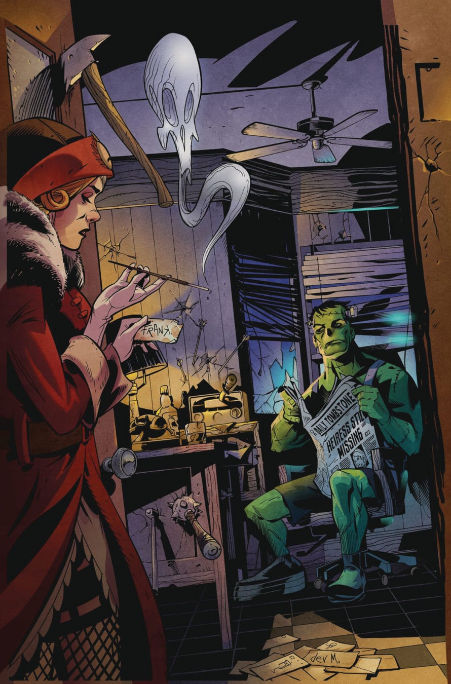
The book is a collection of short stories, each featuring Frank who at times works a case, is stopped by babies falling from the sky; a red hood that I am glad to say has nothing to do with Jason Todd along with a few other clearly obvious characters. As familiar as they are, each character is a darker variation on a familiar tale. Perfect then for a Halloween release date!
Keith Champagne, a creative force with both writing and art credentials, most notably from his time on DC, provides quirky twist after quirky twist with elements of very, very dark humour. Champagne adopts a curious style in the writing; Frank has the ability to think logically, yet apart from the odd “fire bad”“ pronouncement, he is a creation of few grunts, never mind words. The monologue creates the gumshoe element of the story; everybody has a secret. Whilst the hero of the piece maybe monosyllabically challenged to say the least, Champagne“s inversion of the characters and situations we know so well, goes to demonstrate a writer with his finger on the funny bone of the dark monster that is morbid humour.
Along for the ride is artist, Dev Madan, known for both his work on DC and with the property that is the phenomenon of Plants vs. Zombies. For fans of that particular game you will recognise certain styles seen on the page. That isn“t necessarily a bad thing; I for one am not a huge fan of the game or the subsequent comic book from a while back. But here, Madan clearly has his lug nuts tightened on right as his captures the mix and miss-match of Frank perfectly in line with the humour of the book. For example, check out how the legs on Frank are different. The book has a couple of color schemes in play, provided in part by Madan and Augie Pagan. Each scheme uses colors or lack of even, to emphasise key parts of the visual storytelling. Madan“s design chops are clearly on show as he also contributes a clever lettering style for the monologue and the odd grunt here and there.
I don“t why Darby Pop have been keeping a low profile of late. It is a shame as last year I thought the company had turned the corner, producing a number of diverse and interesting books that covered a number of different topics. I hope that this book sees a return to press for genuinely infectious company that always produces entertaining comics.
Writing – 5 Stars
Art – 5 Stars
Colors – 5 Stars
Written & Co-Created by; Keith Champagne
Art & Co-Created by; Dev Madan
Colors by; Dev Madan & Augie Pagan
Published by; Darby Pop Publishing
Author Profile
- I am a long time comic book fan, being first introduced to Batman in the mid to late 70's. This led to a appreciation of classic artists like Neal Adams and Jim Aparo. Moving through the decades that followed, I have a working knowledge of a huge raft of characters with a fondness for old school characters like JSA and The Shadow
Currently reading a slew of Bat Books, enjoying a mini Marvel revival, and the host of The Definative Crusade and Outside the Panels whilst also appearing on No-Prize Podcast on the Undercover Capes Podcast Network
Latest entries

 Comic BooksApril 19, 2024Review: Jill and the Killers #4
 Comic BooksApril 11, 2024Review: Deadweights #1 (of 6)
 Comic BooksApril 10, 2024Review: Jim Henson’s Labyrinth Archive Edition #1 (of 3)
 Comic BooksApril 3, 2024Review: Red Sonja Empire of the Damned #1


