
Of the Earth #1 Review – A Haunting, Slow-Burn Horror Masterpiece That Demands Your Attention
·Al Mega
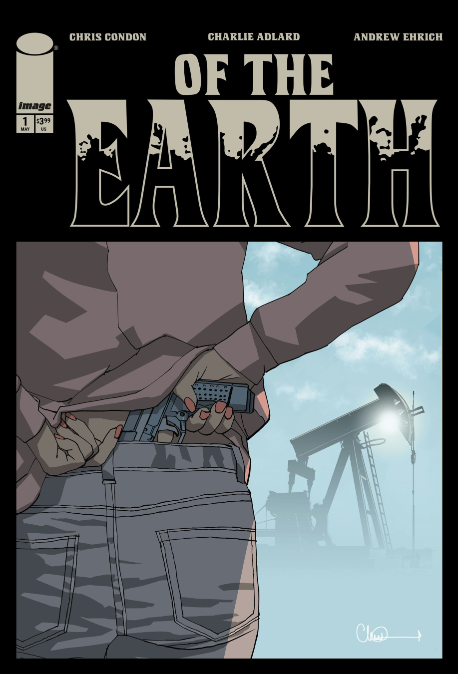
 WEPPPPAAAAAAAAA!!! Oh we OUT HERE in the dusty, sunburnt veins of America with something that don’t just hit it lingers, like heat off asphalt at high noon. Of the Earth #1 rolls up slow, quiet… then punches you in the chest when you ain’t looking. And trust me, that’s exactly how it wants it.
Right from jump, this joint got that eerie, slow-burn swagger. You crack it open and you already feel like something ain’t right. Not “jump scare” wrong nah, this is that creeping, crawling unease. The kind that sits in your passenger seat while you’re driving through nowhere, whispering, “you shouldn’t be here.” WEPA! That’s atmosphere, baby, and this team KNOWS how to weaponize it.
Chris Condon and Andrew Ehrich don’t rush a damn thing and that’s the magic. They build tension like a coil tightening, every line of dialogue feeling deliberate, grounded, real. Ain’t nobody over-talking. Ain’t nobody wasting space. This is that lean storytelling where every word got weight, like it’s dragging something behind it. And when you pair that with the whole “oilfield graveyard” mythology vibe oh man, now you cooking with gasoline. You feel history in this book. You feel folklore. You feel like somebody heard a story once and decided not to repeat it out loud again.
And then BOOM Charlie Adlard steps in like a silent assassin. Let’s talk about it. This ain’t flashy comic book art trying to flex muscles. This is mood art. This is storytelling through shadow, posture, and stillness. The man understands tension like a horror director. Every panel feels like it’s holding its breath. Wide shots of empty land? Oppressive. Close-ups? Intimate… almost uncomfortable. And those character expressions? Subtle, but they say EVERYTHING. You don’t just see fear you feel the moment it starts creeping in.
Now let’s get spicy Pip Martin’s colors? OHHHHH yeah. This is where the book locks in its identity. That dusty, sun-scorched palette? It ain’t just pretty it’s storytelling. The land feels dry, tired, almost hostile. Those yellows and browns don’t just say “desert” they say decay. They say something happened here. And when the tone shifts? You feel it instantly. That’s elite-level color storytelling right there.
And don’t sleep on Hassan Otsmane-Elhaou. Let me say it loud for the people in the back LETTERING MATTERS. And this dude is cooking. The pacing, the placement, the subtle shifts in tone it all works together to guide your eye and your heartbeat. Dialogue feels natural, tension feels timed, and when things get quiet? Oh, it gets LOUD in your head.
Mike Tivey on design? Clean. Purposeful. No nonsense. Everything feels cohesive, like this whole book was built with a singular vision not a bunch of pieces slapped together. That matters.
Now let’s talk about that opening sequence… that slow drip of information through that in-universe text about wildcatters and oilfield myths. That ain’t just flavor that’s foundation. That’s the kind of worldbuilding that sneaks into your brain and sets up the rules before you even realize you’re playing the game. It’s giving folklore. It’s giving generational whispers. It’s giving “don’t go out there after dark” and you don’t even know why yet.
Then we slide into our main narrative road, isolation, tension building like a storm you can’t see yet. The pacing? Chef’s kiss. It moves like a long drive where nothing’s happening… until suddenly EVERYTHING is happening. And when that moment hits yeah, you know the one WEPA!!! That’s impact storytelling. That’s how you make a reader FEEL something instead of just reading panels.
And let’s be real for a second this ain’t a “safe” comic. This ain’t trying to please everybody. This is mature, grounded, and unafraid to sit in uncomfortable spaces. It trusts the reader. It trusts the vibe. And that confidence? That’s what makes it hit harder.
What really got me though? The restraint. In a world where comics sometimes feel like they gotta shout to be heard, Of the Earth #1 whispers and somehow that whisper echoes louder than most explosions. It respects your intelligence. It lets you sit in moments. It doesn’t over-explain. And that? That’s premium storytelling.
This is one of those books where the real horror ain’t just what happens it’s what might be happening. It’s what’s lurking under the surface. It’s what’s buried in that land, in that history, in those stories people stopped telling out loud. Straight up? This is a VIBE comic. This is a “read it twice” comic. This is a “sit with it after you’re done” comic.
And if this first issue is just the ignition? Ohhhhhh we about to take a long, dark ride, fam.
WEPA!!!
CRUSADERS SCORE:
4/5
Writer: Chris Condon & Andrew Ehrich
Artist: Charlie Adlard
Colorist: Pip Martin
Letterer: Hassan Otsmane-Elhaou
Designer: Mike Tivey
Publisher: Image Comics

Leave a Reply
You must be logged in to post a comment.