
Destination Kill #1 Review: Joe Palmer Turns the Future Into a Riot
·Al Mega
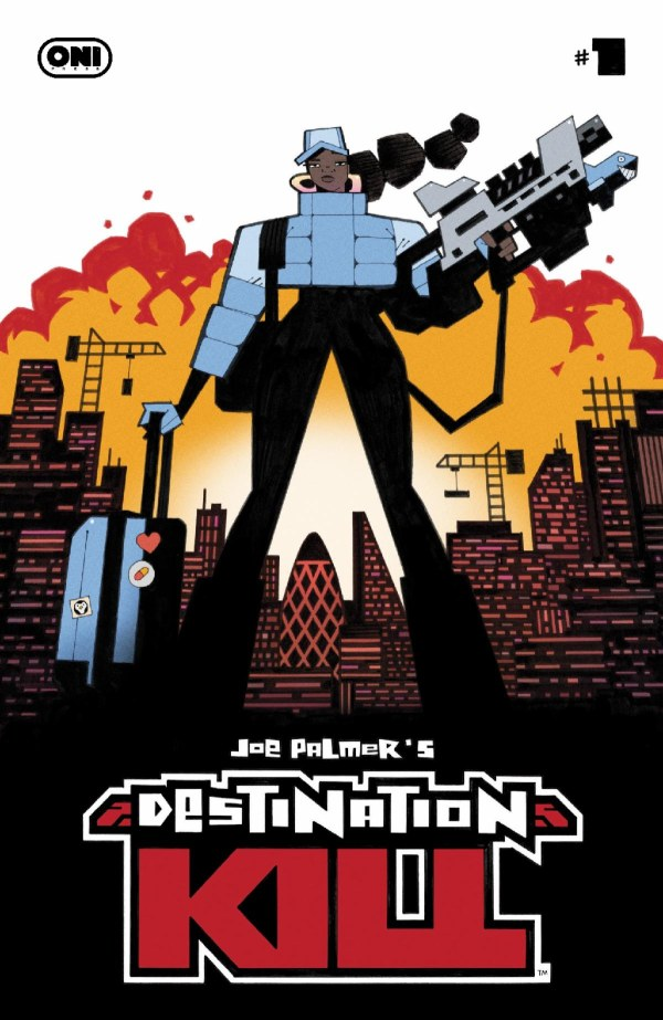
 Destination Kill #1 comes charging out of Oni Press like somebody duct-taped a protest sign to a jet engine and launched it straight through a corporate boardroom window. This is loud, weird, angry, funny, messy, sharp, and unapologetically wired on big dystopian comic book energy. Joe Palmer is not tiptoeing into this world. He is kicking the door open, knocking over the robot bartender, grabbing the mic, and yelling, “The future is cooked, fam!” And honestly? That’s the flavor right there.
Set in 2125, Destination Kill drops us into a future London transformed into Central City, a gleaming corporate-built machine where Overcon has pushed automation so far into everyday life that robot workers pour the drinks, hand out the meds, and keep the shiny dystopian dream looking presentable. Of course, behind all that polished progress is a mountain of displaced human labor, busted lives, angry builders, and people who have had enough of being told that replacement is innovation. WEPA, that part hits close to the ribs, because under all the cartoon chaos and sci-fi absurdity, this book is poking at something very real: what happens when “the future” keeps arriving, but regular people keep getting shoved off the train?
And speaking of trains, the Paradise Loop is one of the book’s biggest hooks: a transatlantic supertrain connecting London and New York in under an hour. That concept alone is wild enough to power a whole series, but Palmer uses it as the glittering symbol of Overcon’s ego. This is not just public transportation. This is corporate mythology on rails. It screams, “Look how advanced we are!” while the streets underneath are full of desperate workers, militarized cops, and people whose lives got bulldozed for the pretty brochure. It’s funny until it’s not. Then it’s funny again because the book has the nervous system of a punk-rock Saturday morning cartoon after three espressos.
The heart of the issue is Gina Serene, a stressed-out Central City detective who looks like she has not had a proper vacation since humanity invented unpaid overtime. Gina is a great lead because she is not presented as some flawless super-cop swaggering through mayhem. She is tired. She is medicated. She is over it. She wants order, but she also knows the system she works inside is one bad decision away from swallowing everybody whole. Her ex-partner, Lance Wingman, slides into the story with pure private-eye disaster energy, and the tension between them gives the issue some needed human spark. Lance is funny, shady, scruffy, and constantly feels like he is one sarcastic comment away from being punched through a wall. Together, they make a fun noir-flavored odd couple trapped inside a future-city riot simulator.
The strongest thing about Destination Kill #1 is Joe Palmer’s visual identity. This book does not look like most comics on the shelf, and that is a compliment with a gold star, a siren, and maybe a tiny robot blinking in the corner. Palmer’s cartooning is angular, exaggerated, kinetic, and stuffed with personality. The characters have rubbery silhouettes, big expressions, sharp body language, and designs that instantly separate the corporate elites, police units, workers, robots, and street-level weirdos. The art has that rebellious British sci-fi comic DNA running through it, but it also has its own comedic brutality. Everything feels like it could explode, collapse, glitch, or insult you in the next panel.
The action pages are where Palmer really starts cooking. When the riot breaks out, the panels get loud. Guns bark, robots stomp, bodies fly, sound effects crash across the page like graffiti with attitude, and the choreography has this madcap physicality that keeps the issue moving. The lettering and sound effects deserve a major shoutout because Palmer does not treat them like decorations. They are part of the artwork. The “DOOM DOOM DOOM,” “CHUGGA CHUGGA,” “TAK TAK,” and all that big, crunchy comic-book noise give the pages rhythm. It feels percussive. You can practically hear the issue banging on a metal table in the back of your brain.
Felipe Sobreiro’s color assists help lock in that deliciously off-kilter palette. The book leans into pinks, blues, yellows, reds, and murky urban tones in a way that makes the world feel artificial but alive. It’s not glossy future-tech. It’s candy-colored societal collapse. That’s a vibe. The colors help separate locations and moods too, from the cold corporate cityscapes to the warmer chaos of the streets and bars. This world is ugly, but it is ugly with style. Like a neon bruise wearing designer sneakers.
 Now, let’s keep it real because that’s how we do it over here at Comic Crusaders. Destination Kill #1 has a ton of energy, but sometimes that same energy becomes its own traffic jam. There is a lot happening in this first issue: corporate worldbuilding, labor uprising, police politics, Gina’s personal stress, Lance’s involvement, Overcon’s public spectacle, robot labor, class tension, riot action, and the setup for the bigger conspiracy. Palmer is throwing a whole toolbox into the air and catching most of it, but a few pieces do clank around. Some readers may feel like the story is racing so fast that the emotional beats do not always get enough room to breathe. Gina and Lance are immediately fun, but the issue could use a touch more quiet space to let their history simmer before everything starts blasting through walls.
The dialogue also has a specific comic rhythm that will work better for some readers than others. It is cheeky, rowdy, profane, and intentionally heightened. When it lands, it gives the book personality for days. When it gets too busy, especially alongside the dense visual action, it can make certain scenes feel like everybody is talking, yelling, shooting, and exploding at the same time. That is clearly part of the intended chaos, but it may overwhelm readers looking for a smoother, cleaner sci-fi thriller. This is not sleek sci-fi. This is grimy, brawling, bar-fight sci-fi with a broken tooth and a union card.
But even with those bumps, there is something exciting about a first issue that feels this fully authored. Destination Kill #1 is unmistakably Joe Palmer’s creature. You can feel the creator’s fingerprints on every crooked building, every chunky robot, every ridiculous weapon, every exhausted face, and every angry crowd scene. This is the kind of book that does not want to politely introduce itself. It wants to make noise, start arguments, and dare you to keep up. That ambition matters. Comics need books that are willing to be visually unruly and politically spicy without turning into homework. Destination Kill wants to entertain first, but it is also asking big, uncomfortable questions about automation, class, policing, corporate control, and who gets sacrificed when progress needs a ribbon-cutting ceremony.
Oni Press has been dropping some bold creator-driven material, and Destination Kill #1 fits right into that lane. It may not be a perfect opening chapter, but it is packed with enough personality, visual invention, and anarchic sci-fi attitude to make it worth the ride. This is a comic with teeth, elbows, and a faulty alarm system that will not stop screaming. If Palmer tightens the emotional pacing in future issues while keeping this level of visual madness, this series could become a sleeper favorite for readers who like their dystopia loud, satirical, and ready to swing a wrench at the future.
Destination Kill is wild, stylish, chaotic, and loaded with promise. Not every punch lands clean, but the ones that do? BOOM. They leave a mark. The Crusade Never Ends!
CRUSADERS SCORE:
3.5/5

Written & Drawn By: Joe Palmer
Color Assists By: Felipe Sobreiro
Lettering & Logo Design By: Joe Palmer
Designer: Winston Gambro
Editor: Bess Pallares
Assistant Editor: Azat Sayadi
Cover A: Joe Palmer
Variant Covers: Riley Rossmo, Ronald Wimberly, Tango, Liana Kangas
Publisher: Oni Press

Leave a Reply
You must be logged in to post a comment.