
Hammerfist #1 Review: Rick Remender and Steve Epting Deliver a Brutal Crime-Horror Knockout
·Al Mega
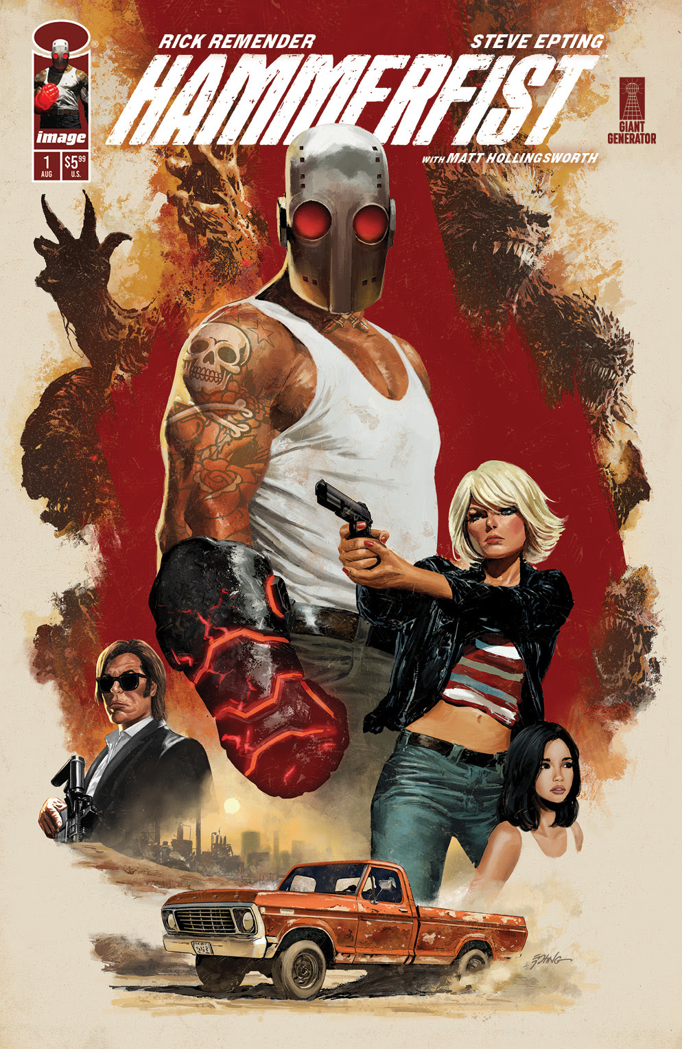
Wooooooo…! Now this is how you kick off a new Image Comics series with blood on the boots, crime in the air, and a cursed knuckle sandwich waiting in the kitchen. Hammerfist #1 comes out swinging like it owes somebody money, then realizes money ain’t enough and decides to punch a hole straight through genre itself. Rick Remender and Steve Epting take a dirty crime setup, drag it through a Nevada dust storm, toss it into a heist movie, then crack open the floorboards and let the horror crawl out. This thing starts grimy. Then it gets nasty. Then it gets wild in that “yo, what did I just read?” kind of way that makes a first issue stick to your ribs.
The issue opens in Lovelock, Nevada with a mood so dry and miserable you can practically taste the cheap motel coffee and bad life choices. Remender doesn’t over-explain the world, thank the comic gods. He lets the place speak. Trailer homes, busted routines, old violence, broke people, dangerous men, and that special kind of silence that only shows up before somebody makes a decision they can’t walk back. The opening sequence has patience, but not the boring kind. It’s the type of patience where the room gets tighter, the shadows get meaner, and you know somebody is about to leave with fewer teeth than they came in with.

Then comes the crime engine. Motel rooms. Cash. Diner booths. A crew coming together. Everybody got a look. Everybody got a problem. Nobody seems clean, and that’s the flavor, fam. Remender writes this like a hardboiled crime flick that found religion in the worst possible basement. You can feel shades of Reservoir Dogs in the tension, the distrust, the sharp little character interactions, and the way people talk around the thing they actually mean. But this ain’t some cute tribute act. Nah. Hammerfist has its own bruised personality. It’s meaner around the edges, more occult in the bones, and by the time the robbery setup really starts moving, the book has already planted enough dread under the floor to make you wonder what kind of nightmare is actually waiting in the vault.
Steve Epting is ridiculous here, and I mean that with full respect and a standing ovation from the back of the bodega. His return to Image hits like a prestige crime comic that got possessed halfway through production. The character acting is top-tier. Faces carry weight. Postures tell stories. A quiet look says more than a whole paragraph of exposition. The big lead has that perfect “walking consequence” energy, built like a man who has survived too many bad decisions and still hasn’t learned to stop making new ones. Epting gives him presence without turning him into a superhero pose machine. He feels heavy, tired, dangerous, and weirdly human, which makes the supernatural madness later hit even harder.

And when the action pops off, oh, it pops off. The heist sequence has clean choreography, clear staging, and real tension. You always know where people are, who has control, who thinks they has control, and who is about to find out they absolutely do not. That’s not easy. A lot of comics fake action with noise. Epting builds action with movement, space, impact, and rhythm. When the story shifts from crime chaos into full occult horror, the visual language expands with it. The glowing fist imagery is instantly memorable, like somebody forged a weapon out of rage, lava, and bad karma. It is a striking lead concept, the kind of visual hook that makes you go, “Yeah, that’s the cover. That’s the poster. That’s the thing people will remember.”
Matt Hollingsworth’s colors deserve a loud salute too. The early pages are soaked in dirty pinks, sick blues, dusty shadows, and motel-light misery. The world feels sunburnt, stale, and spiritually bankrupt, which is exactly what this story needs. Then the supernatural energy crashes in and the palette starts cooking with fiery reds, volcanic oranges, toxic glows, and that hellish crackle that makes the book feel like the temperature just jumped twenty degrees. Hollingsworth doesn’t just color the art, he helps steer the genre shift. Crime turns into horror. Dust turns into fire. Flesh turns into nightmare fuel. WEPA, that is the good stuff.

Rus Wooton’s lettering also keeps the whole beast moving. In a book with hard dialogue, gunfire, impact, panic, and supernatural eruptions, lettering can make or break the flow. Here, it lands clean. The sound effects have punch without swallowing the page, and the dialogue placement keeps Epting’s compositions breathing. That matters, especially when the third act starts throwing bullets, bodies, and occult mayhem into the same blender.
The book works because it does not blow all its mystery in one shot. It gives you enough to understand the danger, enough to enjoy the crime setup, enough weirdness to know something ancient and ugly is lurking underneath, and enough character tension to make the next issue feel mandatory. The book is not trying to be friendly. Good. Friendly is overrated. This is a filthy crime-horror debut with teeth, attitude, and a nasty little heartbeat. It has that old-school Image confidence where creators walk in and say, “We built a world. Come survive it.”
Hammerfist #1 is a brutal, stylish, blood-warmed launch that delivers crime grit, supernatural horror, and action-packed visual storytelling with real swagger. Remender brings the damaged souls and nasty momentum. Epting brings cinematic muscle and unforgettable character design. Hollingsworth brings the heat. Wooton keeps the chaos readable. Image Comics has a savage one here, Crusaders. This book doesn’t knock politely. It breaks the door, takes the cash, wakes the demon, and leaves you standing there like, “Damn… issue two, please.”
CRUSADERS SCORE:
4.5 / 5

Story: Rick Remender
Art: Steve Epting
Colors: Matt Hollingsworth
Letters: Rus Wooton
Created by: Rick Remender & Steve Epting
Publisher: Image Comics
In Shops:
August 26, 2026


Leave a Reply
You must be logged in to post a comment.