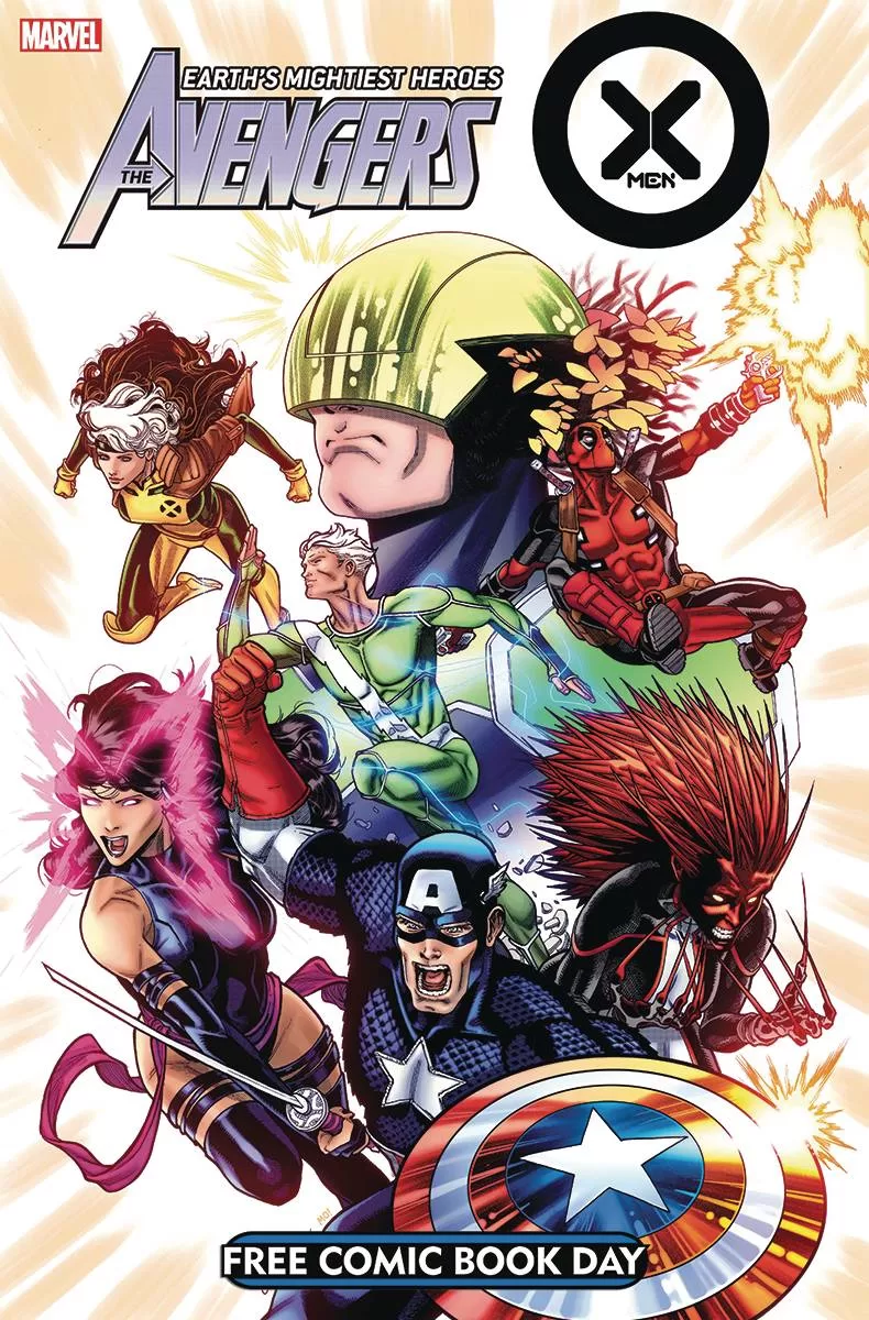
FCBD Review: Uncanny Avengers #1
 Reduce, reuse, recycle, and I’m not just taking about story ideas, seem to be all the rage at Marvel. With a major death in Amazing Spider-Man being more than hinted at, a restart for Captain Marvel on the cards, what better time then to resurrect (appropriate for this generation of X-books I’m sure), the Uncanny Avengers title.
It is a difficult time for the merry mutants. Goodwill in their gifts are waning, humans still fear them and Orchis is still around causing trouble. Could Captain Krakoa return to calm nerves? But when the suit is stolen by persons unknown, the ramifications on the mutant dream of cohabiting with humans could be devastating. A Fall of X perhaps?
Gerry Duggan allows a quick fast forward to July’s Hellfire Gala before teasing the aforementioned new title. The writing works for the most part, I don’t understand how Cyclops is so buff in the preview third yet goes down so easily. On to the main attraction, political shenanigans abound and an assassination attempt on Captain America, sows the seeds for the new team. It was clever idea to attack Cap in the water; not so clever in his means of escape with has more than the air of happenstance and coincidence about it, to eye-rolling effect. Still it is good to see a different take on the mutants. I do have to ask, is Steve Rogers a mutant after his own recent resurrection?
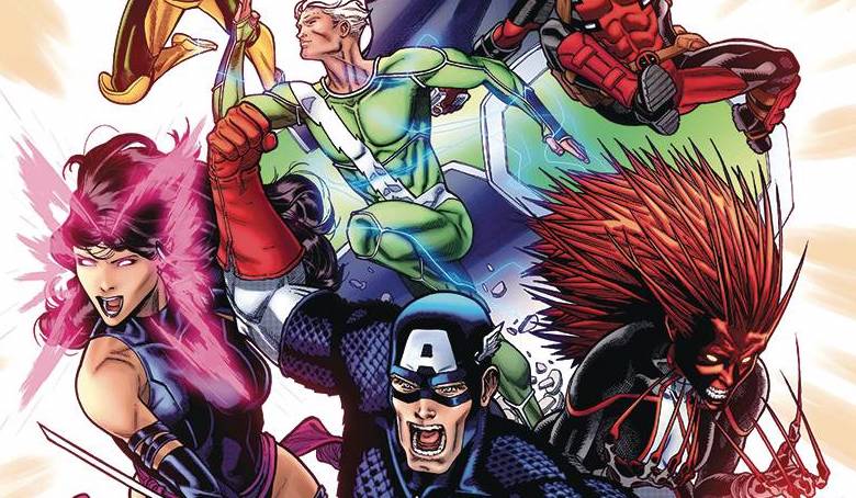
The art is provided by a couple of artists. Taking the X-Men third first; Joshua Cassara’s work feels like a mix of styles. The gala, focussing on Destiny and Mystique looks great with the ladies looking gorgeous beyond belief! The other aspects don’t work quite so well; I have already discussed buff Cyclops, is he really that big? I appreciate that the identity of the suit thief needs to remain a secret, but the colors from Marte Garcia in this section, with its darkness on top or more darkness doesn’t help the flow of the book. VC’s Clayton Cowles delivers his usual X-ccellent X-font.
The main third of the book, AKA “when Cap meets Rogue” features the Ed McGuiness like homage work from Javier Garrón which looks more Avengers than X-Men, thankfully. The art is pacy and works well with plenty of movement along with strong action elements. The final pages demonstrate the flexibility of Garrón’s pencils, delivering as he does a very technical panel. The colors from. Morry Hollowell have a darkness akin to the X-books, especially the scenes in Washington. Finally, VC’s Travis Lanham delivers a different font, visually showing that this is not, in the strictest sense, an X-book.
FCBD comics are hard to analyse. Last year, for example, I was so looking forward to Dark Web after the Spider-Man FCBD offering and look how that turned out? Still, taking it as it is, this book demonstrates everything that is great and not so great about the current X-corner of the Marvel Universe.
Writing – 3.5 Stars
Art (Cassara) – 3.5 Stars
Art (Garrón) – 3-5 Stars
Colors (Garcia) – 3 Stars
Colors (Hollowell) – 4 Stars
Overall – 3.5 Stars
Written by; Gerry Duggan
Art by; Joshua Cassara & Javier Garrón
Colors by; Marte Garcia & Molly Hollowell
Letters by; VC’s Clayton Cowles & VC’s Travis Lanham
Published by; Marvel Worldwide Inc.
Author Profile
- I am a long time comic book fan, being first introduced to Batman in the mid to late 70's. This led to a appreciation of classic artists like Neal Adams and Jim Aparo. Moving through the decades that followed, I have a working knowledge of a huge raft of characters with a fondness for old school characters like JSA and The Shadow
Currently reading a slew of Bat Books, enjoying a mini Marvel revival, and the host of The Definative Crusade and Outside the Panels whilst also appearing on No-Prize Podcast on the Undercover Capes Podcast Network
Latest entries

 Comic BooksApril 19, 2024Review: Jill and the Killers #4
 Comic BooksApril 11, 2024Review: Deadweights #1 (of 6)
 Comic BooksApril 10, 2024Review: Jim Henson’s Labyrinth Archive Edition #1 (of 3)
 Comic BooksApril 3, 2024Review: Red Sonja Empire of the Damned #1


