Review: James Bond 007 – For King and Country #1
 Talk about fast moving and keeping up with current affairs, sees Dynamite’s new James Bond mini series get something of an up to date title, for King and Country. I guess it doesn’t mater who is in charge when you work for the secret service, be it Queen or King, it is always country!
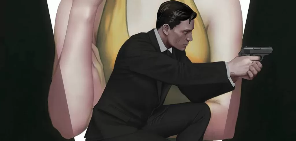
When a formerly assumed dead colleague and ex 00 returns from the grave, it means that world has tuned upside down. What follows drives James Bond off the grid in an effort to survive. But being branded a traitor means that both the good and bad guy are hot on his trail. With a virus let loose in the mercenary community, who can stand in its way, when the resources Bond used to trust are out to kill him.
Phillip Kennedy Johnson, of Action Comics fame, delivers a convoluted and complicated first issue that is steeped in setup. A brave choice for a character that could be seen as an action hero first and foremost. Johnson’s script works brilliantly, delivering a fallen hero story that works a lot better than some of the recent movies, specifically Skyfall. Kennedy gives us a Bond that seems confident in what he knows and is somewhat beaten by the actions of others. It is a true “one man can make a difference” kind of affair. Pay attention as you read; there is a lot going on, Kennedy is clearly drafting for the mature audience.
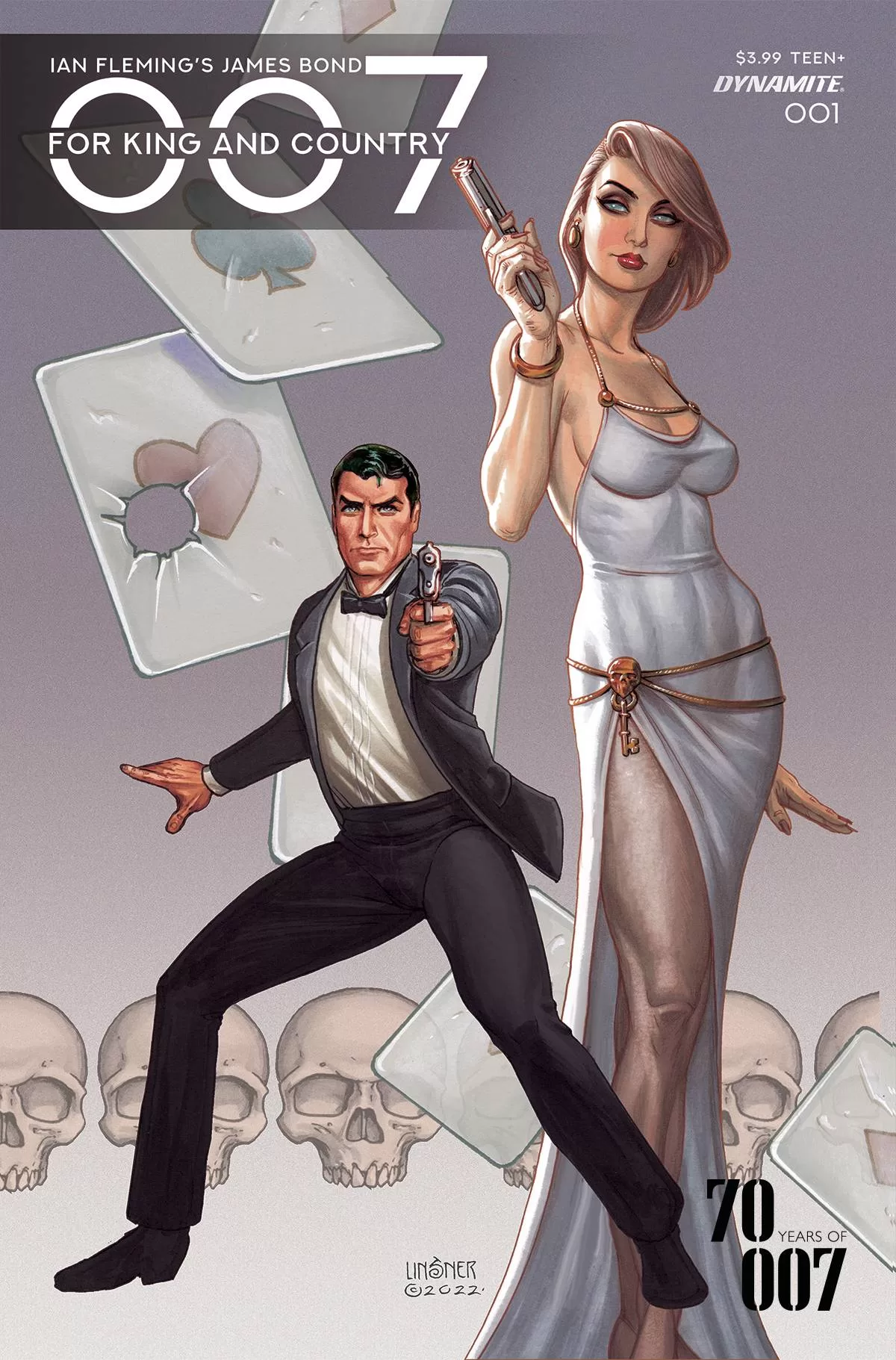
The art is provided by Giorgio Spalletta who takes a kind mish-mash approach to the titular hero. Everyone has a favourite Bond, so in order not to annoy any one group of fans, Spalletta’s Bond has a more Action Man (UK readers will know who I mean) visage and statue. He just needs gripping hands and eagles eyes and we are sorted! The returning 003 has a classic look, kind of like Kristen Scott Thomas, showing that there is a softer, finer side to Spalletta’s pencils. The body frames work throughout the book, be it the action or conversation sections. The thing that really stands out, for me at least, are the colors from Francesco Segala with an assist from Agnese Pozza who bathes the book with textures and tones fitting with the various feelings of warmth, surreptitious clandestine meetings and the hues os both spring and the promise of a darker future. Finally, Jeff Eckleberry’s font is angular in places and he does well not to let the amount of verbiage required for the complicated story.
This book is a great example of who the creative process should work, with writer, artist, colorists and letterer producing their best work for a character that Dynamite have breathed new life into over the last few years.
Writing – 5 Stars
Art – 5 Stars
Colors – 5 Stars
Overall – 5 Stars
Written by; Phillip Kennedy Johnson
Art by; Giorgio Spalletta
Colors by; Francesco Segala & Agnese Pozza
Letters by; Jeff Eckleberry
Published by; Dynamite Entertainment
Author Profile
- I am a long time comic book fan, being first introduced to Batman in the mid to late 70's. This led to a appreciation of classic artists like Neal Adams and Jim Aparo. Moving through the decades that followed, I have a working knowledge of a huge raft of characters with a fondness for old school characters like JSA and The Shadow
Currently reading a slew of Bat Books, enjoying a mini Marvel revival, and the host of The Definative Crusade and Outside the Panels whilst also appearing on No-Prize Podcast on the Undercover Capes Podcast Network
Latest entries

 Comic BooksApril 19, 2024Review: Jill and the Killers #4
 Comic BooksApril 11, 2024Review: Deadweights #1 (of 6)
 Comic BooksApril 10, 2024Review: Jim Henson’s Labyrinth Archive Edition #1 (of 3)
 Comic BooksApril 3, 2024Review: Red Sonja Empire of the Damned #1


