Review: Van Helsing vs Invisible Woman One-Shot
 What do you do when you have a premier vampire hunter in your stable of books? Thats right, get her to chase down anything but a vampire. The old Zenescope gender swap is in full effect as this time around Van Helsing goes up against the Invisible Woman.
Months ago, a doorway to another dimension opened. Though the threat was sorted at the time, doors open both ways and no0one knew what had come through, Now those that came through are making the presence felt, though here not necessarily seen. The Invisible Woman does the first thing that any number of people would do with invisible powers; stalk a pretty girl! Whislt conducting her research, she gets to see Van Helsing at her vicious best and at her softest. This book is one of Zenescope’s over-sized books, so true to form this is something of lead off for a greater threat or story down the line.
From a story by Joe Brusha, Ralph Tedesco, Dave Franchini and Pat Shand, Pat Shand gets the writing credit. I like Shand a lot. His Grim Fairy Tale book reminded me of Claremont in sense of planning and plotting for the long haul along with some interesting character developments. You could argue that without Shand, would Skye Mathers be as popular? Here Shand gets to work with the most over-used idea in comics today; no not the 9 panel page, but the idea of a multiverse! Seriously, is every publisher on this train right now? Granted, where magic is concerned, Zenescope have not been shy with this trope, but the timing feels wrong. Shand’s writing is solid as you would expect, serving to try and set up the bigger story whilst also delivering a recap to bring new readers up to speed.
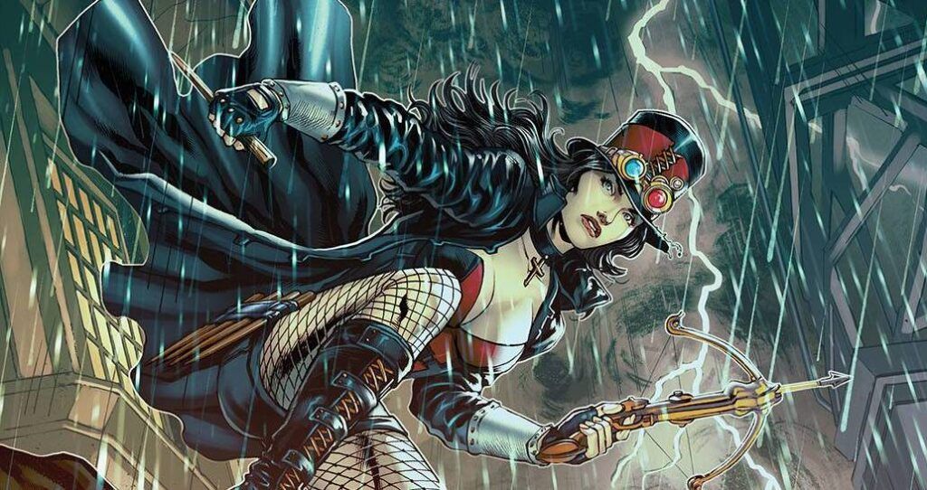
Rodrico Xavier provides the art work. To say that I am disappointed is an understatement. I guess I just don’t understand how a hot pant wearing, basque covered, fishnet sporting woman can look so unattractive! This may seem harsh; there are a couple of good panels, mainly when the focus is on the face, the last panel is gorgeous, but the majority of poses are awful with inconsistent body frames. The best art is actually the pages covering the history of the Invisible Woman. Colors are supplied by Ceci De La Cruz and again the past elements really work, whereas the time spent in the lab feels less detailed. Letters are provided byTaylor Esposito of Ghost Glyph Studios who does his usual excellent work on the font. I will say that the coloring of the text boxes during the third act is a tad confusing as they are very similar making the conversation hard to follow. As always there are a few variants kicking around; for me cover C by Ivan Tao (at the top of the review) is the one to look for.
I understand why Zenescope are publishing the over-sized books and honestly I don’t have an issue with it. I think that there is a place on the rack for single issue stories. I do have an issue with the overall quality of the book, which feels inconsistent and, ironically for an over-sized issue, feels bloated. More care and attention required.
Writing – 3 Stars
Art – 3 Stars
Colors – 3 Stars
Overall – 3 Stars
Story by; Joe Brusha, Ralph Tedesco, Dave Franchini and Pat Shand
Written by; Pat Shand
Art by; Rodrico Xavier
Colors by; Ceci De La Cruz
Letters by; Taylor Esposito of Ghost Glyph Studios
Published by; Zenescope Entertainment
Author Profile
- I am a long time comic book fan, being first introduced to Batman in the mid to late 70's. This led to a appreciation of classic artists like Neal Adams and Jim Aparo. Moving through the decades that followed, I have a working knowledge of a huge raft of characters with a fondness for old school characters like JSA and The Shadow
Currently reading a slew of Bat Books, enjoying a mini Marvel revival, and the host of The Definative Crusade and Outside the Panels whilst also appearing on No-Prize Podcast on the Undercover Capes Podcast Network
Latest entries

 Comic BooksApril 19, 2024Review: Jill and the Killers #4
 Comic BooksApril 11, 2024Review: Deadweights #1 (of 6)
 Comic BooksApril 10, 2024Review: Jim Henson’s Labyrinth Archive Edition #1 (of 3)
 Comic BooksApril 3, 2024Review: Red Sonja Empire of the Damned #1


