
G.I. JOE #26 REVIEW – NIGHT FORCE DOESN’T COME TO PLAY
·Chris Crash
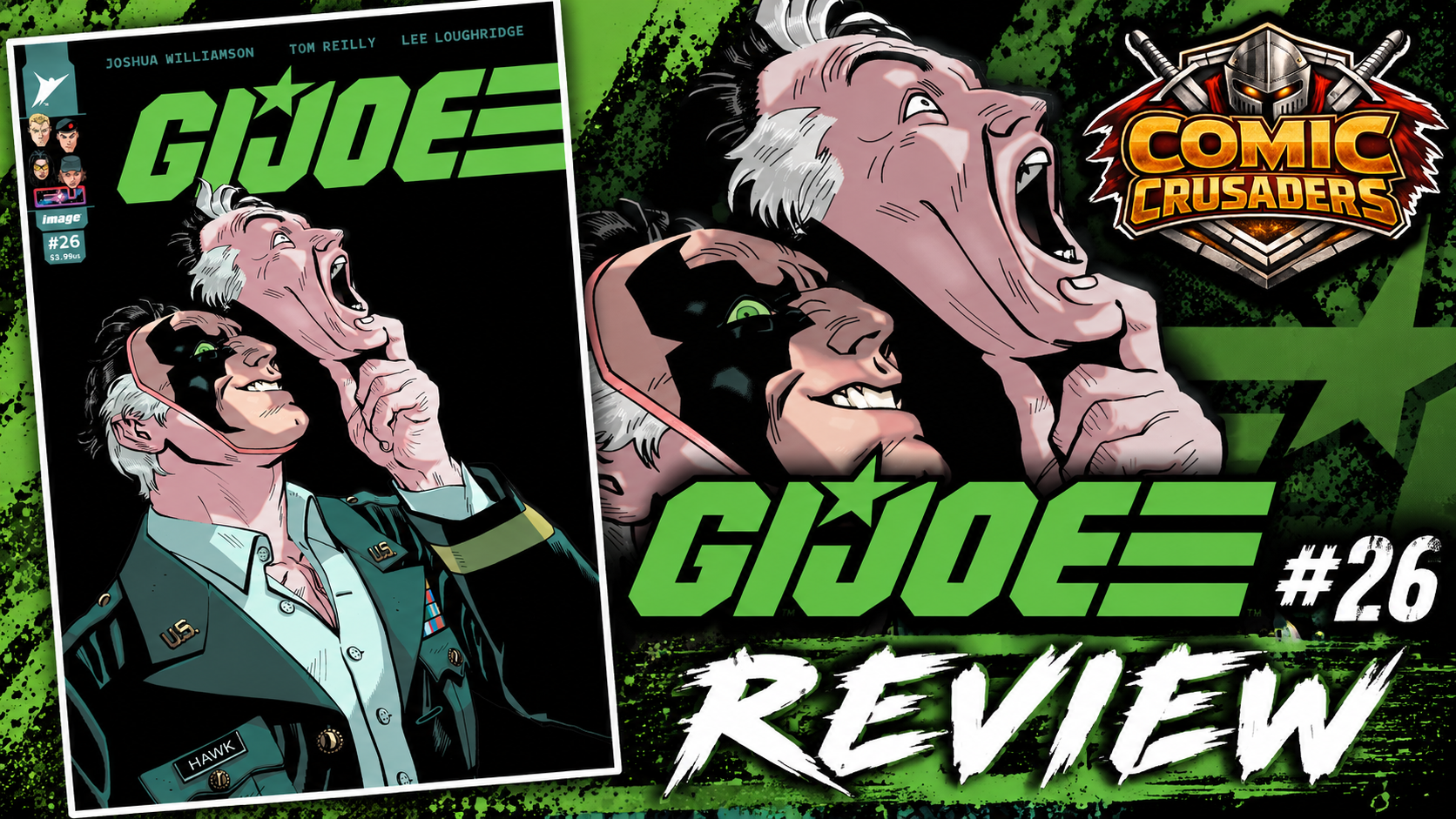
Yo, G.I. Joe #26 wastes absolutely ZERO time before somebody catches hands. Joshua Williamson basically looks at the fallout from #25, looks at G.I. Joe and Night Force standing on opposite sides of this Baroness mess, and says, “Yeah, screw the meeting. Let them work it out the old-fashioned way.” And I am here for it. No fifteen-page briefing, no everybody sitting around a table explaining what we already know, just military tension, busted loyalties, dangerous hardware and enough physical punishment to make me wonder whether Hasbro includes medical coverage with the action figures. This issue knows exactly what kind of book it wants to be, and once the gloves come off, they stay the hell off.
What works for me is that this is not some random “heroes fight because comics” nonsense. These people know each other. They have history. There is respect buried underneath all that anger, and everybody involved thinks they are the one protecting the mission. That makes every punch feel a little nastier because nobody here is fighting just to prove who has the bigger action figure. Night Force does not suddenly become a squad of assholes because the story needs villains, and the Joes are not walking around with glowing halos over their helmets either. Williamson lets both sides have a point, then lets those points collide at high velocity. Now THAT is how you make a team-versus-team fight mean something.

Tom Reilly, Man! Reilly is out here making this shit look EASY. Fight-heavy comics can turn into visual soup real fast. You know the pages I mean. Somebody is punching somebody, there is a leg coming from somewhere, three guns are firing, and suddenly you are staring at the panel wondering who the hell is even standing anymore. Not here. Reilly keeps the geography crystal clear while bodies are moving, weapons are firing and everybody is having the worst day imaginable. His layouts have speed without becoming sloppy, and his impact shots actually feel like IMPACT. You feel the wind-up, the hit and that beautiful little “oh damn, that probably hurt” moment afterward. As somebody who loves toys and action figures, I also appreciate how much personality he gets out of the gear, uniforms and physical silhouettes. These characters look like people you immediately want on the shelf, but the comic never feels like it is trying to sell you the shelf.
Lee Loughridge comes in with those cold blues, military greens and muted tactical tones that give the whole issue this proper night-ops vibe without falling into the classic trap of “it is nighttime, so I guess nobody needs to see shit.” Thank you! When the violence kicks up, the oranges, reds and yellows punch straight through those colder colors, so gunfire and explosions actually feel disruptive instead of blending into the scenery. More importantly, the characters remain readable against the environments. That sounds basic until you read enough action comics where camouflage apparently means camouflaging the entire damn page. Loughridge gives Reilly’s linework room to breathe while still making the book feel dirty, dangerous and tactical.
Rus Wooton deserves his flowers too because lettering an issue moving this fast can either keep the engine running or throw a wrench directly into it. Here, everything flows. Dialogue balloons guide you naturally through the panels, the sound effects have enough attitude to make those hits feel louder, and nothing starts covering Reilly’s work just because somebody discovered the giant-font button. You probably will not stop halfway through the issue thinking, “Damn, that balloon placement is fantastic,” because normal human beings do not read comics like psychopaths. But when lettering is bad, EVERYBODY notices. Wooton keeps the rhythm clean and lets the violence breathe, which is exactly what this issue needs.
The Cobra Commander and Major Medusa material works because Williamson understands that not every subplot needs to jump onto the table screaming, “LOOK AT ME TOO!” There is bigger shit moving behind this Joe versus Night Force confrontation, and we get enough of that machinery turning to remind us that this universe does not stop just because our heroes are currently beating the brakes off each other. My one real criticism is that #26 is absolutely benefiting from the work already done in this run. Could somebody grab this cold and understand who is punching whom? Sure. Would they understand why those punches matter? Not nearly as much. This is not the issue I would toss at somebody and say, “Here, start G.I. Joe with this.” The emotional payoff belongs to readers who have been watching these relationships crack.

Now here is where the collector side of my brain gets happy. G.I. Joe #26 respects the toys, uniforms, weapons, vehicles and ridiculous amount of iconography this franchise has accumulated without turning the comic into a twenty-something-page toy commercial. There is a difference between honoring the stuff people grew up loving and constantly elbowing the reader in the ribs going, “REMEMBER THIS? REMEMBER THIS GUY? YOU OWNED THIS!” This run gets that. It LOOKS like G.I. Joe. It FEELS like G.I. Joe. But the Energon Universe is still allowed to screw with the furniture. Alliances break. Characters change. Decisions have consequences. Nostalgia gets invited to the party, but thankfully nobody lets it control the damn playlist.
So yeah, G.I. Joe #26 kicked my ass in exactly the way I wanted it to. Williamson keeps the story lean and lets character conflict drive the violence, Reilly stages the action so cleanly that you can practically pose the damn panels, Loughridge makes nighttime tactical warfare look atmospheric without making me crank my screen brightness to 900 percent, and Wooton keeps every conversation, explosion and body slam moving in the right direction. It is aggressive, clean, fun and just messy enough emotionally to make all that fighting matter. If you have been riding with this run, put #26 in the pull pile. And maybe buy the Joes some ice packs. These dudes are gonna need them.
CRUSADERS SCORE:
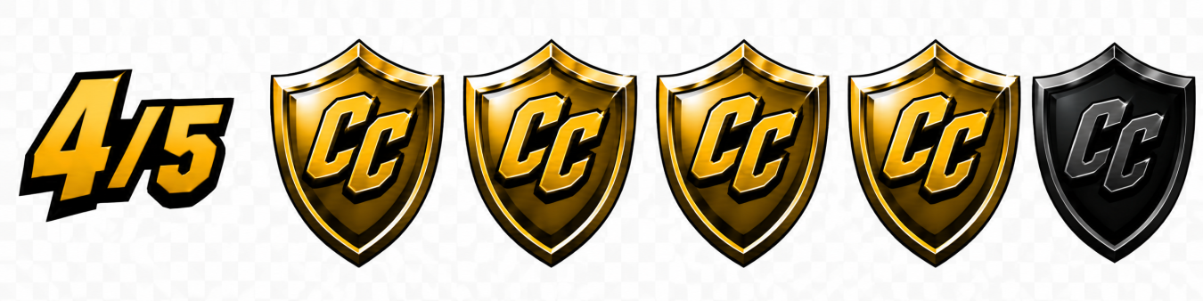
4/5
Writer: Joshua Williamson
Artist: Tom Reilly
Colorist: Lee Loughridge
Letterer: Rus Wooton
Editor: Ben Abernathy |
Publication Design: Andres Juarez
Production: Abigail Lee
Publisher: Image Comics / Skybound
On Sale:
September 16, 2026
Leave a Reply
You must be logged in to post a comment.