
The Head: A Legend Is Born Review | MTV’s Weirdest ’90s Hero Still Has Bite
·Al Mega
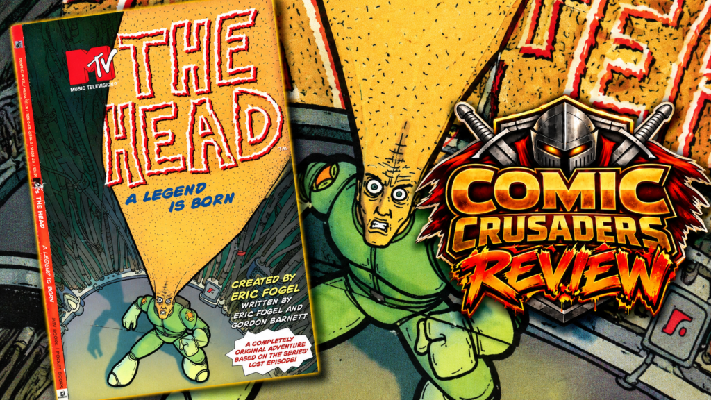
Yo, familia, remember when MTV was actually willing to get weird? I’m talking REAL weird. Not some executive-approved, focus-group-tested little oddball with a cute catchphrase. I’m talking a regular dude named Jim whose head looks like somebody parked a traffic cone on his shoulders, a purple alien named Roy living inside that enormous dome, and a city full of people who somehow still find time to complain about everyday nonsense. The Head: A Legend Is Born, the 1996 MTV Books/Pocket Books adaptation, is a beautiful reminder that the ’90s had absolutely no problem being strange in public. I miss that energy, man.
Eric Fogel and Gordon Barnett take the premise from MTV’s The Head and throw us into an alien-invasion story with a whole lot of New York attitude. Jim isn’t some polished superhero who wakes up knowing how to save the world. He’s an awkward guy trying to survive the day while Roy, his extraterrestrial tenant, drags him into a conflict that’s way bigger than either one of them. There’s a whole cast of misfits orbiting the madness, including the sharp-tongued Raquel, and the book knows the funniest thing about these characters isn’t that they look ridiculous. It’s that they argue, panic, get annoyed, and keep moving like regular New Yorkers who just happen to be surrounded by intergalactic lunacy.
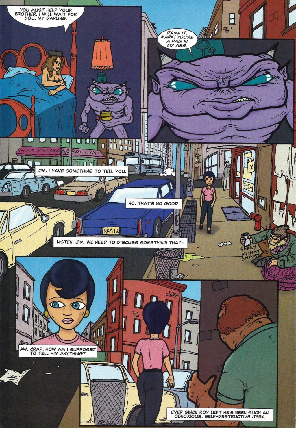
The first stretch hits that old-school cartoon sweet spot. Jim’s bizarre new circumstances collide with Roy’s mission, the threat keeps getting uglier, and the book finds room for little jokes without constantly elbowing you in the ribs. One minute somebody’s having a conversation in an apartment; the next, a massive yellow creature is tearing through the city like it owns the block. Roy’s attitude is half the entertainment. He’s small, purple, cranky, and carries himself like the toughest guy in the room. Jim, meanwhile, looks like he’s still trying to figure out how this became his life. That’s a good comedy pairing, familia.
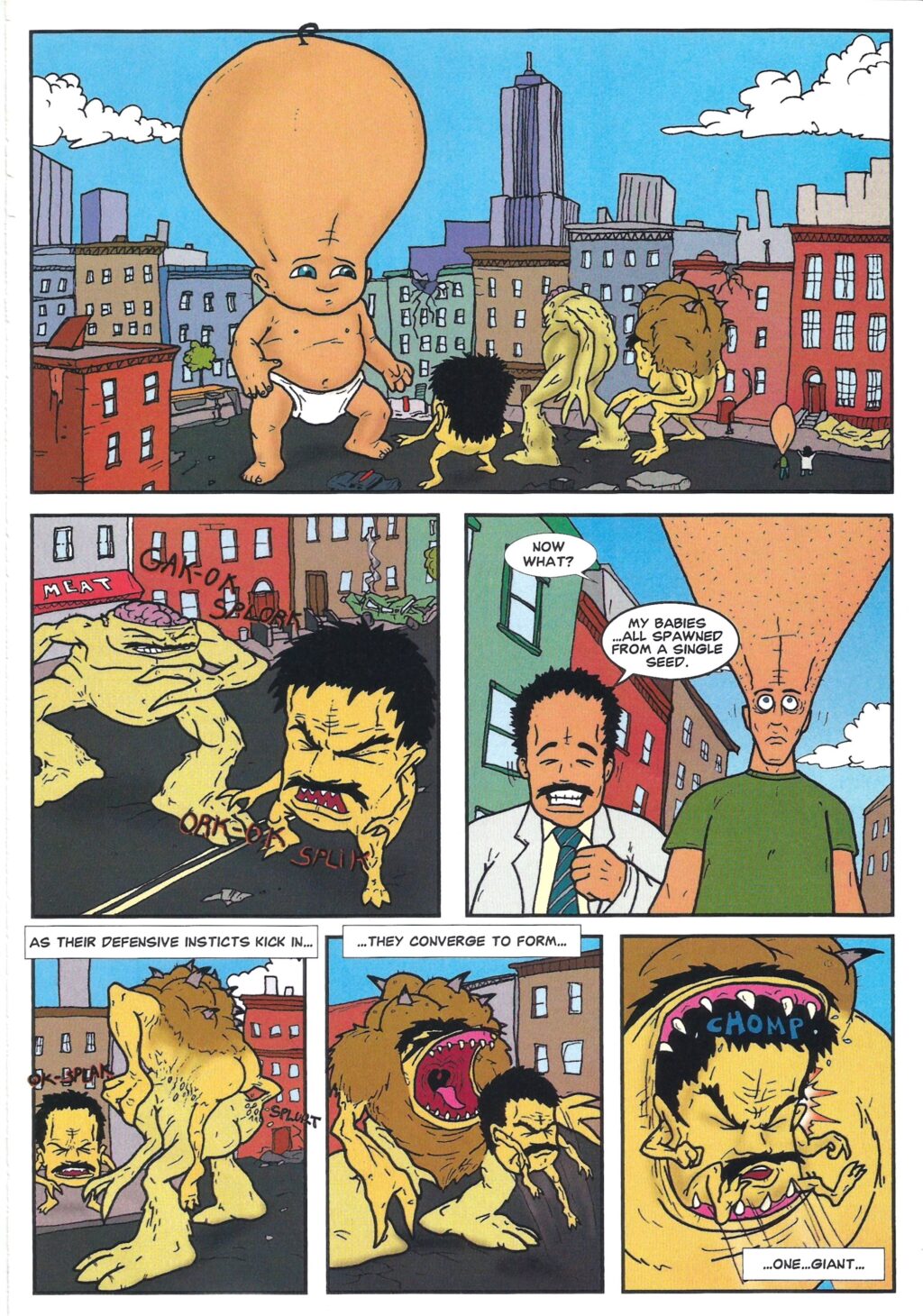
Then things go full Saturday-morning fever dream. Alien ships, military interference, grotesque transformations, strange technology, and fights that make absolutely no attempt to behave like a grounded superhero comic. There’s a sequence involving a giant yellow monster that practically dares you not to grin. Later, the story moves deeper into the extraterrestrial conflict, and the character dynamics get more interesting as Jim has to stop being a spectator in his own ridiculous adventure. The book’s four-chapter structure keeps raising the stakes, though the middle can feel like one frantic chase crashing into the next. Sometimes I wanted a little more room for the characters to breathe before another monster started wrecking somebody’s afternoon.
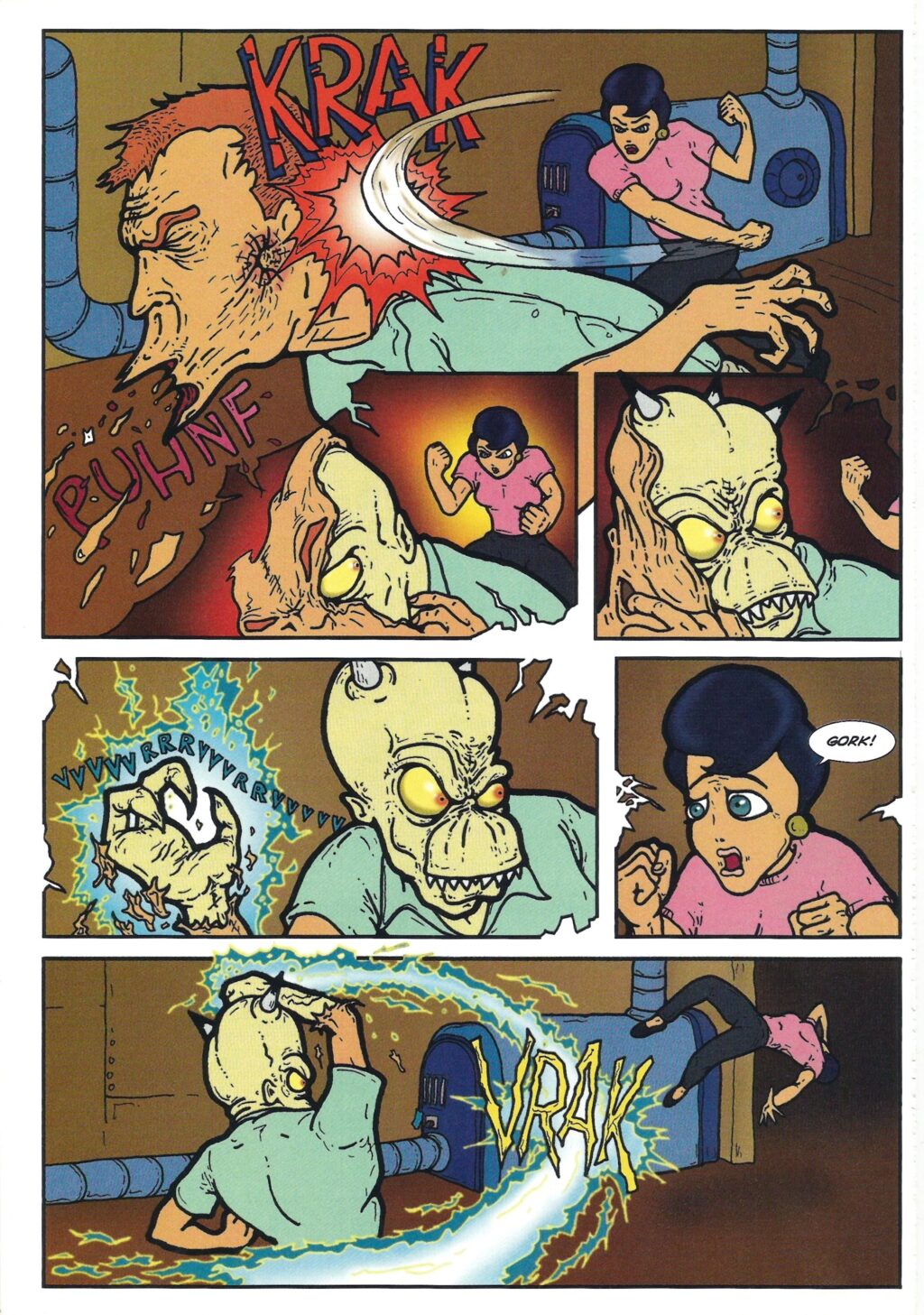
Visually, this thing is a time capsule, and I mean that with love. The artwork isn’t trying to compete with the slick superhero illustration coming out of the major publishers in 1996. The figures are deliberately lumpy, faces contort into ridiculous expressions, and Jim’s gigantic forehead becomes its own storytelling device. The cityscapes have that slightly grubby, angular cartoon quality that fits the material perfectly. Artists Chris Prynoski, Jody Schaeffer, Brad McDonald, and Matt Sheridan are credited on the book, with digital ink-and-paint work by Soo Kim and James Edwards. Those contributions matter because the color and line treatment carry so much of the comedy. The bright greens, purples, yellows, and bruised blues make every creature look like it crawled out of a particularly unhinged animation cel.
There’s also a trade-off to adapting an animated property into this kind of comic presentation. Some pages explode with personality, especially when the action gets big and the sound effects start flying. Others have stiff transitions or crowded speech balloons that make the reading rhythm bumpier than it should be. The humor occasionally depends on timing that would probably hit harder with the show’s voices and movement. That’s not a dealbreaker, but it’s noticeable. The book works best when it embraces what comics can do: big reaction shots, exaggerated compositions, and grotesque creature designs that let your imagination fill in the motion.
Here’s why I’d still put this in front of a fan of weird ’90s animation. The Head has personality coming out of every ridiculous pore. It belongs to that glorious stretch when MTV animation didn’t feel obligated to look respectable, and when an offbeat creator-driven premise could carry a whole adventure without somebody insisting it needed to resemble Batman. The storytelling is messy in spots, the pacing gets noisy, and the art isn’t always clean. Good! This isn’t a book that should look like it arrived wearing a tie. It’s an eccentric little artifact with monsters, heart, sarcasm, and enough alien insanity to remind you why we loved discovering oddball comics in the first place. If you grew up on MTV’s Oddities, this one feels like running into an old friend who still owes you five bucks.
CRUSADERS SCORE:
3.5/5
Created by: Eric Fogel
Writers: Eric Fogel, Gordon Barnett
Artists: Chris Prynoski, Jody Schaeffer, Brad McDonald, Matt Sheridan
Art and Computer Supervisor: Patrick Worlock
Digital Ink and Paint Coordination: David McGrath
Digital Ink and Paint: Soo Kim, James Edwards
Digital Effects: Adam Osterfeld, Chris Prynoski, Patrick Worlock, Eric Fogel
Color Design: Monica Smith, Sophie Kittredge
Art Direction: Roger Gorman, Reiner Design Consultants, Inc.
Design Coordination: Hannah Leider, Reiner Design Consultants, Inc.
Production Supervision: Dominie Mahl
Production Assistant: Dave Huges
Publisher: MTV Books / Pocket Books
Original Publication: April 1996
Leave a Reply
You must be logged in to post a comment.