
The Scope #1: Nemby’s Awakening Part 1 Review
·Daniel Black
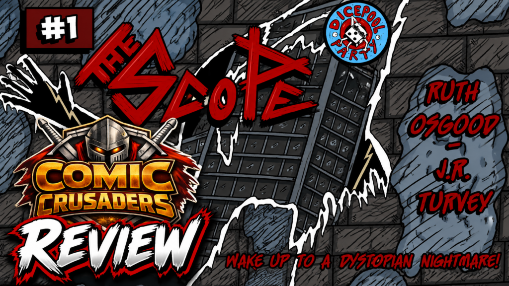
The Scope #1: Nemby’s Awakening feels like catching a hungry band in some cramped Brooklyn spot before anybody knows their name. Everything ain’t polished yet. You hear the amp buzzing, somebody comes in half a second early, maybe a cable is being held together with electrical tape and prayer, but there is something happening in that room. You stay. That is what Ruth Osgood and J.R. Turvey have here. This book is rough around the edges, absolutely, but it has personality, strange creatures, awkward human moments and a handmade identity that feels like these creators are building their own joint instead of checking boxes from somebody else’s comic book blueprint.
Osgood’s writing is strongest when she lets Nemby react like an actual person who suddenly realizes the world around her is getting way weirder than she signed up for. The dialogue has this loose, natural quality where the humor can sneak into a conversation without somebody stopping everything to announce the joke. I dug that. Nemby gives us a believable way into all this madness because she is not walking around acting like supernatural insanity is just another Tuesday. When things get strange, she looks rattled. When something does not make sense, you can see her trying to catch up. There are moments where the exposition comes through a little too clean and direct, but Nemby’s personality keeps those scenes from turning into somebody reading the instruction manual out loud.
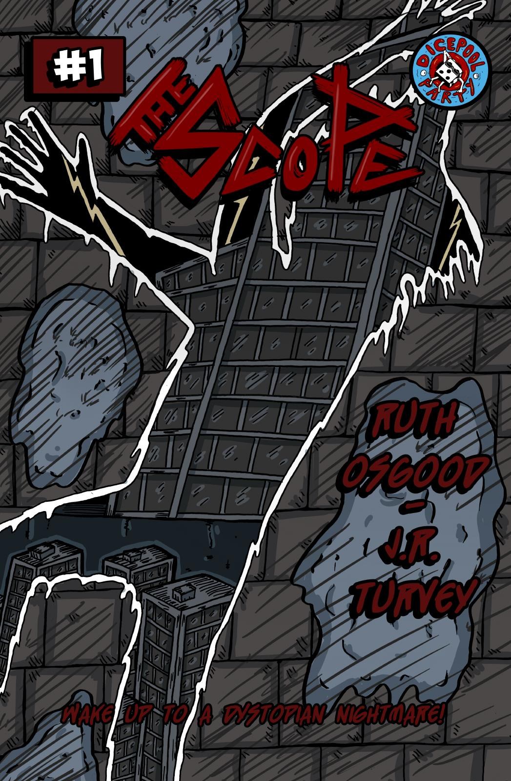
Turvey’s artwork has the same DIY energy. The pencils, inks and colors are not chasing slick superhero-house-style perfection, and this book would probably lose something if they did. Faces stretch. Bodies get strange. Monsters look like they crawled out of somebody’s notebook at three in the morning after too much coffee and not enough sleep. Even the environments can bend around whatever mood the scene needs. When Turvey leans into that weirdness, The Scope starts developing its own visual language. You are not looking at another indie comic desperately trying to cosplay as Marvel or DC. This thing has grime under its fingernails.
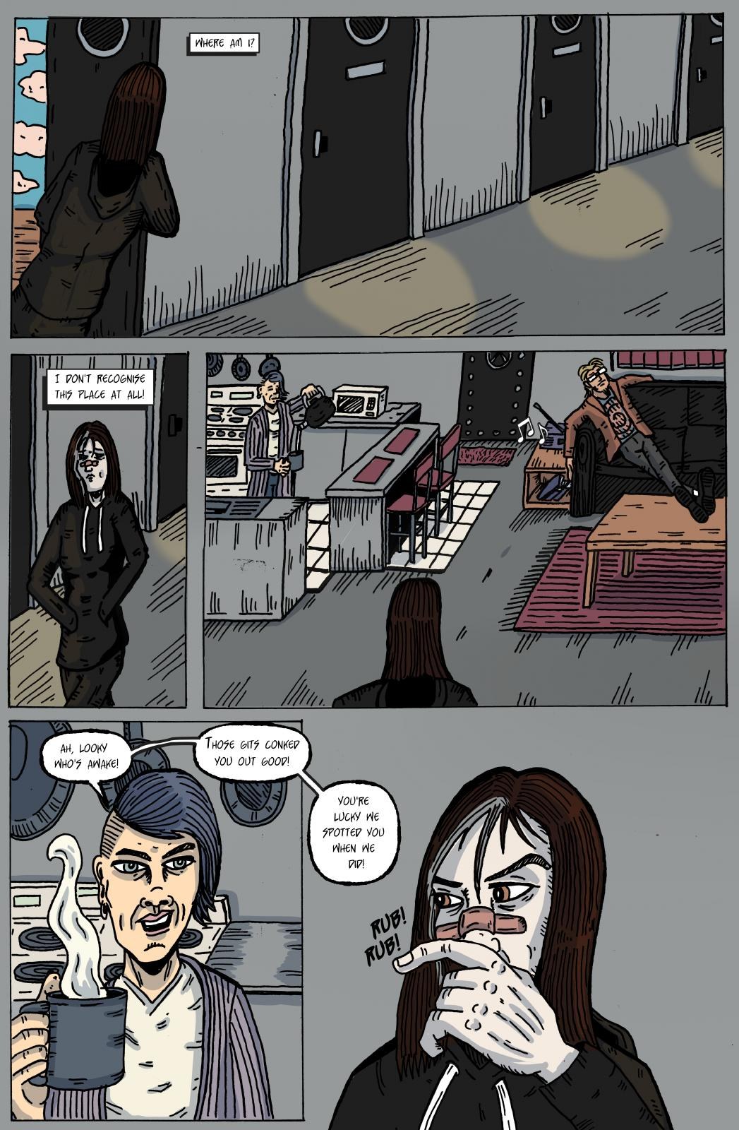
That same handmade quality comes through in the character designs. Nemby’s long hair, exhausted face and increasingly “what the hell is happening to my life?” expressions make her easy to follow even when the world around her starts losing its damn mind. Then the stranger characters push further into these exaggerated, almost underground-zine shapes. That contrast works. The normal world looks one way, then the supernatural starts ripping through it like somebody tore open the page underneath. When Turvey really pushes that separation, the comic gets interesting fast.
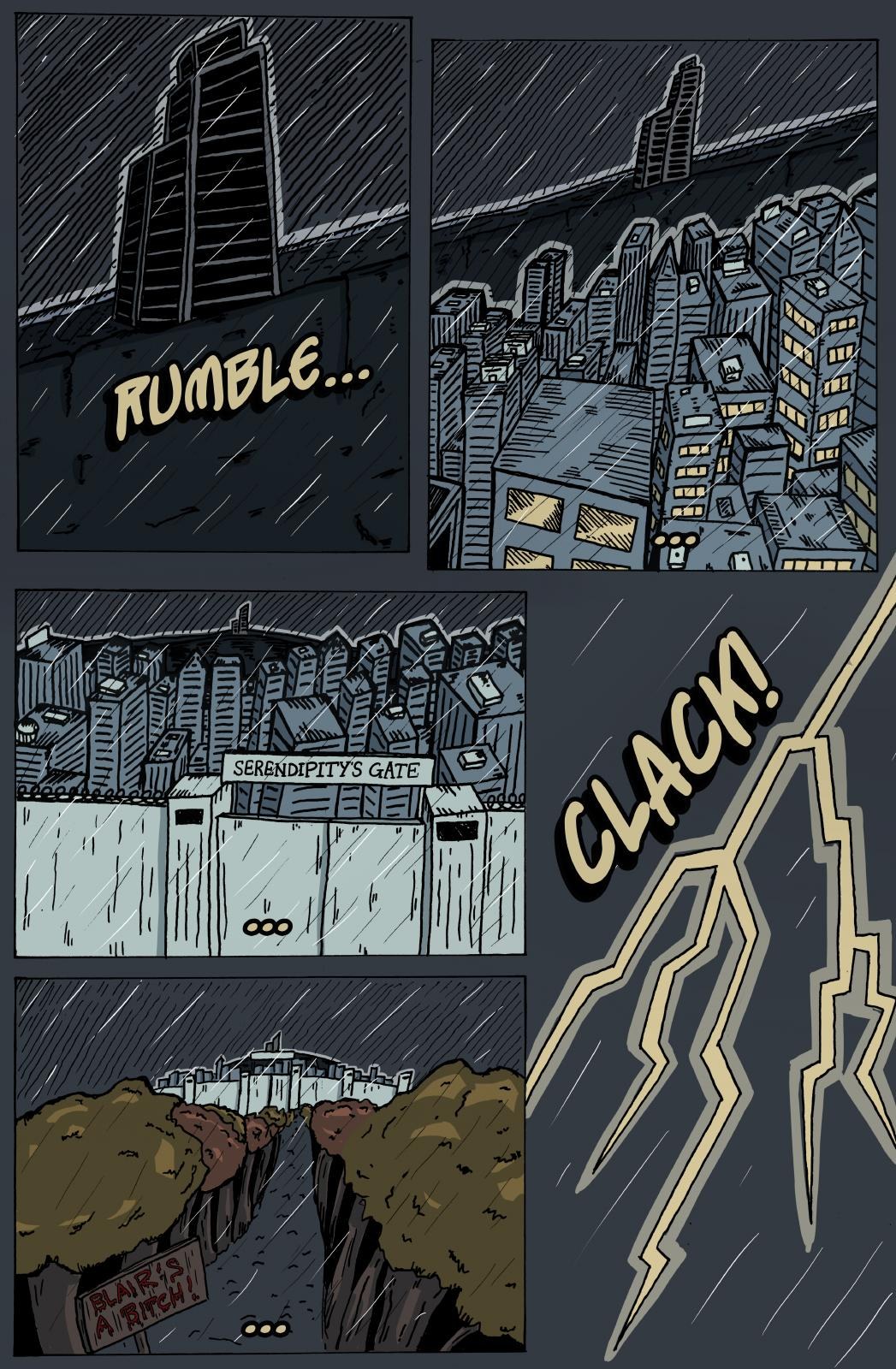
Where the book needs some tightening is the sequencing. There are transitions that jump to the next beat before the previous one has fully landed, and occasionally the panels get crowded because the dialogue, effects, acting and movement are all asking for your attention at the same damn time. There is energy there, but energy still needs direction. Clean up that visual hierarchy and suddenly the same raw artwork starts hitting twice as hard because now the reader knows exactly where the eye is supposed to go. Osgood’s lettering carries a lot of weight too, and giving some balloons more breathing room while trimming the heavier blocks would immediately smooth out the reading rhythm.
I would also tell this team one thing going into issue #2: trust the silence. Seriously. You already got my attention. You do not have to explain every weird thing five seconds after showing it to me. Let one of those creepy images sit there for a beat. Let Nemby stare at something and give us time to stare with her. Let the reader wonder, “What the hell did I just see?” before somebody starts talking again. Horror needs oxygen. Comedy does too. Giving those moments another second to breathe could make the scary stuff creepier and the funny reactions hit harder without changing anything about the personality of the book.
The environments could use that same attention going forward. I do not need every brick in every building rendered like somebody is submitting architectural plans to City Hall, but stronger establishing shots would help anchor us before reality starts getting bent out of shape. Once I understand the room, the street or the building, Turvey can destroy that geography all he wants and I am coming along for the ride. Without that anchor, a few location changes feel flatter than the mood around them deserves. That is not about making the artwork cleaner for the sake of looking “professional.” It is about giving the weird stuff something solid to push against.
And despite those growing pains, I would take this comic over some technically flawless indie book with absolutely no damn heartbeat. The Scope has one. You can feel Ruth Osgood and J.R. Turvey trying to make something that belongs to them. There is attitude here. There is weirdness. The monster imagery has some bite, Nemby has room to become a stronger lead, and the ending points us toward the next issue without pulling that cheap trick where Chapter One pretends it answered questions nobody expected answered yet. This is the beginning of the mythology, not the Wikipedia page explaining all of it.
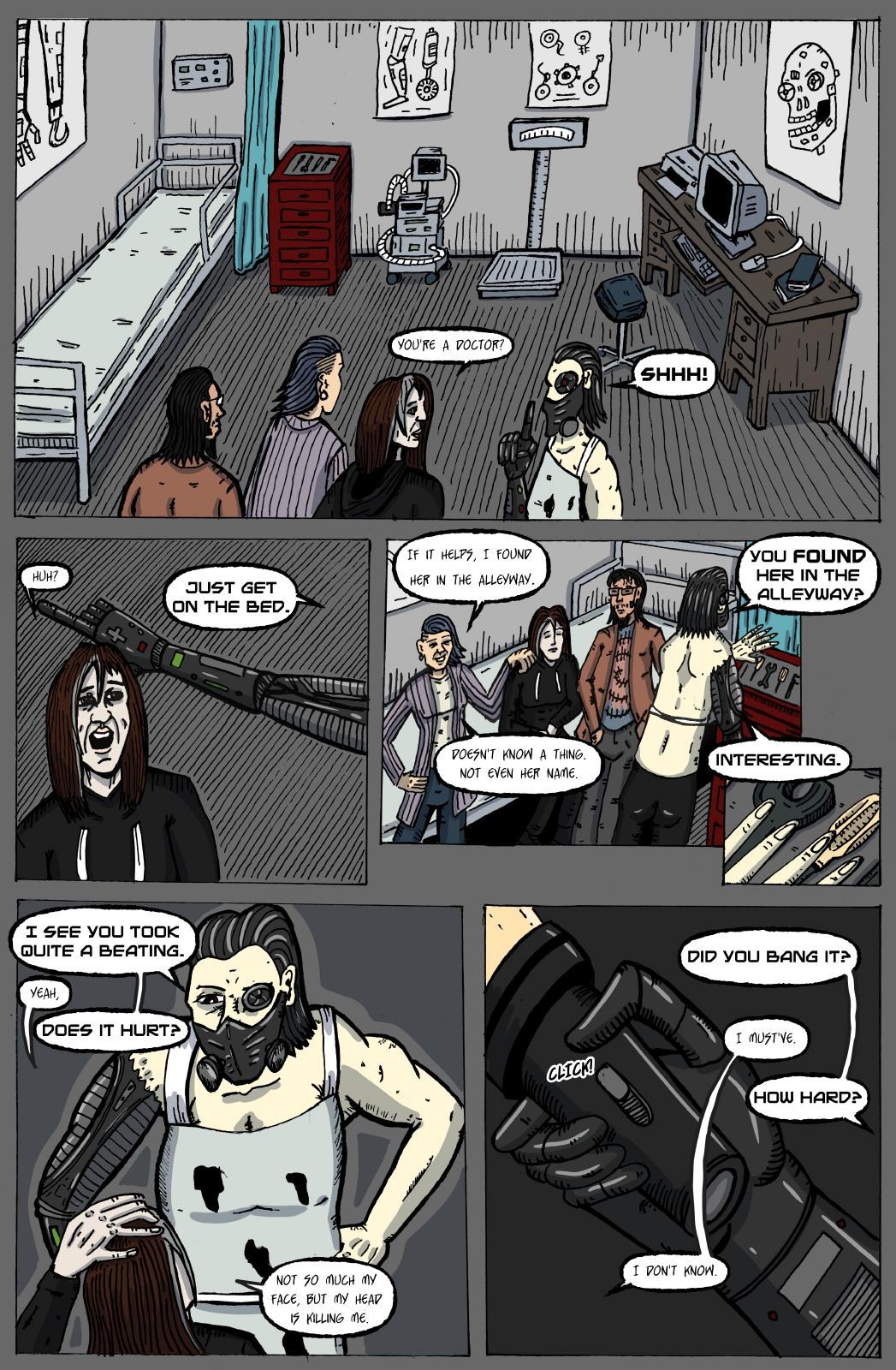
That is why I am interested in seeing where they take it. The Scope #1: Nemby’s Awakening is not some perfectly tuned machine rolling off the assembly line, and I do not think it should be. The bones are here. The voice is here. Now tighten the timing, clean up the page-to-page navigation, let the strongest images breathe and give those supernatural moments enough room to really punch us in the face. Because underneath the rough edges, there is something alive in this joint. Turn that volume up, sharpen the execution and keep the weirdness exactly where it is.
CRUSADERS SCORE:
3.5/5 
Writer / Creator / Letterer: Ruth Osgood
Pencils / Inks / Colour: J.R. Turvey
Publisher: Dicepool Party Comics

Leave a Reply
You must be logged in to post a comment.