REVIEW: Punk’s Not Dead #2
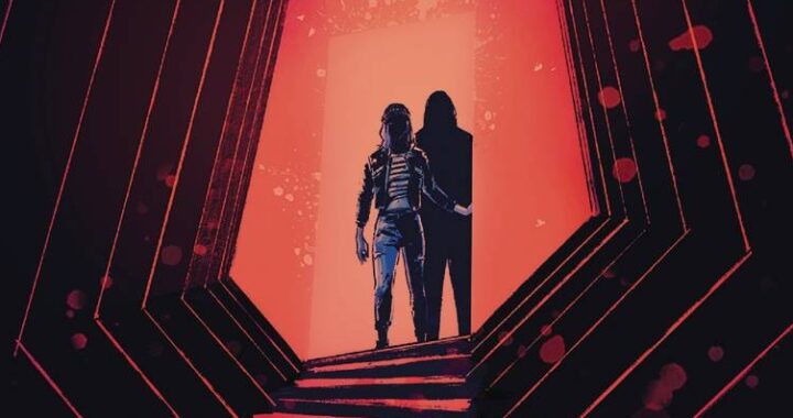
 I“d say from a personal standpoint that I know enough about punk to be a trustworthy point of view on the second issue of this series, or for a good amount of punk things. So starting off, I enjoy the layout of the cover. It screams classic punk in design, though the illustrations are obviously digital and sadly mishmashed in a bad way. Not punk rock bad, just “uhhhhh what?”“ bad..
Punk“s Not Dead is about a kid in what seems to be high school named Fergie, and he happens to have the ghost of Sid Vicious is haunting him. By haunting I mean following him around and saying stereotypical British things, basically what a person who knows very little about Sid Vicious would imagine him saying. So that“s one part of the story, and the other part follows an old woman named Dorothy Culpepper who can see and diminish ghosts who haunt random people. She also has a sidekick who is a young man named Asif Barg whose sole purpose is to act like an idiot and be the target of Dorothy“s sexual harassment. So that“s basically this book.
This is where I take a deep breath and try to be professional, so let“s break it down. The basic story of a young boy being haunted by a punk rock legend would be perfectly acceptable and possibly enjoyable, especially to someone who enjoys the punk scene. But this story is written so horribly that it“s hard to understand what the hell is even going on, and it seems as though David Barnett tried to throw ever British slang term he knew into this mess. We get it, it“s British, they“re not in America, but the damn thing should still be able to be comprehensive. The fact of the matter is that it“s just painful to make sense of the story or what the characters are even tried to say to each other.
Next, the art by Martin Simmonds is not at all bad but I couldn“t imagine a worse art style for this story. It“s about ghosts and punk rock and all that, and Martin“s illustrations are so soft and rounded and look like they“d feel quite pleasant if you were to reach out and touch them. They“re more classic children“s book illustrations and I would never imagine this being a book even involving Sid Vicious just by looking at the artwork alone. There is no clever juxtaposition here, and every attempt at a rough texture just ends up looking like an ink smudge that was attempted to be blended into the surrounded illustrations. It does NOT work whatsoever. The various attempts at showing movement and motion come out looking confusing and awkward, and I can“t distinguish what directions the characters are even supposed to be moving in at many panels in this book. It“s pretty hard to look at especially because it“s clear that Martin put a lot of time and work into his illustrations and they just fail in this context.
This is one of the most painful attempts at a comic book that I“ve ever seen, and I“m not sure who would ever look at this and go, “Yeah, that all works together.”“ It“s not charming, it“s not clever, it“s not witty, it“s just a mess.
Cover: 3 Stars
Story: 1 Star
Artwork: 2 Stars
Colors: 3 Stars
[yasr_overall_rating size=”large”]
CREATORS:
David Barnett (Author) ”¢Â Martin Simmonds (Artist, Cover Artist) ”¢Â Caspar Wijngaard (Cover Artist)
Author Profile
Latest entries

 ReviewsMarch 23, 2018REVIEW: Dark Beach #3
 ReviewsMarch 22, 2018REVIEW: Punk’s Not Dead #2
 ReviewsJanuary 30, 2018REVIEW: EMPOWERED & SISTAH SPOOKYS HIGH SCHOOL HELL #2
 ReviewsDecember 14, 2017REVIEW: Jelly Vampire