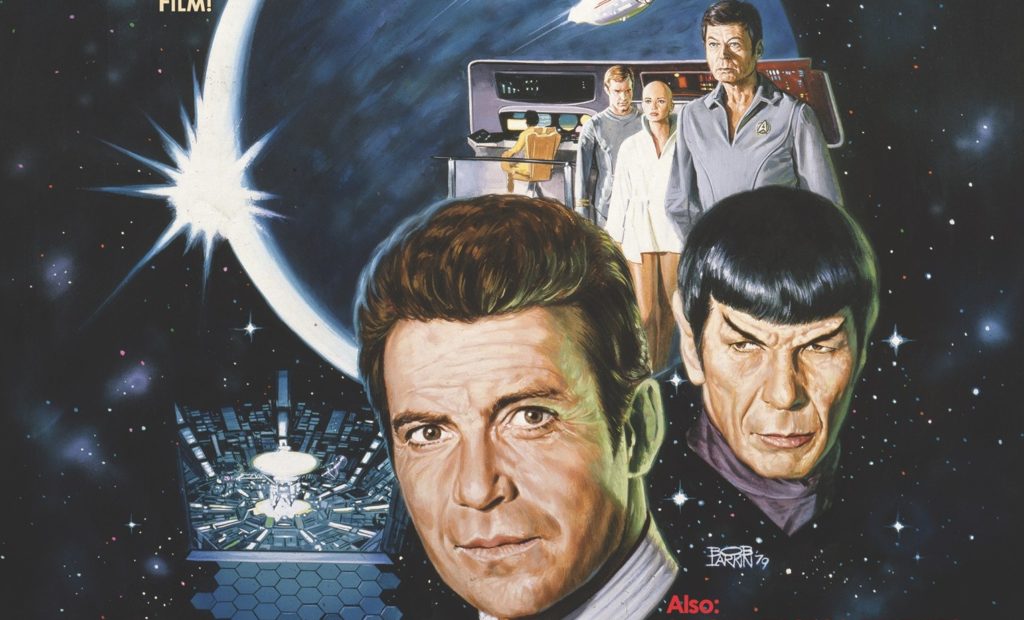
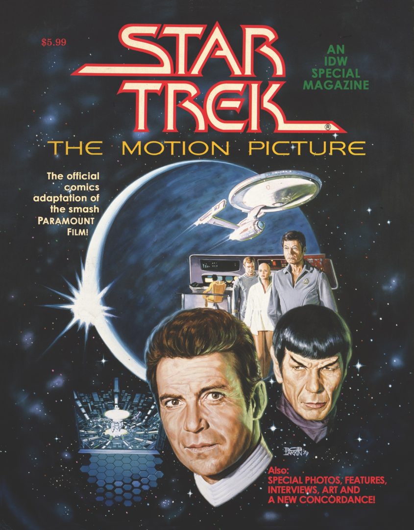
Review: Star Trek: The Motion Picture Facsimile Edition
 Movies, another frontier. This is the voyage of the Starship Enterprise. It’s new mission, take Star Trek from TV out to the masses. To boldly go, across multiplexes across the world, where no syndicated TV show has gone before!
After the hit that was Star Wars (prior to the rename of A New Hope), went to prove that there was life in Sci-FI. At that stage, there was bold imagery and context in 2001 or Close Encounters and there was space opera, with nothing in between. Then the push of Trekkies culminated in the arrival of the first Trek movie, bringing the then, only crew of the Enterprise back onto the bridge. Thanks to Star Wars and KISS, Marvel became aware of the benefits of the tie-in comic book. Looking to capture the same sort of buzz, Marvel went and got top tier talent to capture this first new voyage.
A strange probe has entered the galaxy. Dispatching of a couple of Klingon cruisers, the probe get the attention of the Federation council and a certain pointy eared character looking to purge his emotion. Quicker than you can say “Red Alert, Raise Shields”, Admiral Kirk has taken command of the Enterprise from new Commander Will Decker, pulled together his old crew and along with a new helms-person they are off to save the galaxy once more.
Marv Wolfman is the writer who get to chronicle this movie. Regardless of what you think of the movie, and it is totally divisive, Wolfman could have thought of this book as a pig or a poke. After all, he had to convert the movie into a comic. Therein lies the strength of the writing. This movie goes by a number of names; the Emotion Picture; the No Motion Picture, but under Wolfman the comic reads like Star Trek in a way that the film failed to do so. Maybe there isn’t the same panache to Wolfman here than on Teen Titans for example. but there didn’t really need to be. Wolfman hits the beats of the film, which is no mean feat considering how disjointed the movie can be.
For art, Marvel turned to one its biggest stars of the time; Uncanny X-Men’s Dave Cockrum. In much the same way as Wolfman, Cockrum had his creative hands a tad tied with the need to follow the cinematic art. Still, the key elements are all there from Spock’s revelations, Ilia’s transformation to the dialogue heavy elements, which feature some very good likenesses. The Enterprise, though, looks great. Cockrum is joined by inker Klaus Janson, who at the time was making waves on Daredevil. There is an obvious comparison here; the first issue of the Star Wars adaptation was very ink heavy, due to lack of photos and art from the movie. Eventually, Howard Chaykin changed his heavy hand to cleaner lines and the book then looked great. Looking back, were Marvel looking to create a different look to try and differentiate from their own Star War book? I am not sure, but here, the heavy inks kind of mirror the lack coherency of the movie. Letterer John Costanza does a great job, highlighting the key parts of the movie’s dialogue that not even big Bill Shatner’s delivery could distort. Finally, colors are provided by the late Marie Severin, who does a great job, especially with the transformed ships and V’Ger effects. Remember, this was back when letterers and colorists weren’t that recognised.
Back in the day, I actually had this book in the UK annual format. Somewhere along the line I didn’t notice how deathly dull the movie would turn out, which I saw years after the event. Still, if you use the idea that you can learn more from failure than success, you can see how the tonal changes of subsequent movies had on the franchise. Marvel, never one to let things like having no Spock or having no Enterprise for a time stop them as the comic run carried on. I understand that the idea of facsimile are popular amount but I unsure what makes this book so important to warrant a reprint. Furthermore, the price point at $5.99 seems a little steep for a book where the work has already been done. As a Trek fan, I enjoyed reading this book and taking a warp down memory lane.
Writing – 4 Stars
Art – 4 Stars
Colors – 4 Stars
Overall – 4 Stars
Written by; Marv Wolfman
Art by; Dave Cockrum and Klaus Janson
Letters by; John Costanza
Colors by; Marie Severin
Published by; IDW
Author Profile
- I am a long time comic book fan, being first introduced to Batman in the mid to late 70's. This led to a appreciation of classic artists like Neal Adams and Jim Aparo. Moving through the decades that followed, I have a working knowledge of a huge raft of characters with a fondness for old school characters like JSA and The Shadow
Currently reading a slew of Bat Books, enjoying a mini Marvel revival, and the host of The Definative Crusade and Outside the Panels whilst also appearing on No-Prize Podcast on the Undercover Capes Podcast Network
Latest entries

 Comic BooksApril 19, 2024Review: Jill and the Killers #4
 Comic BooksApril 11, 2024Review: Deadweights #1 (of 6)
 Comic BooksApril 10, 2024Review: Jim Henson’s Labyrinth Archive Edition #1 (of 3)
 Comic BooksApril 3, 2024Review: Red Sonja Empire of the Damned #1


