
SPACE GHOST VS. THE HERCULOIDS #1 Brings Two Hanna-Barbera Powerhouses Together
·Chris Crash
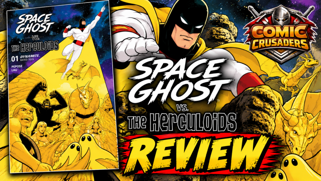
Space Ghost vs. The Herculoids #1 could have gone wrong so damn easily. You know the move. Throw a couple classic Hanna-Barbera names on a cover, hit everybody with the “remember this?” stick for twenty pages, crank out twelve variants, and hope nostalgia does all the heavy lifting. David Pepose thankfully does not pull that lazy nonsense here. This actually feels like two different adventure worlds crashing into each other, with personalities, responsibilities, and enough friction to make the crossover feel like a story instead of a licensing department group photo.
Pepose understands Space Ghost without turning him into some stiff cosmic statue. He has that serious, locked-in energy, but there is still enough personality underneath it to make him interesting. On the other side, the Herculoids actually feel like a family and a unit instead of a checklist of creatures everybody remembers from Saturday morning cartoons. Zandor, Tara, Dorno, Zok, Igoo, Tundro, Gloop and Gleep all have a reason to be here, and that matters because the book gives you time to feel the difference between these characters before smashing their worlds together. That contrast is where the fun starts.

Jonathan Lau is doing heavy lifting all over this thing. Space Ghost needs to move like a sleek superhero, while the Herculoids need to feel massive, weird and physical. Lau somehow gets both languages on the same page without making it look like characters from two unrelated comics got Photoshopped together five minutes before deadline. Igoo looks like he should shake the ground when he moves. Zok has that airborne dragon menace. Tundro feels like somebody weaponized a damn rhinoceros tank. Gloop and Gleep are basically living chaos blobs, and Lau still gives them enough personality that you always know what the hell you are looking at.
That sense of scale is probably my favorite part of the art. Space Ghost is basically one sleek human-sized missile flying through scenes filled with giant creatures, strange anatomy and completely different silhouettes. Lau uses depth and staging to turn that mismatch into a strength instead of a problem. When he finally opens the page up and lets the action breathe, it feels big because he spent time establishing what “big” actually means first. That sounds simple, but plenty of crossover books skip that step and everybody ends up looking like they weigh twelve pounds.
Andrew Dalhouse comes in with exactly the kind of color palette this book needs. You get hot oranges, deep space blacks, glowing greens and those big superhero energy bursts, but the whole thing never starts looking like somebody dipped the pages in plastic. The creatures still have texture. The environments stay readable. Space Ghost’s powers keep their sharp visual identity even when the panel is packed with monsters, debris and chaos. Taylor Esposito has a similar job with the lettering because there are a lot of voices moving around here, and the book never becomes a traffic jam. The sound effects have enough old-school punch to fit the material without making the comic feel like it is making fun of itself.

And that last part matters because Pepose shows some restraint with the fan service. Yeah, you are getting recognizable powers, creatures and classic visual beats. Of course you are. That is part of why we showed up. But the comic does not stop every three pages, elbow you in the ribs and scream, “HEY, YOU REMEMBER THIS, RIGHT?” Longtime fans do not need to be reminded why these characters matter every five seconds. New readers need to understand why they are cool now. This issue spends more energy doing that, which is exactly the right call.
The first issue is definitely arranging pieces on the board, and if you have been reading comics for a while, you are probably going to see a couple character beats coming before they land. Fine. I can live with that because the book is earning trust. It has to prove that there is an actual comic underneath the crossover logo, and once the action starts opening up, it proves the point. The setup is not dead weight because it is building the chemistry that the whole series is going to live or die on.
And man, the creature work is just fun as hell. Sometimes comics forget that a giant rock ape, a laser dragon, a horned living tank and two shape-changing blobs fighting alongside space heroes is already a ridiculously entertaining idea. You do not have to apologize for the pulp. You do not have to make everything ironic. Just make it cool. Lau draws these creatures like he actually enjoys them, and that enthusiasm comes through on the page. When everybody starts moving, the action stays readable instead of becoming the usual crossover problem where six characters are flying around and you need a GPS to figure out who punched who.

The book also does something a lot of issue ones screw up: it leaves room for the damn series to grow. We get the collision, the personalities, the spectacle and enough trouble brewing to make me want issue two without the creators dumping the entire toy box onto the floor immediately. The review copy itself frames Space Ghost as the cosmic vigilante protecting the Galactic Federation while the Herculoids defend their own world, which gives the crossover a real foundation beyond “these characters are owned by the same company.” That is how you keep me coming back. Make me care about the chemistry, not just whatever surprise character you plan on throwing onto the final page.
Look, I love legacy characters. I collect this stuff. I grew up with this stuff. That also means I am not giving anybody bonus points just for putting old favorites on glossy paper. If the book sucks, it sucks. If it is good, say it is good. Space Ghost vs. The Herculoids #1 is good because the creative team respects the characters without treating them like museum pieces. Pepose gives the crossover a reason to exist, Lau makes the whole thing look like these worlds were always meant to collide, and everybody else shows up ready to make the book pop.
So yeah, give me issue two. Just keep telling the story before somebody decides what this series really needs is seventeen foil covers and a glow-in-the-dark Gleep variant.
CRUSADERS SCORE:
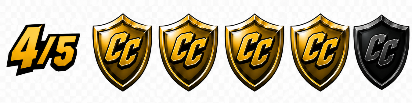
4/5
Writer: David Pepose |
Artist: Jonathan Lau |
Colorist: Andrew Dalhouse |
Letterer: Taylor Esposito |
Editor: Joseph Rybandt |
Main Cover: Francesco Mattina | Publisher: Dynamite Entertainment
Leave a Reply
You must be logged in to post a comment.