
The Doom Patrol #1 Review: Weird, Wild, and Wonderfully Broken
·Al Mega
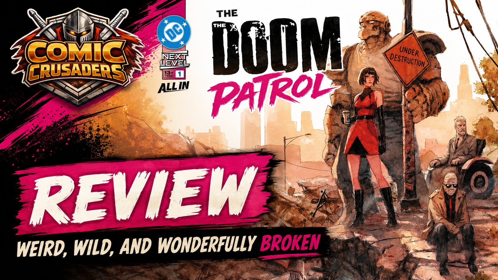
WEPAAAA! The Doom Patrol #1 comes out the gate weird, grimy, funny, a little sad, and very comfortable being uncomfortable. That is exactly the pocket this book needs to live in. Darcy Van Poelgeest does not waste time trying to reinvent the wheel or drown the reader in continuity. He drops Cliff, Rita, Larry, and Caulder into a strange little status quo, lets their personalities do the heavy lifting, and builds the issue around character chemistry instead of nonstop spectacle. Smart move. The result feels like Doom Patrol without feeling like somebody is doing an impression of an older Doom Patrol run.
The writing works best when the team is simply bouncing off one another. Cliff is cranky without becoming a one-note grouch, Rita has that calm-but-not-really-calm energy that fits her perfectly, and Larry carries a weariness that gives the book more heart than you might expect from a story that gets pretty damn bizarre. Van Poelgeest keeps the dialogue loose and natural. Nobody sounds like they are auditioning for a trailer voice-over, and nobody stops the story cold to explain thirty years of trauma. Praise be. There is exposition here, but it comes through behavior, reaction, and memory instead of a big block of “Hey reader, here is my entire biography.”
The issue’s biggest strength is the balance between humor and damage. The Doom Patrol is always better when the absurdity is funny because the characters take it seriously, not because the book keeps winking at you. That distinction matters. The team ends up involved in something small and almost ridiculous by superhero standards, but the story never treats them like clowns. Underneath all of it is this feeling that everybody is hanging together with duct tape, stubbornness, and maybe some overdue therapy. That gives the comedy weight instead of turning it into random weirdness for the sake of weirdness.

Van Poelgeest also does a solid job with pacing. The issue moves quickly, but it does not feel rushed until the back end, where the immediate conflict resolves a little faster than I wanted. That is probably my biggest knock. The setup earns your attention, the character work keeps you invested, and then the external problem gets handled with less resistance than the buildup suggests. It is not a dealbreaker, but I definitely wanted the issue to make the team sweat a little harder before closing the door on that beat. The larger mystery around Caulder has more juice, though, and that thread gives the book enough forward momentum to make issue two an easy pickup.
Niko Henrichon’s artwork is where this thing really starts flexing. The pages have texture. Real texture. Nothing looks overly polished or digitally scrubbed until it squeaks. Cliff looks heavy, like every step should crack pavement. Larry looks tired even when half his face is hidden. Rita has elegance, but Henrichon always leaves just enough tension in her body language to remind you that control is not exactly guaranteed. Even the environments feel lived in, scuffed up, and slightly wrong. This is not shiny superhero art, and thank goodness for that. Doom Patrol should never look like everybody just walked out of a toothpaste commercial.

Henrichon handling the colors gives the book a strong visual identity too. The quieter pages lean into dirty oranges, faded yellows, browns, creams, and muted greens that make the world feel tired before anything supernatural even happens. Then the stranger material crashes in with brighter purples, harsh whites, glowing energy, and nasty little bursts of color that tell your eyes, “Yeah, normal just left the building.” WEPA. The shift works because it is not random. The color changes are part of the storytelling. You feel the weird coming before the dialogue has to explain it.
The sequencing is equally strong. Henrichon keeps Caulder’s scenes tighter and more boxed in, then opens things up when the team is moving through the world. Once the issue starts leaning harder into the bizarre, the panel flow loosens up and the pages get more aggressive. It gives the action more impact without turning the comic into visual soup. The compositions remain readable, the eye always knows where to go, and the bigger moments land because the earlier pages gave them room to breathe.

Lucas Gattoni’s lettering deserves credit because this book could have gotten messy fast. The captions stay clean, the typewriter material has its own identity, and the stranger voices get enough treatment to feel different without becoming some unreadable “look how artsy we are” nonsense. The sound effects fit into Henrichon’s pages instead of sitting on top of them like stickers. That may sound small, but lettering can either help a dense page breathe or completely murder it. Gattoni keeps everything moving.
As part of DC’s Next Level push, The Doom Patrol #1 feels like one of the smarter launches because it does not confuse accessibility with blandness. New readers can follow it without needing a YouTube explainer open on another screen, while longtime readers will recognize the emotional baggage and oddball chemistry immediately. If you caught our review of Next Level: One Shot #1, this feels like the next logical step in showing what DC can do when it lets a creative team establish tone before chasing scale. You can also revisit our review of Unstoppable Doom Patrol #6 for another recent flavor of the World’s Strangest Heroes.
The Doom Patrol #1 works because the creative team understands the assignment without overplaying it. Van Poelgeest gives the characters personality, Henrichon gives the book grit and visual identity, and Gattoni keeps the weirdness readable. The immediate conflict could have hit harder, and the issue clearly holds some of its bigger cards for later, but as a first issue? Yeah, fam, this does what it needs to do. It gives you the team, gives you the tone, gives you enough mystery to come back, and leaves a little dirt under your fingernails on the way out.
CRUSADERS SCORE:
4/5
Script: Darcy Van Poelgeest
Art & Cover: Niko Henrichon
Letters: Lucas Gattoni
Variant Covers: Clayton Crain, Ian Bertram, Hayden Sherman, Ashley Wood
Assistant Editor: James Reid
Editor: Ben Meares
Group Editor: Rob Levin
Publisher: DC Comics
Leave a Reply
You must be logged in to post a comment.