
Whatmen Review: Watchmen Gets Roasted With Zero Mercy
·Al Mega
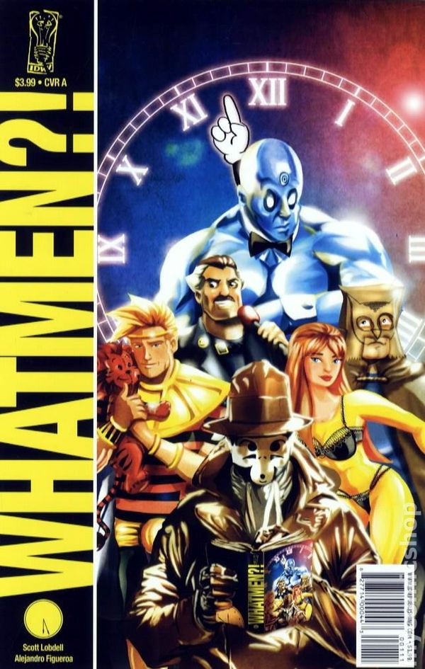
WEPA! Some comics approach sacred cows with respect. Whatmen walks into the museum, jumps the velvet rope, knocks over the display case, and asks why the giant blue dude refuses to put on some damn pants. Right from the opening page, writer Scott Lobdell makes the mission crystal clear: dignity has been canceled, nobody is safe, and one of comic-book history’s most celebrated stories is about to get roasted like pernil on Christmas Eve.
The foolishness begins with the death of the Stand-Up, a disgraced former superhero whose encounter with a slippery bar of soap turns one of comics’ most famous murder mysteries into an embarrassingly stupid bathroom accident. Enter Nutsack, the trench-coated vigilante who narrates every ordinary observation like humanity has ten minutes left before extinction. Soap? Conspiracy. Breakfast? Conspiracy. Somebody suggesting the death was accidental? That person is obviously part of the conspiracy. My guy is completely buggin’, yet he commits to the nonsense with such grim confidence that the joke keeps landing.
Lobdell understands that successful parody requires more than changing names and repeating recognizable scenes. Whatmen goes directly after the original’s solemn narration, fractured chronology, repeating imagery, psychological baggage, elaborate supplemental documents, moral speeches, and characters who discuss the destruction of civilization while looking like somebody stole their parking spot. The comic knows what made Watchmen memorable, then grabs every one of those ingredients and tosses them into a blender set to disrespect.
Nutsack’s investigation introduces a lineup of spectacularly dysfunctional heroes. Doc NYC possesses nearly unlimited cosmic power but cannot escape boredom, relationship problems, or the uncomfortable realization that clothing might be useful. Ozzy Mandious is supposedly the smartest man alive, which means he spends most of the book admiring himself and explaining plans nobody asked to hear. Hooty desperately misses the glory days of costumed heroics, while the group’s romantic relationships possess all the emotional stability of a shopping cart rolling downhill toward traffic.

The character names are juvenile. That is absolutely the point. Lobdell bounces between sharp structural satire and unapologetic middle-school stupidity, creating the comic-book equivalent of a brilliant professor telling fart jokes during a lecture. Sometimes the collision is hilarious. Occasionally, it is corny as hell. Still, the book never pretends it is operating with sophistication or restraint. Restraint left the building on page one and took good taste with it.
Alejandro Figueroa’s artwork is the true engine behind the madness. He does not simply draw funny versions of familiar characters. He recreates the rigid visual language associated with Dave Gibbons’ storytelling and then sabotages it from inside the panel. The repeated close-ups, symmetrical layouts, heavy silhouettes, mirrored compositions, and dramatic architecture make every scene appear enormously important. Then somebody gets smacked with cookware, terrorized by soap, or interrupted by an editorial note admitting the plot has gone completely off the rails.
That contrast is where Whatmen is funniest. Figueroa presents complete stupidity with a straight face. Nutsack crouches dramatically in shattered windows while admitting he should have used the elevator. Doc NYC contemplates existence across time and space while everybody nearby begs him to discover underwear. Ozzy poses like a marble statue while discussing his intellect, physique, and ridiculous plan. Every character believes they are participating in the most important story ever published. The artwork lets them believe it. That is comedy, fam.
Aldo Giordanelli’s inks keep the figures crisp and readable, even when the panels become crowded with visual jokes, background references, and unexpected cameos. His shadows preserve enough noir atmosphere to maintain the resemblance to the source material without burying the expressive faces. Those side-eyes, stunned reactions, vacant stares, and moments of pure embarrassment frequently hit harder than the dialogue.
Amber Shields’ colors and text-page designs also deserve serious recognition. The bold pinks, dirty yellows, deep purples, electric blues, and sickly greens capture the visual temperature of the original while pushing everything into exaggerated cartoon territory. Shields also sells the supplemental pages, presenting fake autobiographies, police documents, newspaper articles, and interviews with enough conviction that they feel like legitimate extensions of the joke instead of filler.
Richard Starkings and Comicraft’s Albert Deschesne manage narration boxes, traditional balloons, sound effects, editorial interruptions, and giant declarations without allowing the pages to become unreadable. The lettering often becomes part of the punchline, especially when oversized outbursts or editorial comments puncture a dramatic moment at exactly the right time.
The comic fires references in every direction, including superhero clichés, comic-shop culture, television crime dramas, adaptation anxiety, celebrity jokes, and the entertainment industry’s obsession with turning respected comics into blockbuster movies. Some references still hit immediately. Others are locked firmly inside 2009, particularly the jokes surrounding the then-upcoming Watchmen film. That dated quality does not kill the experience, but it definitely stamps the book as a product of its era.
Not every gag lands. Several jokes lean heavily on sex, anatomy, bodily functions, or intentionally crude names. A few have aged like milk sitting on a Brooklyn fire escape during August. Readers unfamiliar with Watchmen may also feel locked outside the party because much of the humor depends on recognizing exact layouts, scenes, dialogue rhythms, and character dynamics. This is not an introduction to the classic graphic novel. This is the drunken comedy roast held after everybody has already read it.
The pacing can also become relentless because Lobdell stuffs jokes into nearly every caption, panel, document, and transition. That density reflects the work being parodied, but some punchlines could use more breathing room. Whatmen is strongest when Figueroa’s visual setup is allowed to finish the joke. When the characters, captions, and editors all compete for the final word, the comedy becomes a little crowded.
Still, the book earns respect because it commits completely. There is no cautious, halfway satire here. Lobdell attacks the philosophy, dialogue, plotting, and suffocating seriousness, while Figueroa attacks the visual compositions. Giordanelli, Shields, Starkings, and Deschesne make the production look authentic enough for every ridiculous moment to hit harder.
Whatmen is loud, immature, clever, dated, visually disciplined, and proudly disrespectful. It understands that sometimes comics require scholarship and reverence. Other times, somebody has to look directly at one of the most acclaimed graphic novels ever made and ask, “Yo, what if Rorschach was named Nutsack?” That is culture. WEPA!
CRUSADERS SCORE:
4/5

Writer: Scott Lobdell
Pencils and Covers: Alejandro Figueroa
Inks: Aldo Giordanelli
Colors and Text-Page Design: Amber Shields
Lettering: Richard Starkings and Comicraft’s Albert Deschesne
Editors: Chris Ryall and Scott Dunbier
Original Publication: February 2009
Publisher: IDW Publishing

Leave a Reply
You must be logged in to post a comment.