
Macabre Majesty #1: Slave to the Red Review
·Al Mega
WEPAAAA! Yo, Macabre Majesty #1: Slave to the Red is one weird-looking little bastard, and I mean that with love. This joint looks like somebody found a cursed children’s book buried underneath an abandoned church in Brooklyn, cracked it open, spilled some cheap red wine across the pages, and accidentally summoned something they definitely were not prepared to deal with. Right from jump, Drew Hanson, Jean Auguste Johnston and Nikki Powers make one thing crystal clear: pretty ain’t the mission here. This comic wants to be grimy. Crooked. Uncomfortable. A little nasty around the edges. And fam, that handmade ugliness is exactly what got me.
Hanson and Johnston drag us into this gothic fantasy world where blood, slavery, ritual and power are already baked into the walls before we fully understand what the hell is going on. I dig that they don’t grab you by the collar and start explaining every piece of mythology like somebody reading instructions off the back of a cereal box. Nah. They make you work a little. Watch the characters. Study the imagery. Pick up pieces from the dialogue and start putting this nightmare together yourself. Sometimes that mystery works beautifully. Other times? Ehhh, slow down, papi. A couple of transitions had me flipping backward like, “Wait, did I miss a page?” Mystery is cool. Making me investigate my own reading comprehension is a different situation.
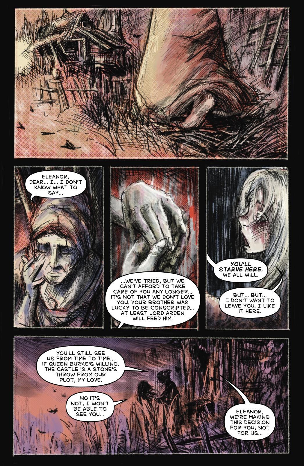
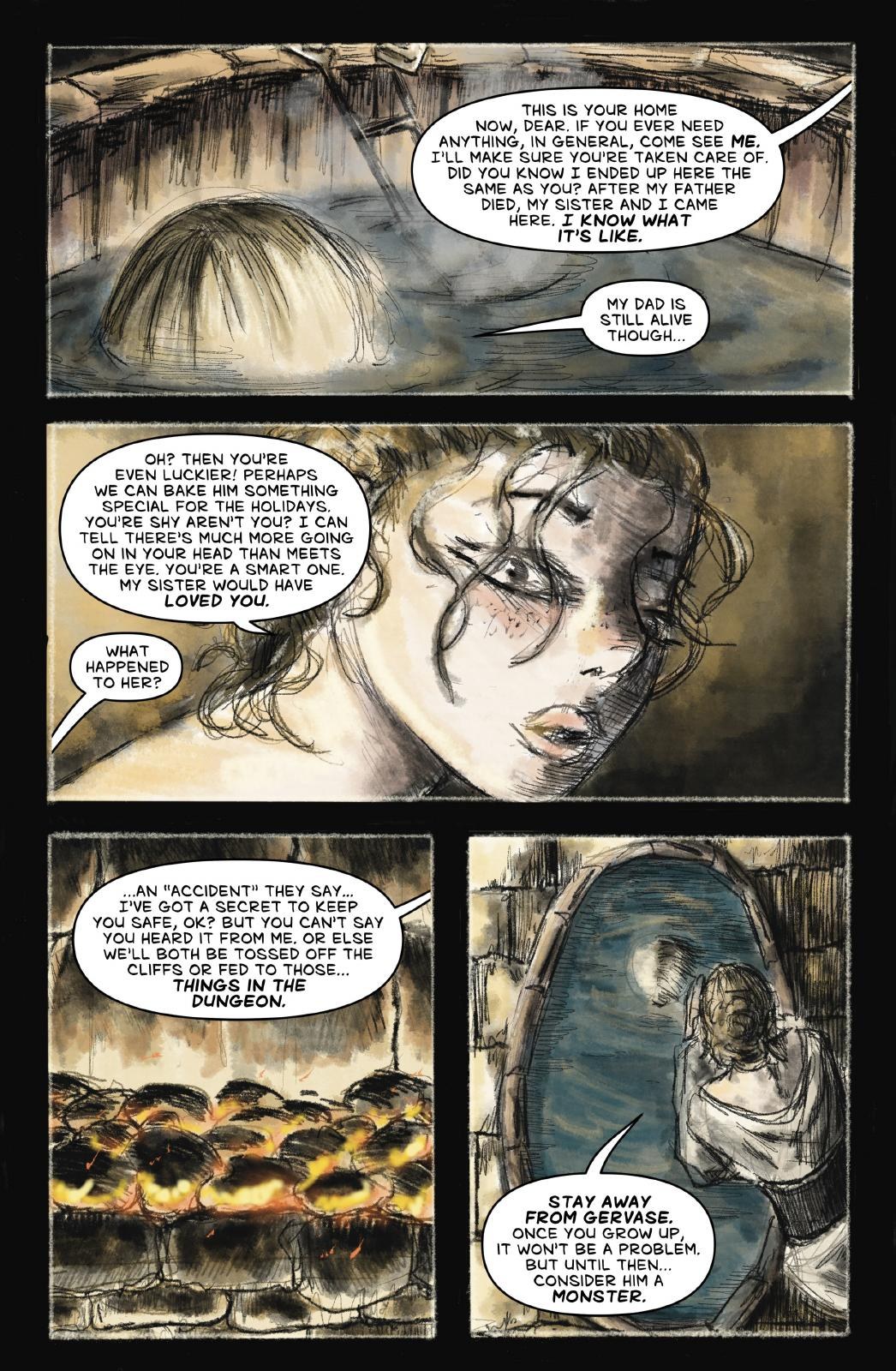
But the ART? Ay bendito. This thing has personality dripping off the paper. The ink doesn’t glide across these pages, it scratches at them. Watercolors bleed into spaces like they weren’t invited but showed up anyway. Bodies twist. Faces shift. Characters can look almost regal in one image and straight-up sickly a few panels later. There’s no obsession with making everything anatomically perfect or digitally pristine, and thank goodness for that because perfection would’ve murdered this book’s whole vibe. The artwork feels restless, almost infected by the world it’s depicting.
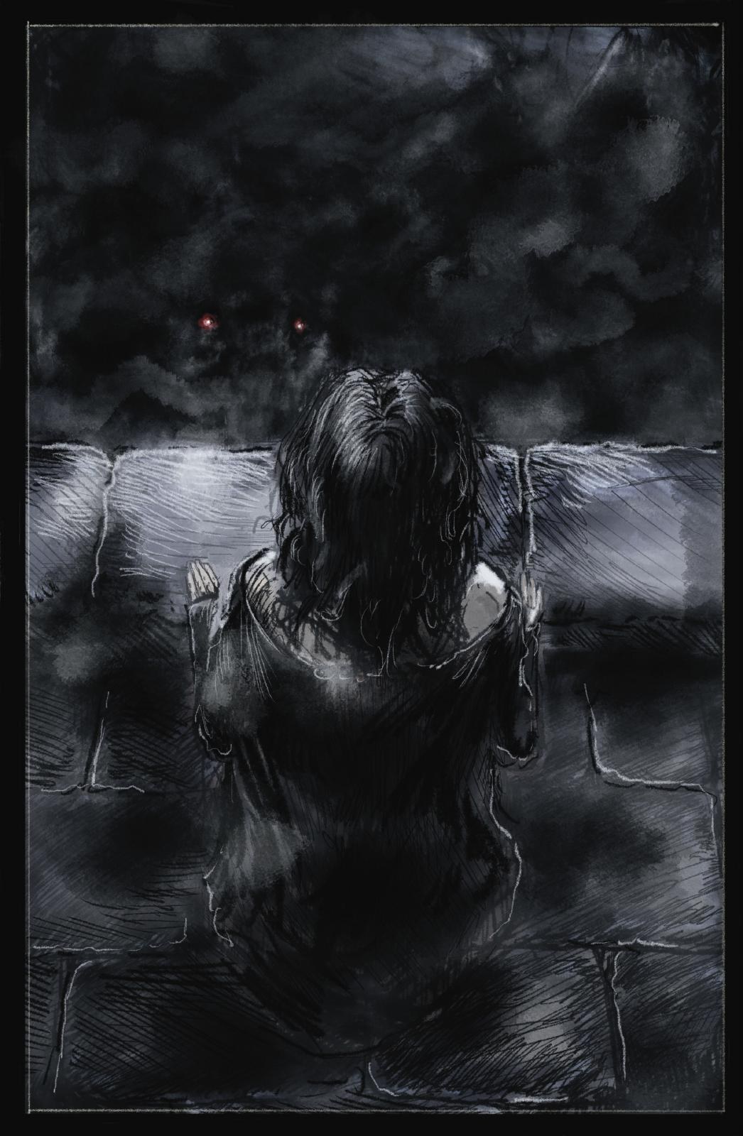
What really got me were those moments when the creators pull back and let negative space do some heavy lifting. You’ll get a nasty little splash of red here, a warped silhouette there, maybe a figure surrounded by all that empty paper, and suddenly the page hits harder than something loaded with a thousand little details. That’s when Macabre Majesty is cooking. You might not completely understand every piece of its mythology yet, but you can feel something wrong crawling underneath it. Horror needs that. Sometimes knowing exactly what’s hiding in the basement ruins the fun.
Nikki Powers understands what kind of book she’s lettering too. Thank you! Nothing would’ve killed this atmosphere faster than dropping squeaky-clean, sterile-looking digital balloons over artwork that looks like it crawled out of somebody’s fever dream. The lettering feels like it belongs in this world. There are spots where placement and contrast could be tightened because readability occasionally takes a hit, but Powers never feels disconnected from the visual identity. That’s important. Lettering ain’t decoration, fam. It’s part of how your eyeballs travel across the page.
That brings me to the biggest thing holding this issue #1 back from hitting even harder: sequencing. Hanson and Johnston clearly know what emotion they want each scene to leave behind. I can see it. I can damn near smell it. But occasionally the road connecting those moments gets foggy, especially when symbolism, composition and narrative information all start fighting for the driver’s seat. There were a few spots where I understood the mood immediately but had to assemble the actual storytelling beat afterward. That’s fixable. The visual language is already here, and that’s usually the harder thing to discover.
Listen, I will take a comic with too much personality over one with none every damn time. You know how many technically gorgeous indie comics I’ve read that disappeared from my brain before I finished my cafecito? Too many. Perfect anatomy. Gorgeous colors. Clean panels. Absolutely nothing rattling around upstairs afterward. Macabre Majesty ain’t suffering from that problem. This sucker leaves residue. You close it and still remember what it felt like. That’s worth something.
The violence benefits from that same dirty, unstable artwork. Nobody here looks like a superhero mannequin waiting for somebody to draw blood on top of perfectly rendered muscles. Damage becomes part physical, part symbolic. A smear might be blood. Could be shadow. Could be fear leaking into the picture. Sometimes it’s all three. That gives the story this warped dream logic where reality feels like it’s constantly threatening to come apart at the seams, which fits this world beautifully.
When these creators nail that balance? Oof. That’s the sauce right there. One silhouette. One nasty patch of red. One lonely figure swallowed by blank space. Suddenly everything locks into place and the page speaks without screaming at you. Those are the moments I want more of because they prove this creative team already understands what makes Macabre Majesty different. Now it’s about sharpening the storytelling around that identity instead of sanding the identity down to make the storytelling easier.
That’s really where I land with Slave to the Red. Don’t clean this thing up too much. Please. Don’t send it through some digital car wash until all the fingerprints, stains and weird little imperfections disappear. The grime is part of the damn flavor. Tighten the transitions. Give the reader a slightly stronger hand moving from beat to beat. Let the most powerful compositions control the page. But keep this sucker strange.
Macabre Majesty #1 isn’t perfect, and it doesn’t need to be. What it does need is exactly what it already has: a pulse. An identity. Something you can recognize from across the comic shop without checking the logo. Drew Hanson and Jean Auguste Johnston have built a nasty little gothic playground here, and Nikki Powers helps make the words feel like they were born inside it instead of pasted on afterward. There’s work to do, absolutely, but there’s something cooking underneath all that blood and watercolor. And yeah, fam…
I’m coming back to see what crawls out next. WEPA!
CRUSADERS SCORE:
4/5
Story & Art: Drew Hanson and Jean Auguste Johnston
Lettering: Nikki Powers
Publisher: Dungeon Rat Productions
Support their Kickstarter:
https://www.kickstarter.com/

Leave a Reply
You must be logged in to post a comment.